A website to bring a historical documentary to life
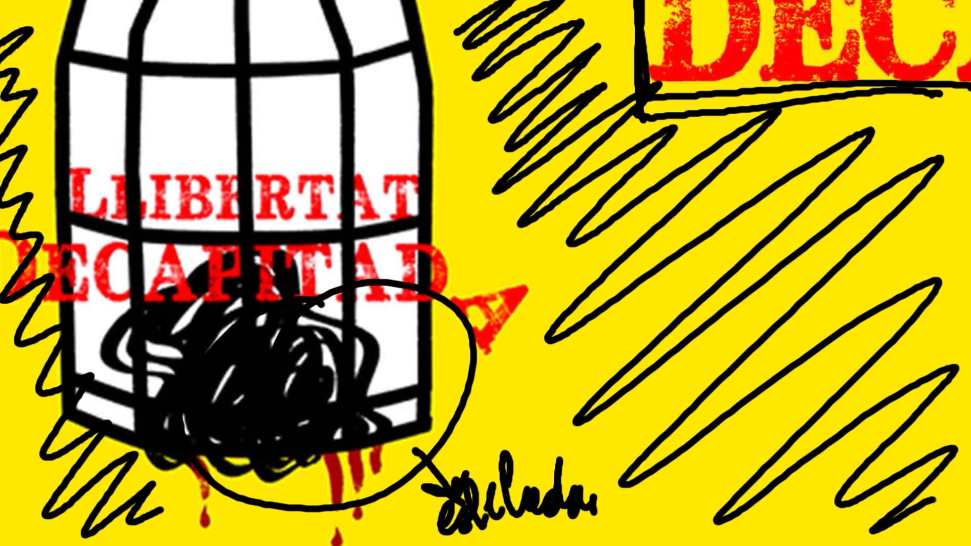
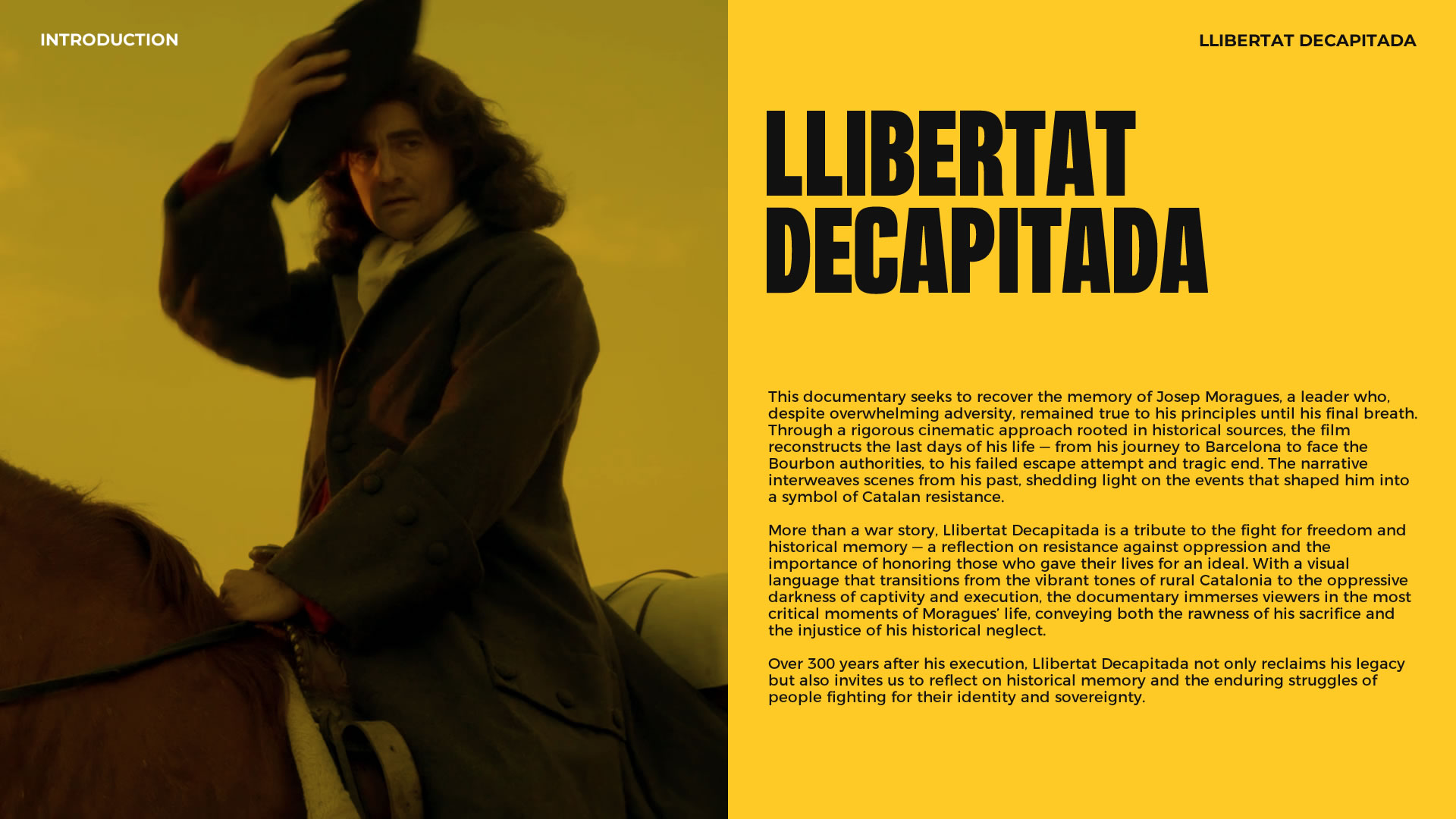
Llibertat Decapitada
A documentary needs more than a powerful story — it needs funding to come to life. For this real-world project, I designed a website that not only promoted the film but also helped attract potential investors and connect with an engaged audience.
The platform focused on clear information architecture, a bold visual design, and intuitive navigation — ensuring every visitor could quickly access key information about the production and its cultural impact.
Introduction
The Client
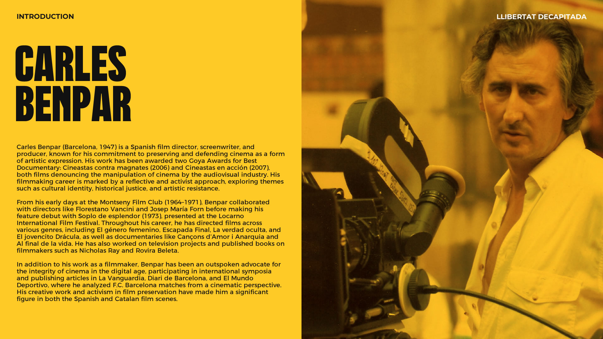
Carles Benpar
Carles Benpar (Barcelona, 1947) is a film director, screenwriter, and producer known for his commitment to the preservation of cinema and the defense of artistic freedom. He has won two Goya Awards for Best Documentary for *Cineastas contra magnates* (2006) and *Cineastas en acción* (2007), films that denounce cinematic manipulation. His work spans from fiction films to historical documentaries, often exploring themes such as identity, justice, and memory. He has directed films like *Escapada Final*, *El género femenino*, and *La verdad oculta*, and has also contributed to television projects and published studies on filmmakers like Nicholas Ray. His work stands out for its rigorous narrative style and deep reflection on cinema as a tool for denunciation and historical remembrance.
The Documentary
"Llibertat Decapitada"
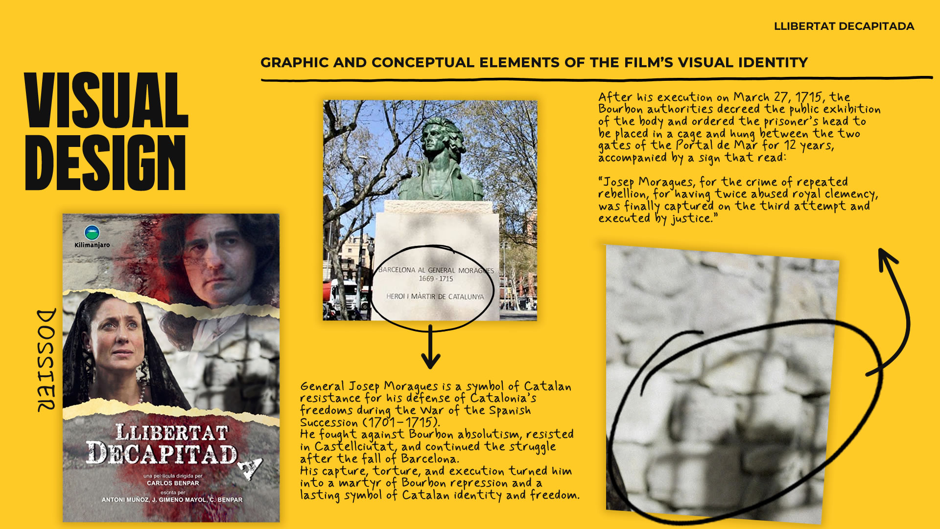
This documentary reconstructs the final days of General Josep Moragues, a symbol of Catalan resistance during the War of the Spanish Succession. Through a cinematic approach rooted in historical documentation, the film explores his struggle against Bourbon absolutism, his capture in 1715, and his brutal execution — used as a warning to those opposing Philip V’s rule. With immersive storytelling and carefully crafted cinematography that follows Moragues’ journey from hope to sacrifice, the documentary restores the legacy of a figure long forgotten. More than a historical account, *Llibertat Decapitada* is a meditation on memory, resistance, and the price of freedom — placing Moragues in the collective memory where he rightfully belongs.
Team
-
Carles Benpar → Film director, responsible for the investor presentation strategy and timeline coordination.
-
Néstor F. → Illustrator and visual designer, in charge of providing graphic and multimedia elements.
-
Anna B. → Content coordinator and copywriter, ensuring quality and consistency across all texts.
-
Cristina R. → Translator, responsible for adapting content into different languages depending on the target audience.
-
Guille Herrera → Responsible for graphic identity, visual design, user experience, interface design, and website development. I also handled content review and the launch of the live site.
Timeline
7-month project.
-
Research and synthesis:
2 months (January–February) -
Ideation, prototyping, and testing:
2 months (March–April) -
Development and launch:
3 months (May–July)
Project Challenge
The website needed to meet two key objectives: on one hand, to attract investors by presenting the film in a compelling way; on the other, to persuade a government agency by highlighting the documentary’s cultural and social value — emphasizing its historical relevance as justification for receiving public funding.
To achieve this, it was essential to structure the information clearly and persuasively without overwhelming the user, balancing text and visuals to keep both audiences engaged. In addition, I designed an intuitive user experience with smooth navigation and a fully responsive interface, ensuring optimal access across both mobile and desktop devices.
Research & Synthesis
During the initial meetings with the client, we leveraged his extensive experience in film production to gather key information, define the target audience, and establish the research goals.
Research
Objective
Determine the best way to present the documentary in order to:
- Attract investors in the audiovisual sector who are interested in financing film projects.
- Convince government agencies responsible for granting cultural subsidies.
Target Audience
Film investors
- Production companies, film investment funds, and private businesses with an interest in the industry.
Government funding agencies
- Officials or experts in charge of evaluating projects for public funding.
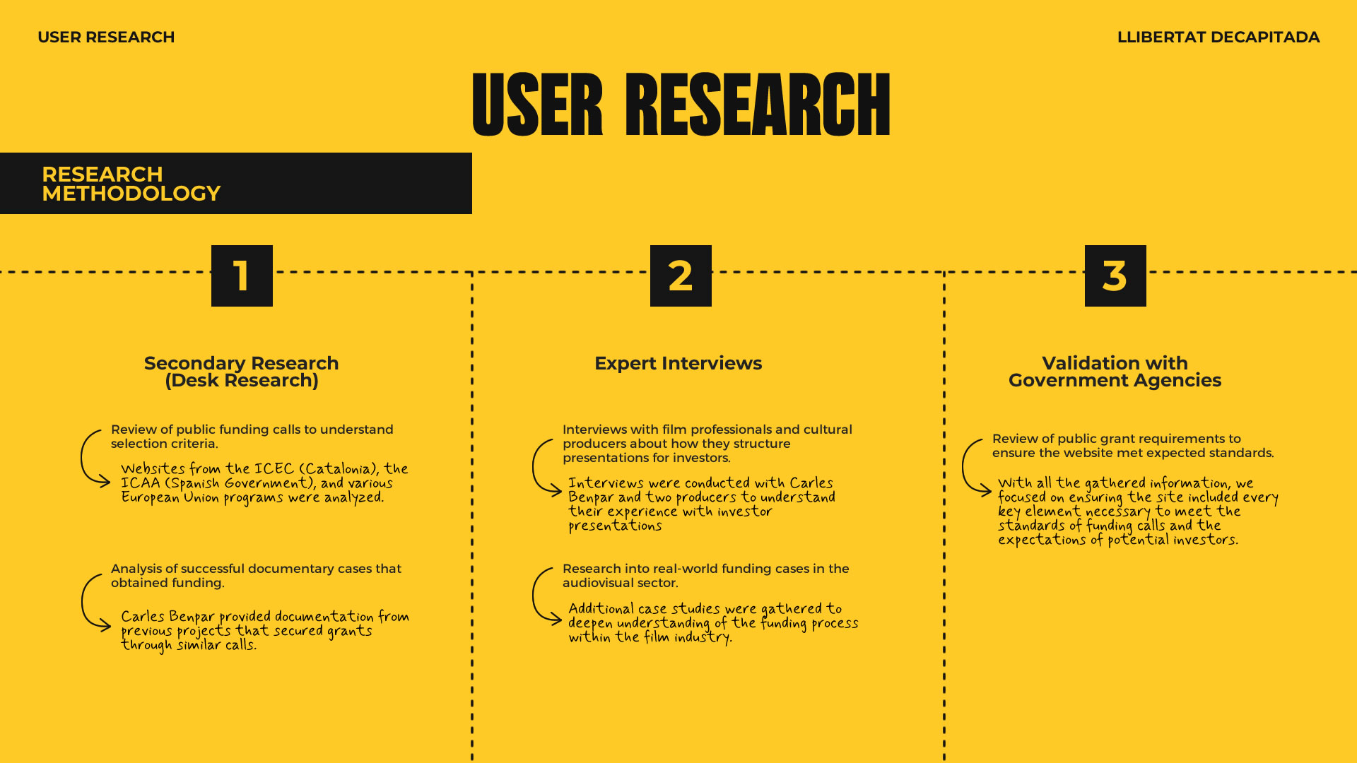
Research Methodology
Since direct access to the target audience was limited, an agile and efficient research plan was developed.
- Secondary research (desk research)
- Interviews with industry experts
- Validation with government institutions
Definition & Synthesis
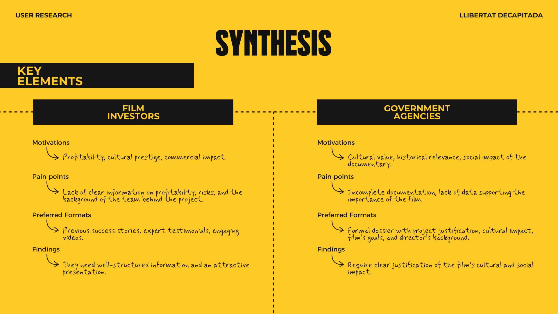
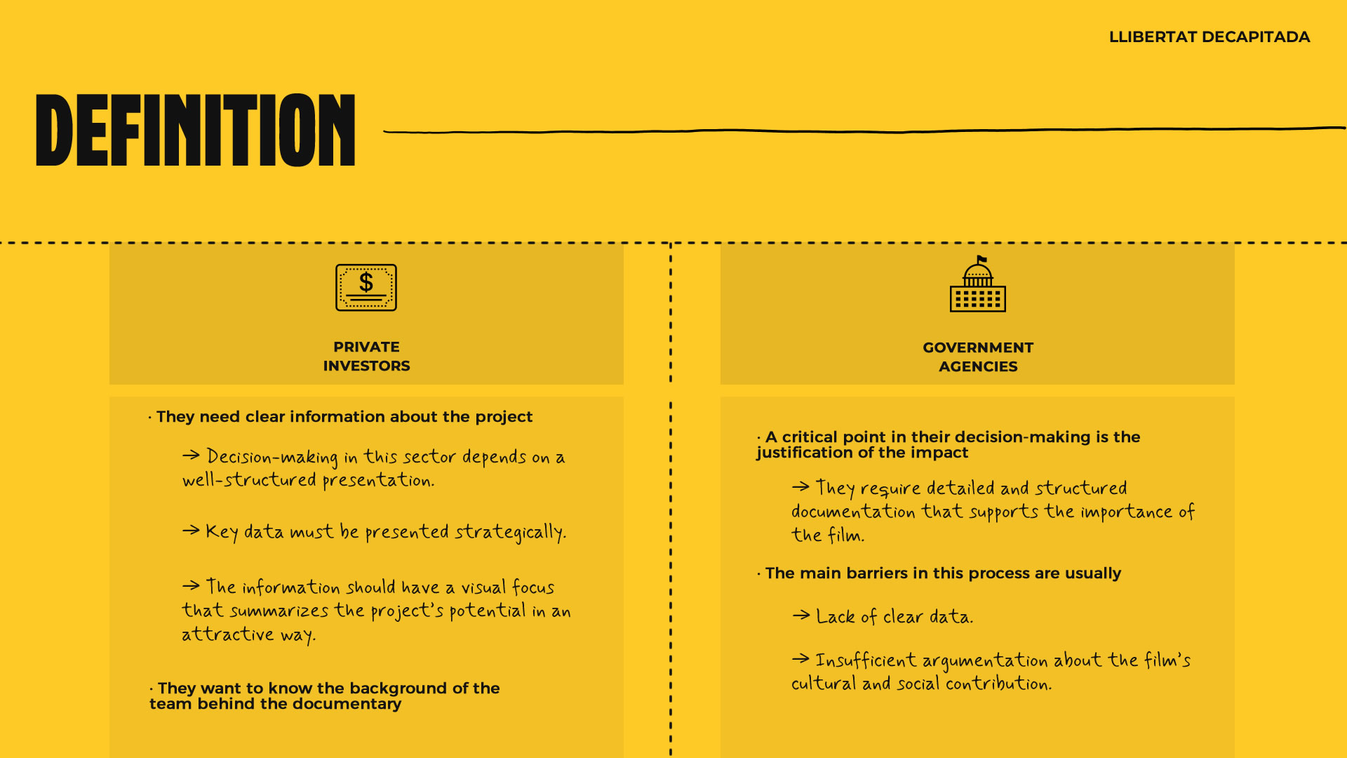
Film Investors
Film investors look for projects that balance profitability, cultural prestige, and commercial impact.
Government Agencies
To grant funding to a film project, government agencies assess its cultural value, historical relevance, and social impact.
Ideation & Prototyping
Objective
With key elements defined and a deep understanding of the target audience, the next step was to transform the research into tangible design solutions. Through a structured ideation process, we explored different ways to present the documentary in a clear and persuasive manner. Iterative prototypes were developed, prioritizing visual hierarchy and usability to ensure an intuitive and effective experience — one that would appeal to investors and meet the funding criteria of public institutions.
Generating Ideas
Given the small team, limited resources, and tight deadlines, the strategy focused on using agile, efficient, and low-cost ideation techniques.
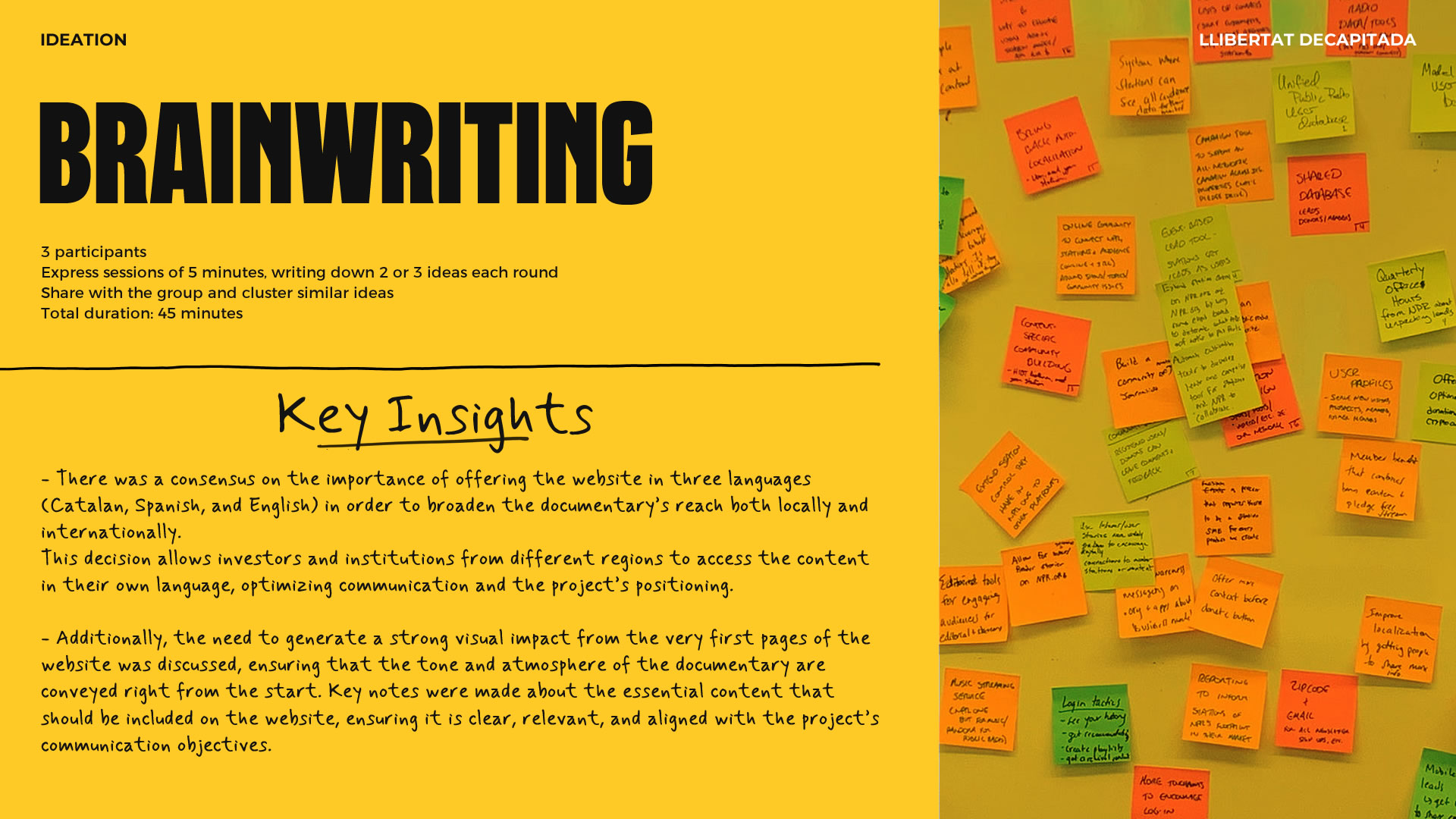
Rapid Brainwriting
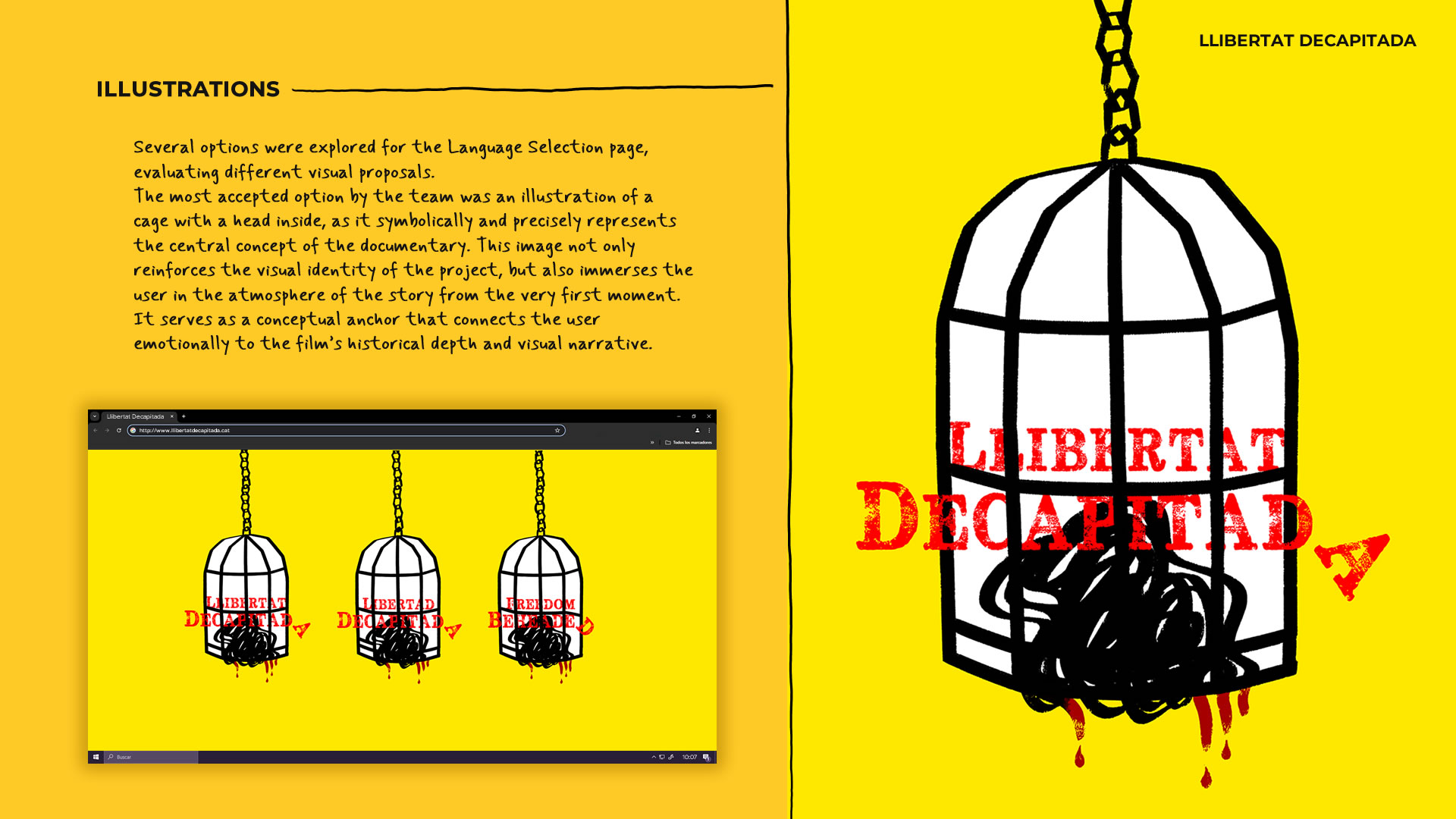
- It was decided that the initial design would be developed for desktop, allowing for maximum visual impact and a solid, well-structured layout. Later, the design would be adapted to different screen sizes using a responsive approach, ensuring a consistent user experience and preserving design strength across all devices.
- During the Brainwriting session, several key ideas emerged for the structure and functionality of the website. Two participants emphasized the importance of offering the site in three languages (Catalan, Spanish, and English) to broaden the documentary’s reach locally and internationally. We also explored solutions for managing access to sensitive documents, such as the screenplay, ensuring they were available on request.
Card Sorting with Post-its
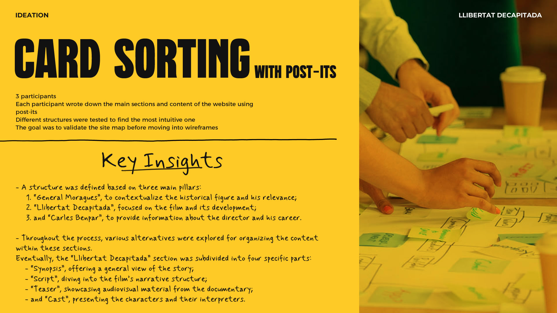
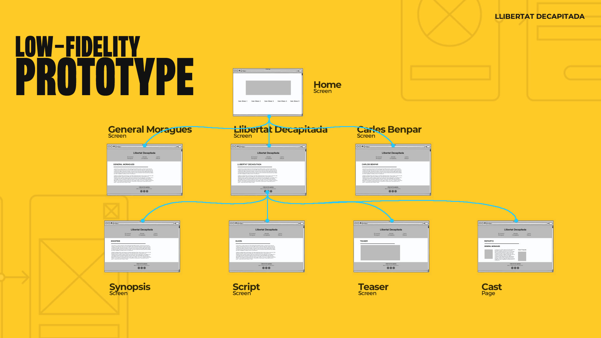
- Based on the Card Sorting session, key improvements were identified for the site’s structure. A core framework with three main sections was proposed: “General Moragues”, “Llibertat Decapitada”, and “Carles Benpar”. After testing various alternatives, we decided to subdivide the “Llibertat Decapitada” section into “Synopsis”, “Screenplay”, “Teaser”, and “Cast”.
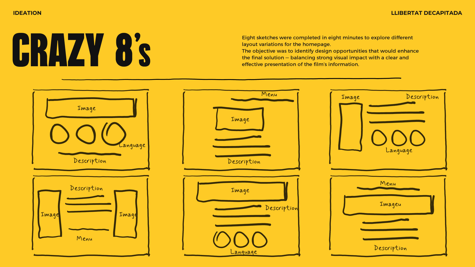
Rapid Sketching (Crazy 8’s)
- Eight sketches were created in eight minutes to explore different versions of the homepage layout. The goal was to identify design opportunities that could enhance the final solution by combining strong visual impact with a clear and effective presentation of the film’s information.
Sitemap
After conducting user research, we identified that the target audience needed to understand both the value of the documentary and the background of the team behind it. To achieve this, the information had to be presented clearly, with a well-structured layout aligned with the expectations of investors and funding institutions.
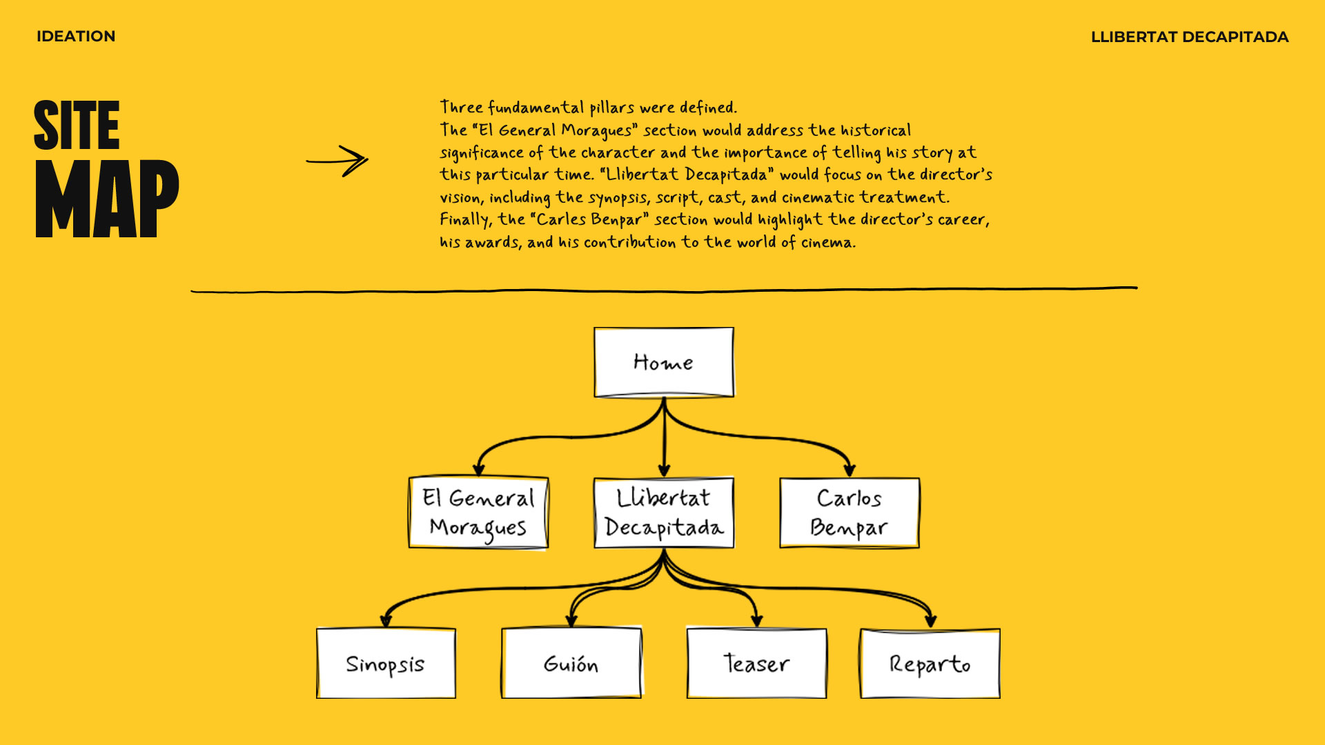
This process of refinement and iteration led to a solid structure that balances informative depth with visual appeal — ensuring each section addressed specific audience needs while strengthening the documentary’s overall presentation.
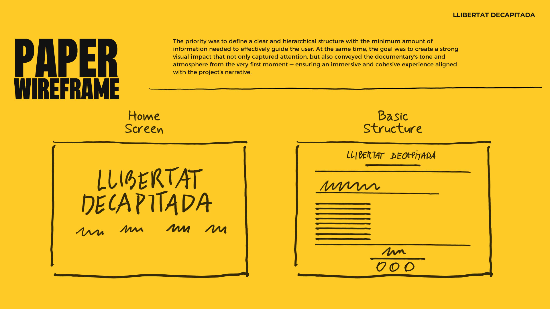
Paper Wireframe
Following the ideation sessions, the focus shifted to designing the site’s two main entry points: the Language Selection screen and the Homepage.
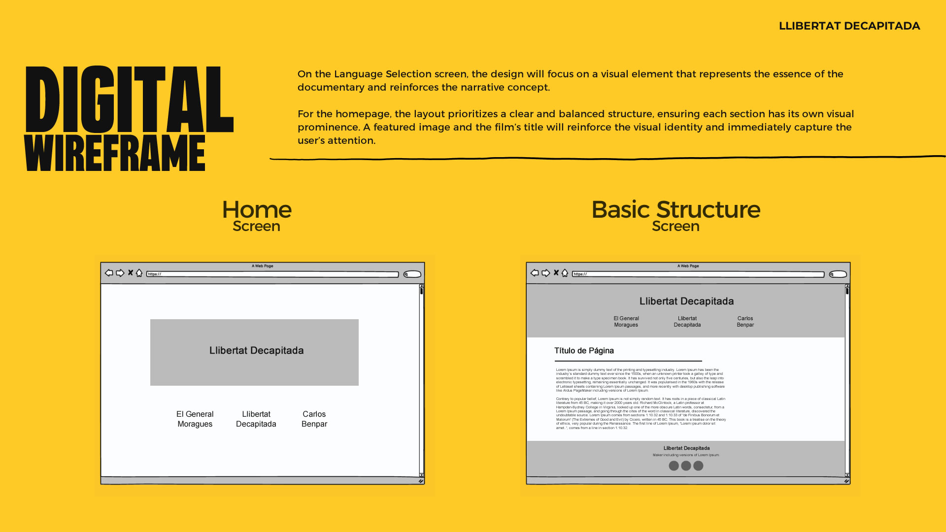
Digital Wireframe
After outlining the site’s foundation on paper, the sketches were digitized to define each screen in more detail and move toward a low-fidelity prototype. This allowed for early usability testing and initial design adjustments.
Low-Fidelity Prototype
Once the design of all screens was completed, they were connected in Figma, creating a navigation flow that simulates the real user experience within the website. This process allowed for the structuring of interactions between the different sections and the preparation of a functional prototype necessary for usability testing, ensuring the user journey was smooth and intuitive before moving on to the validation and refinement phase.
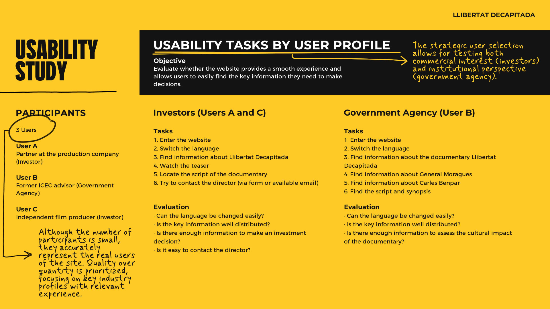
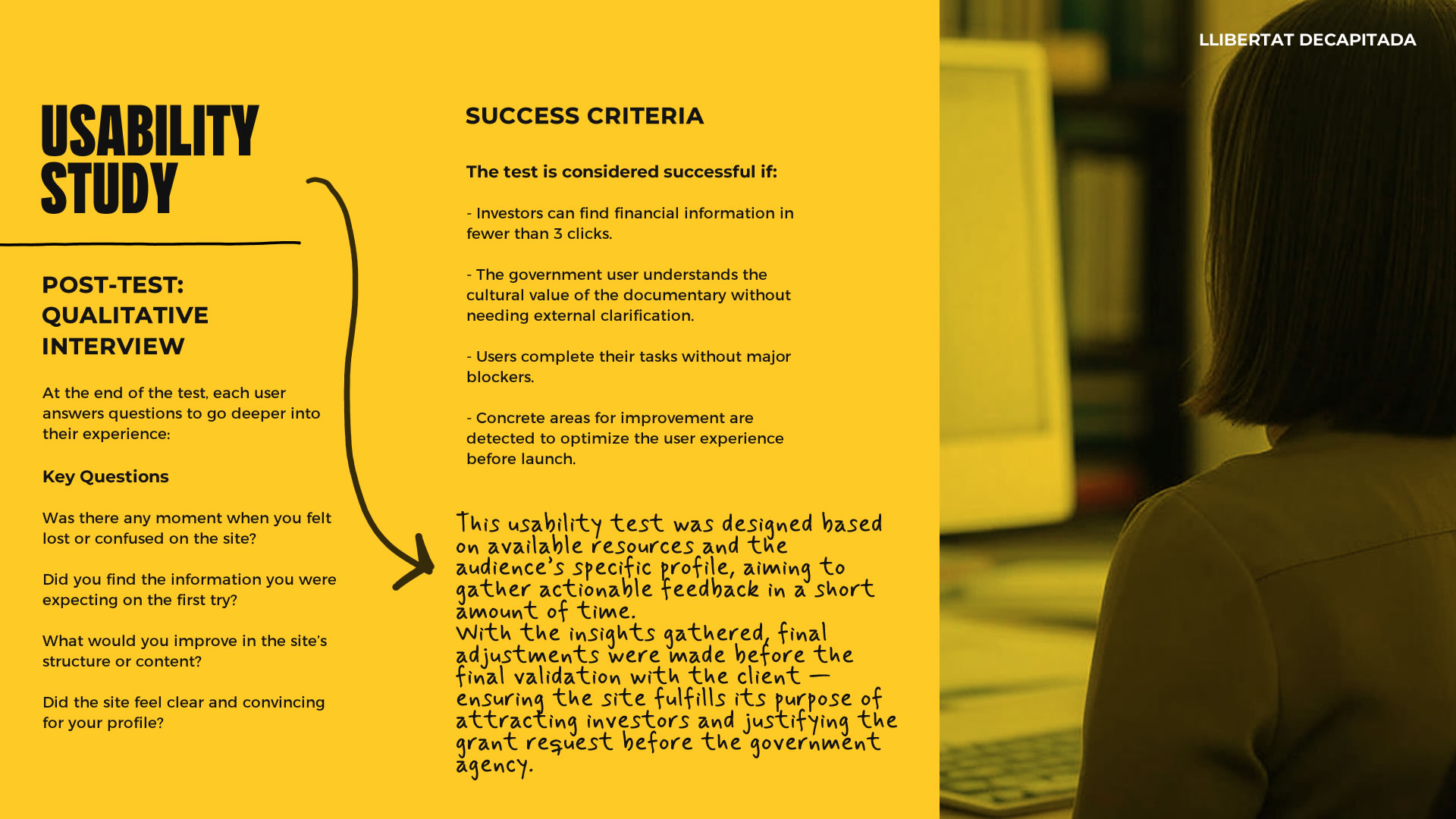
Usability Study
Given the context of the project, an efficient usability test was designed, focused on validating the user experience based on the specific needs of the key user profiles: investors and government agencies.
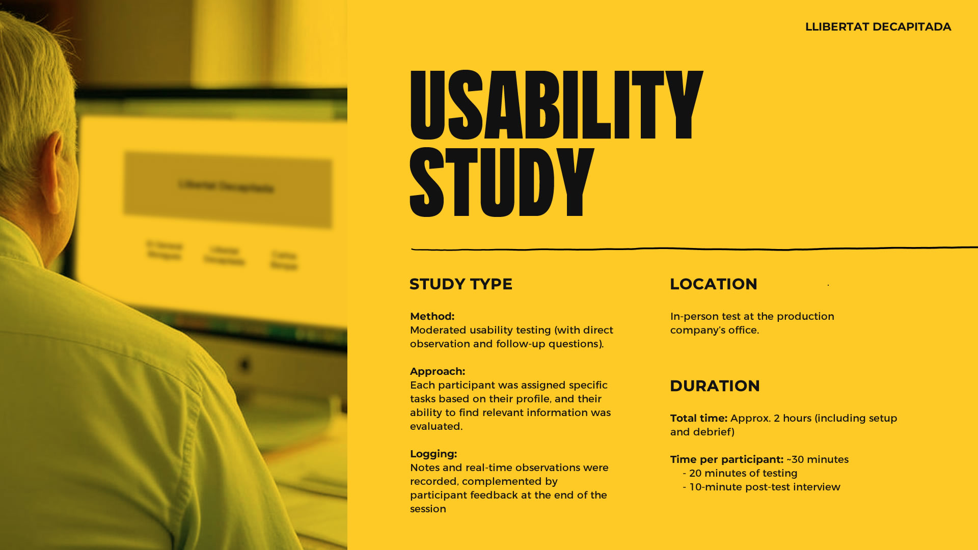
The usability study proved highly valuable — participants with extensive industry experience engaged in a collaborative manner, providing generous and precise feedback that enriched the design process.
Findings & Opportunities for Improvement
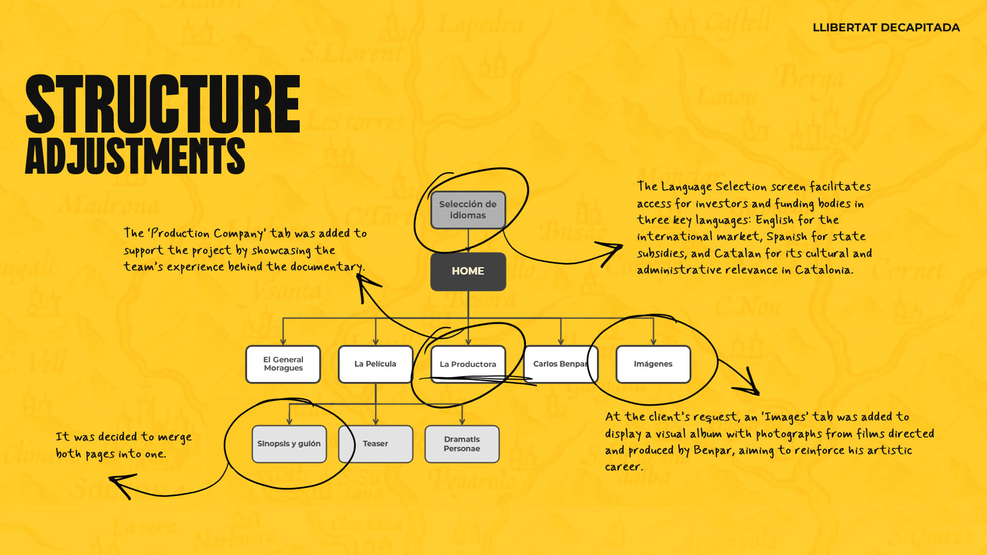
1 · Difficulty Changing Language
- Participants encountered difficulties when trying to change the language, which caused friction in the user experience and disrupted smooth site navigation.
- Implement a Language Selection screen before the homepage, allowing users to choose their language from the start and ensuring a smoother transition.
2 · Lack of Information About the Production Company
- Users noted that, beyond the director’s profile, it would be important to include information about the production company behind the documentary. Showcasing the team's experience and background builds credibility and increases trust in the project.
- Add a “Production Company” tab in the navigation menu to highlight the experience and support of the team behind the film.
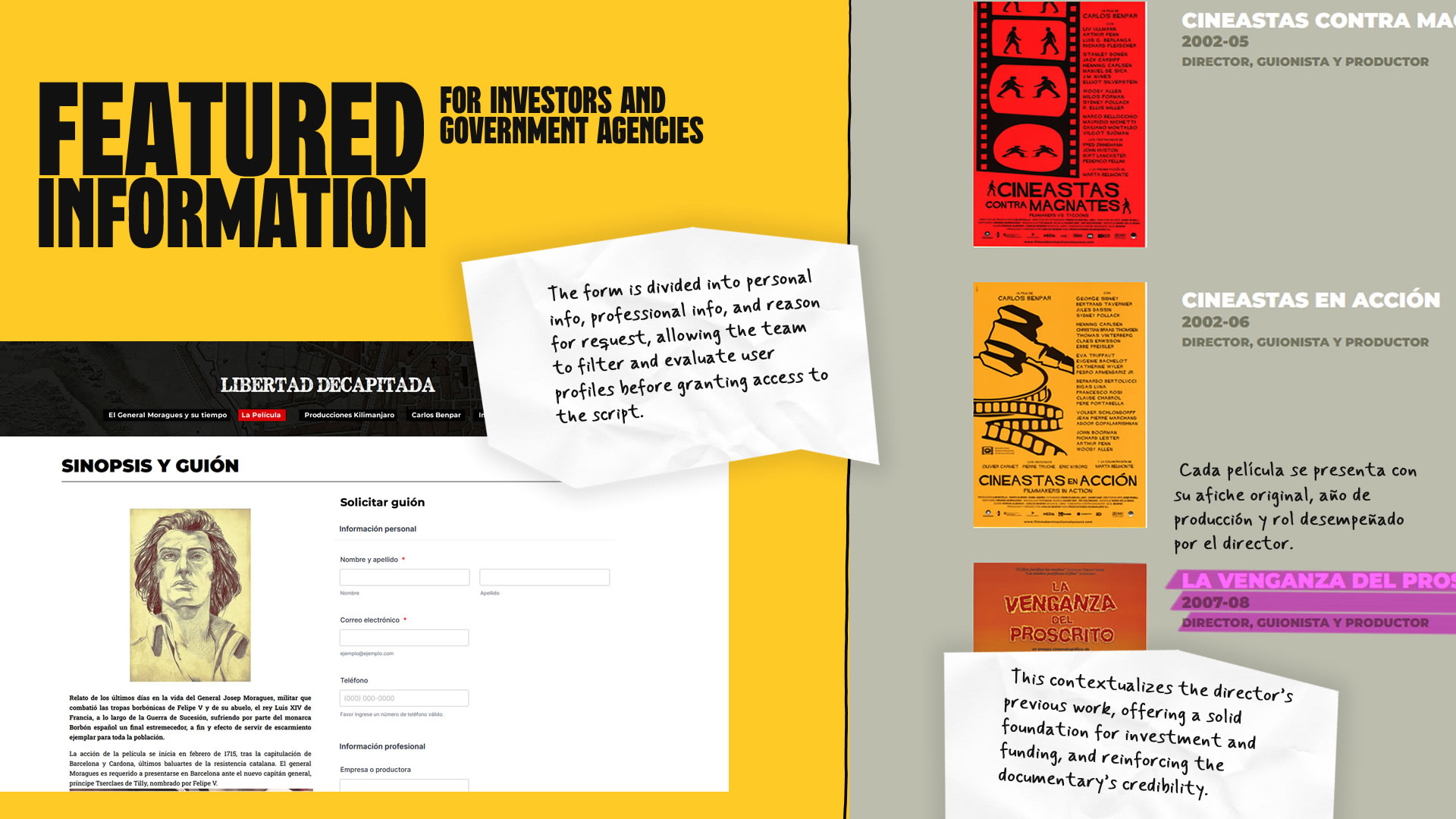
3 · Restructuring of the “Synopsis” and “Screenplay” Sections
- Some users felt that both sections should be integrated into a single page to make content easier to read and understand. Additionally, they mentioned the full screenplay should only be accessible to those with a legitimate interest in evaluating it.
- Merge “Synopsis” and “Screenplay” into one page and implement restricted access to the screenplay — allowing only verified users to view the document.
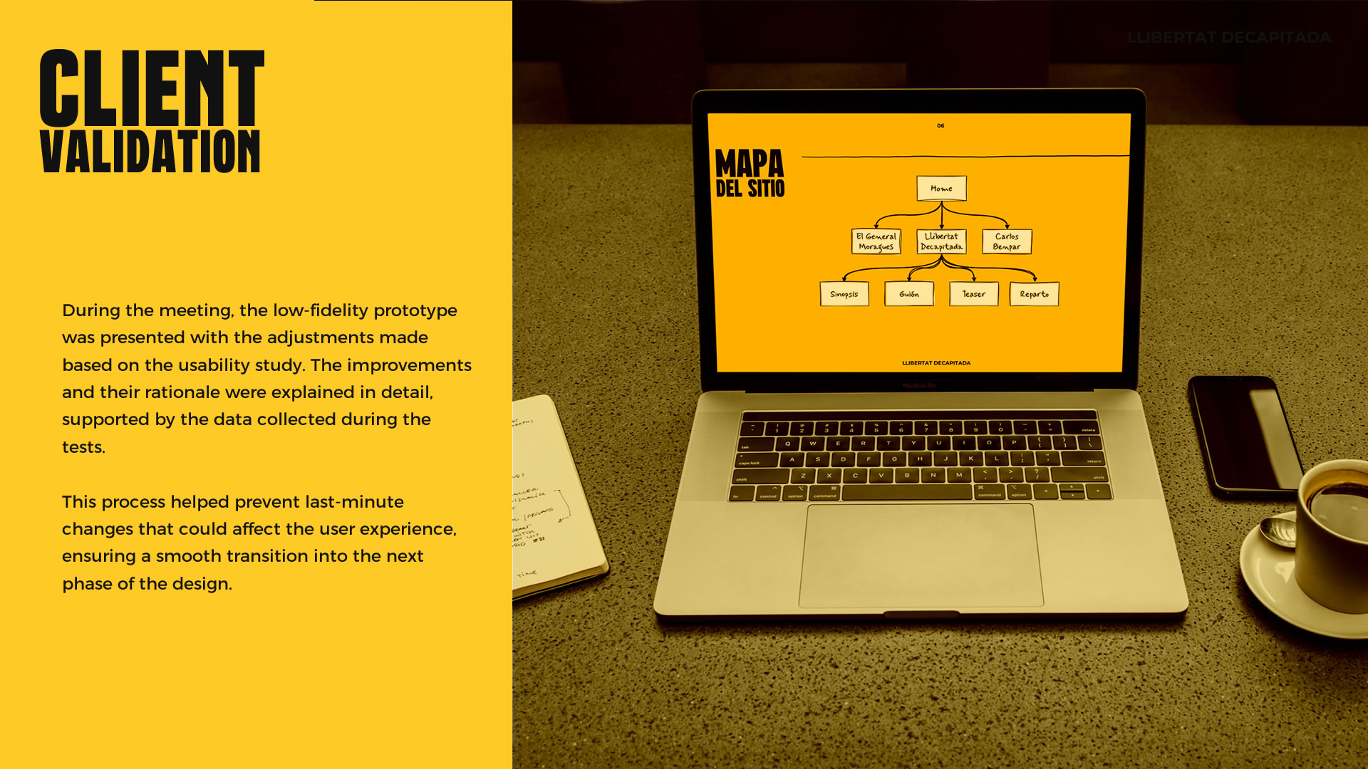
Client Validation of the Structure
Given the client’s deep knowledge of the film industry, we decided to complement the usability testing with a dedicated meeting to validate key findings before moving on to the high-fidelity prototype. This step ensured that the proposed improvements were aligned with the client’s expectations and creative vision, maintaining a balance between usability and editorial control over the website.
The client validated the findings and also requested the addition of a new tab in the navigation menu titled “Images”, designed to showcase a gallery of photographs from his career as a director. This addition aimed to reinforce his experience and further establish his artistic trajectory within the website — adding unique value to the project’s presentation.
Final Design & Testing
Decision to Skip the High-Fidelity Prototype
A strategic decision was made to move directly into development and omit the high-fidelity prototyping phase, based on several factors aimed at optimizing project time and resources.
First, the website’s structure had already been clearly defined and validated. The client approved the low-fidelity prototype and made the necessary adjustments, with no major changes anticipated in layout or content hierarchy. Additionally, the website serves a primarily informational purpose, with a straightforward structure that did not require visual simulation before development.
Finally, since both the design and development were under my responsibility, moving directly into code enabled a more efficient implementation process by skipping unnecessary intermediate steps. Before beginning development, the site’s structure and visual direction were agreed upon with the client, ensuring full alignment with expectations and requirements.
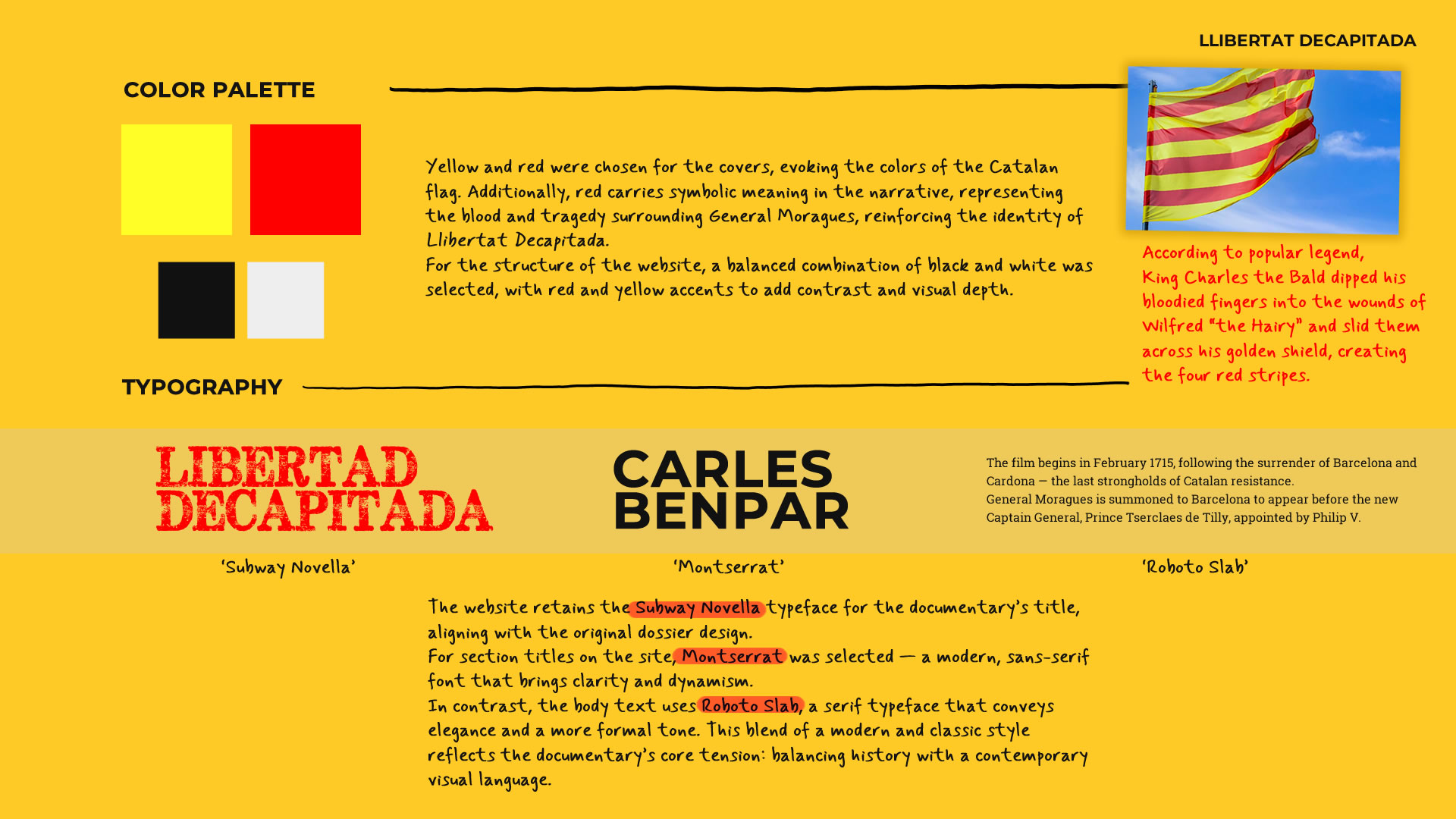
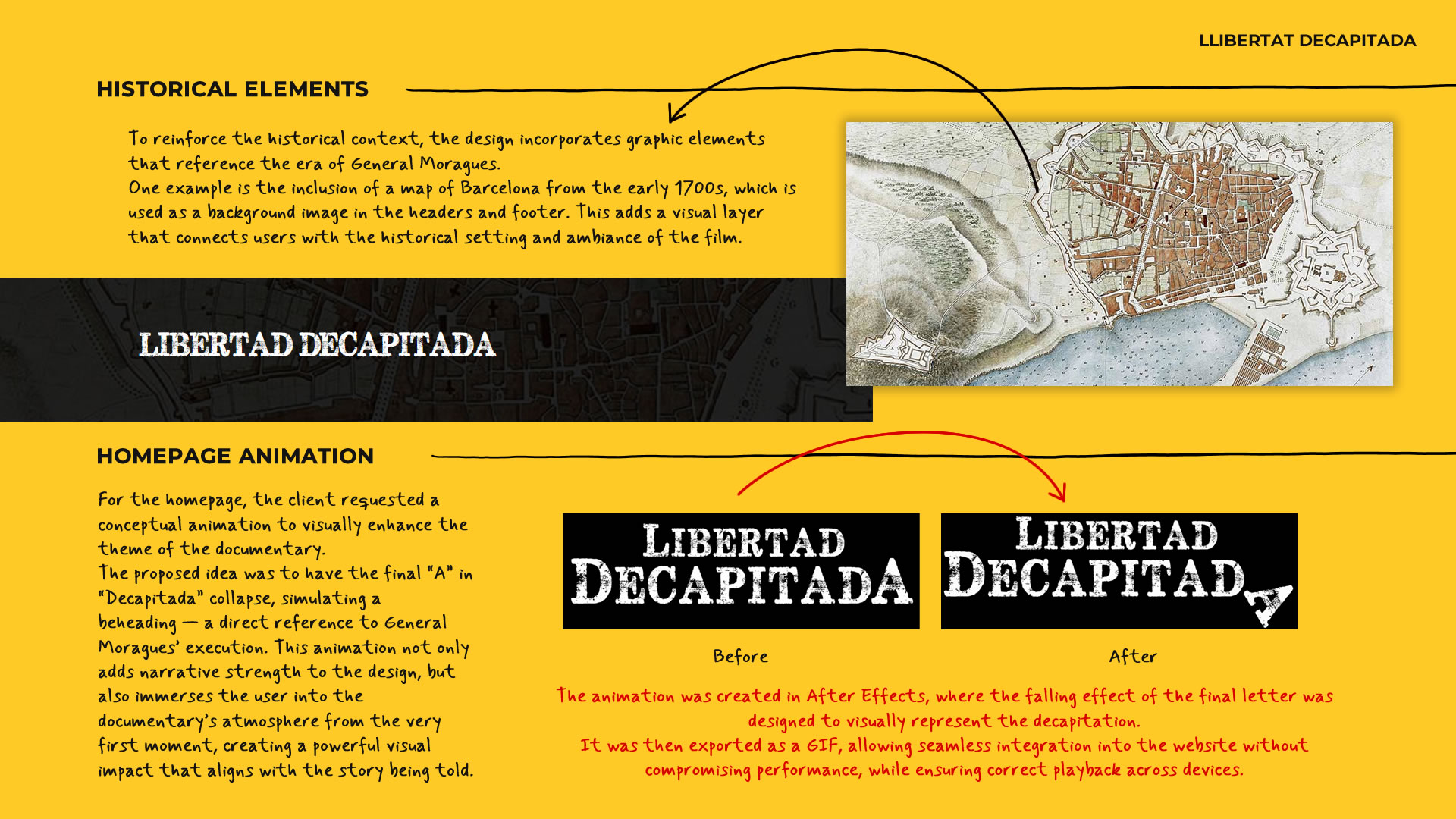
Visual Design
The site’s visual development was based on the graphic identity previously established by Carles Benpar and his team for the documentary. To ensure aesthetic and conceptual consistency, we held several meetings with the client and design collaborators, where we defined key visual guidelines for adapting those elements to a digital environment.
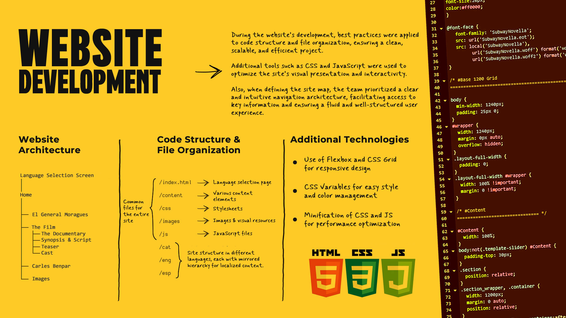
Website Development
The website was fully developed using HTML, CSS, and JavaScript, ensuring a clear semantic structure, flexible layout, and a smooth user experience. Accessibility was prioritized, with compatibility for screen readers and compliance with web standards. The site was also optimized for fast loading times across various devices and network conditions.
Clean, modular code was implemented to support scalability and future updates — ensuring long-term maintainability and performance.
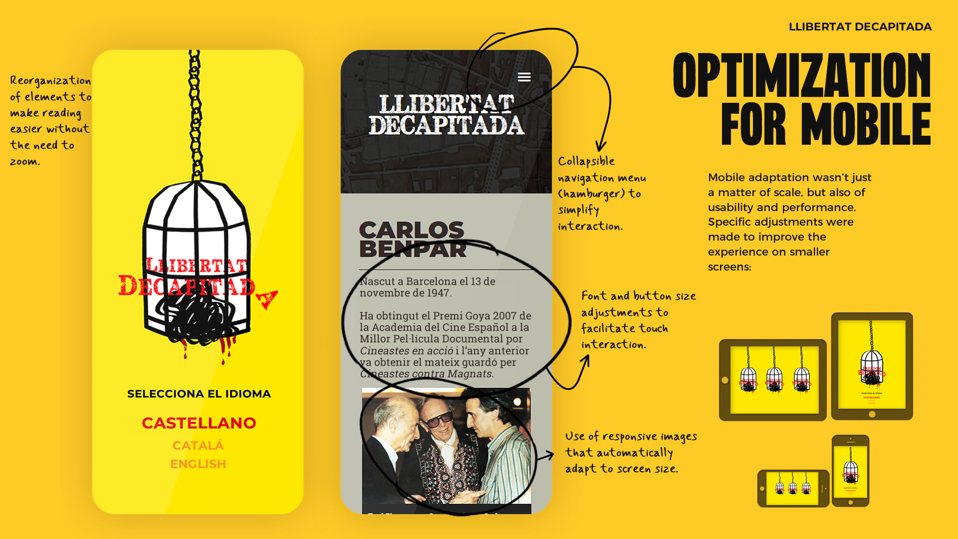
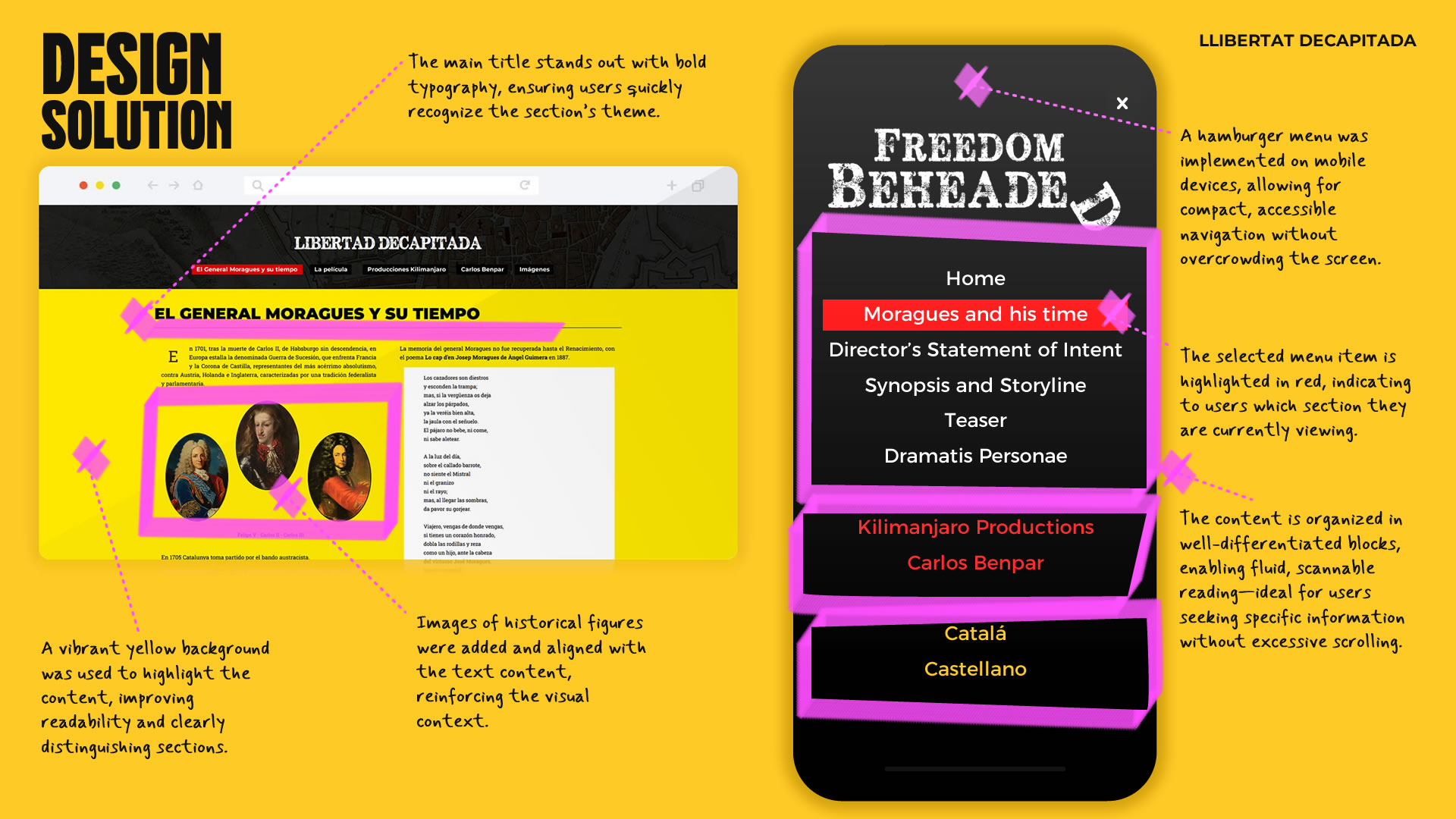
Mobile Optimization
Since our target audience — investors and government institutions — primarily review content on desktop devices, the design and development process focused first on creating a clear, professional layout for large screens. However, to ensure broader accessibility and compatibility, the site was also built with a fully responsive design, optimized for mobile and tablet devices.
Usability & Performance Adaptation
Mobile optimization went beyond scaling — it focused on usability and performance. Specific adjustments were made to enhance the experience on smaller screens:
- Layout refinements
- Loading speed and performance improvements
- Enhanced mobile accessibility
Validation Testing
To ensure the website met the expected communication and navigation goals, a final validation phase was conducted to assess the adjustments made following the initial usability testing.
Due to limited team and resources, a mixed-method approach was used, combining participants from the original usability test with a new user. This strategy helped confirm that the improvements addressed previously identified issues while offering fresh insight from someone navigating the site for the first time.
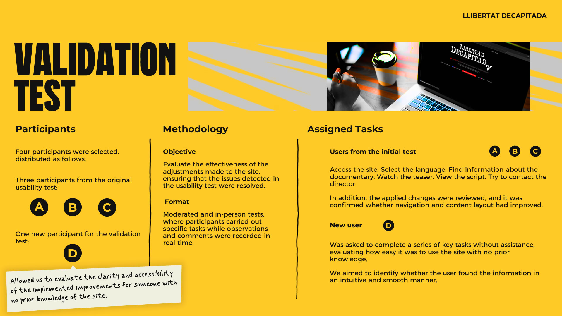
Final Adjustments
The validation tests confirmed that the implemented changes improved site navigation and made key content more accessible for both user groups. The user experience was smooth across desktop and mobile, with no significant usability or accessibility issues reported by new users.
Minor interface adjustments were made — including line-height tweaks, margin refinements, and resizing certain images — to ensure a more balanced and readable design.
During the final client validation meeting, some updates to section names were requested. "El General Moragues" was renamed to "General Moragues and His Time", and "Llibertat Decapitada" became "The Film". Additionally, a new page titled "Director’s Statement" was added, where the filmmaker shares his artistic vision and motivations behind the documentary, offering deeper insight into the project.
Implemented Solution
Clean and Structured Design
From the very beginning, one of the main goals was to deliver a UX/UI design that was clear, functional, and aligned with the target audience’s needs. Since the primary users — investors and government institutions — typically access content in professional environments, we prioritized a clean visual structure with clear hierarchy and an intuitive user experience.
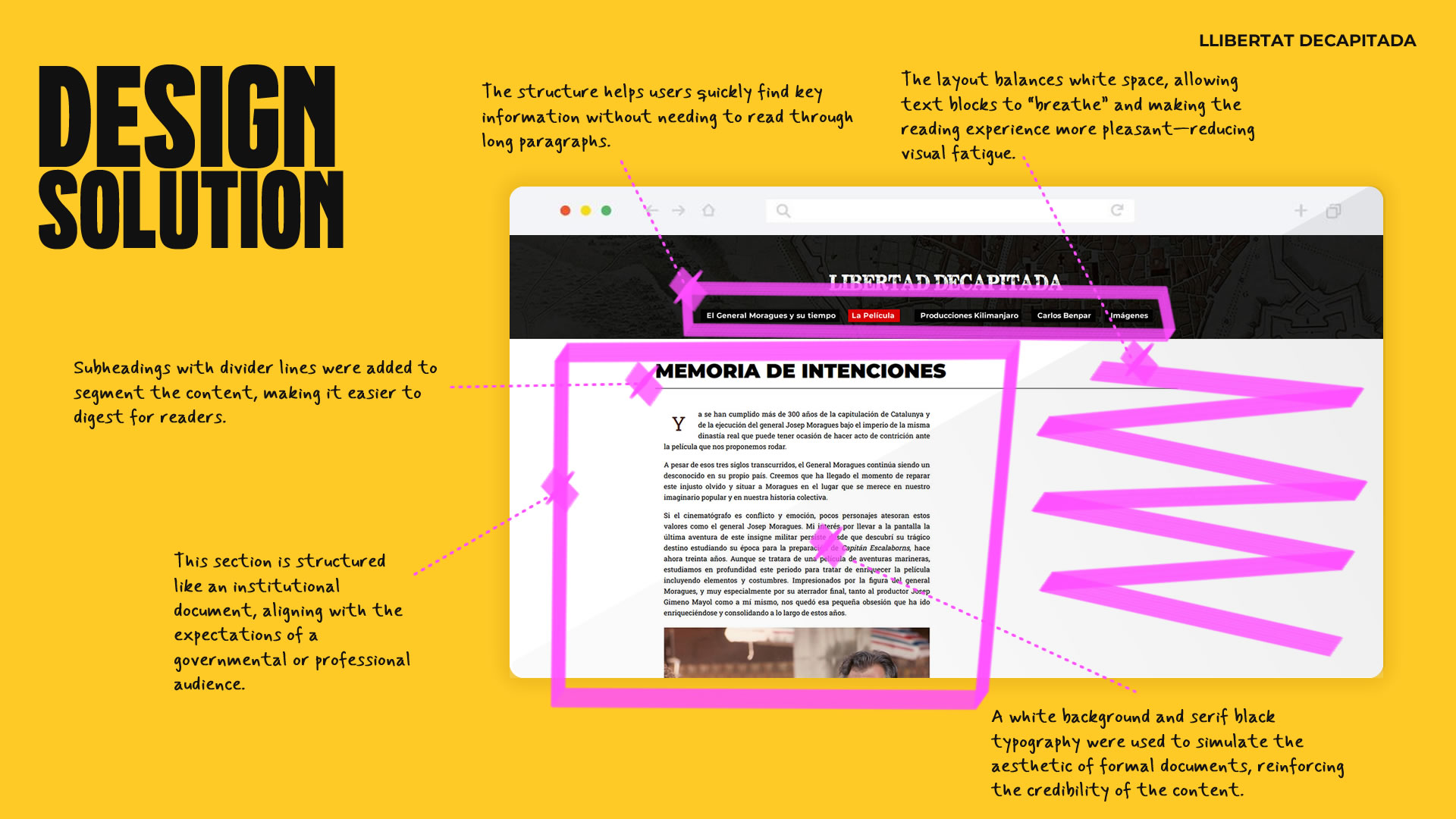
Key Information for Investors and Government Institutions
The website was designed to provide investors and government institutions with quick and structured access to key information about the project. Sections such as the synopsis, screenplay, teaser, and the director’s background were strategically organized to communicate the documentary’s historical and cultural relevance, as well as its viability as a cinematic production.
For investors, the focus was on presenting the project in a clear and compelling way, allowing them to quickly assess the film’s potential and access relevant material such as the screenplay. For government agencies, the site emphasized the documentary’s cultural and historical significance, highlighting the director’s professional trajectory as a strong asset to support funding applications.
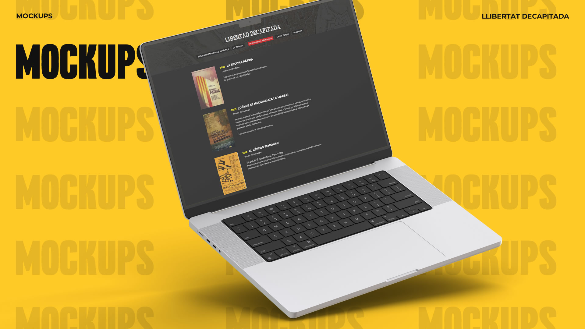
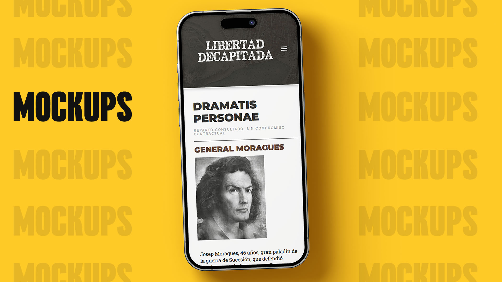
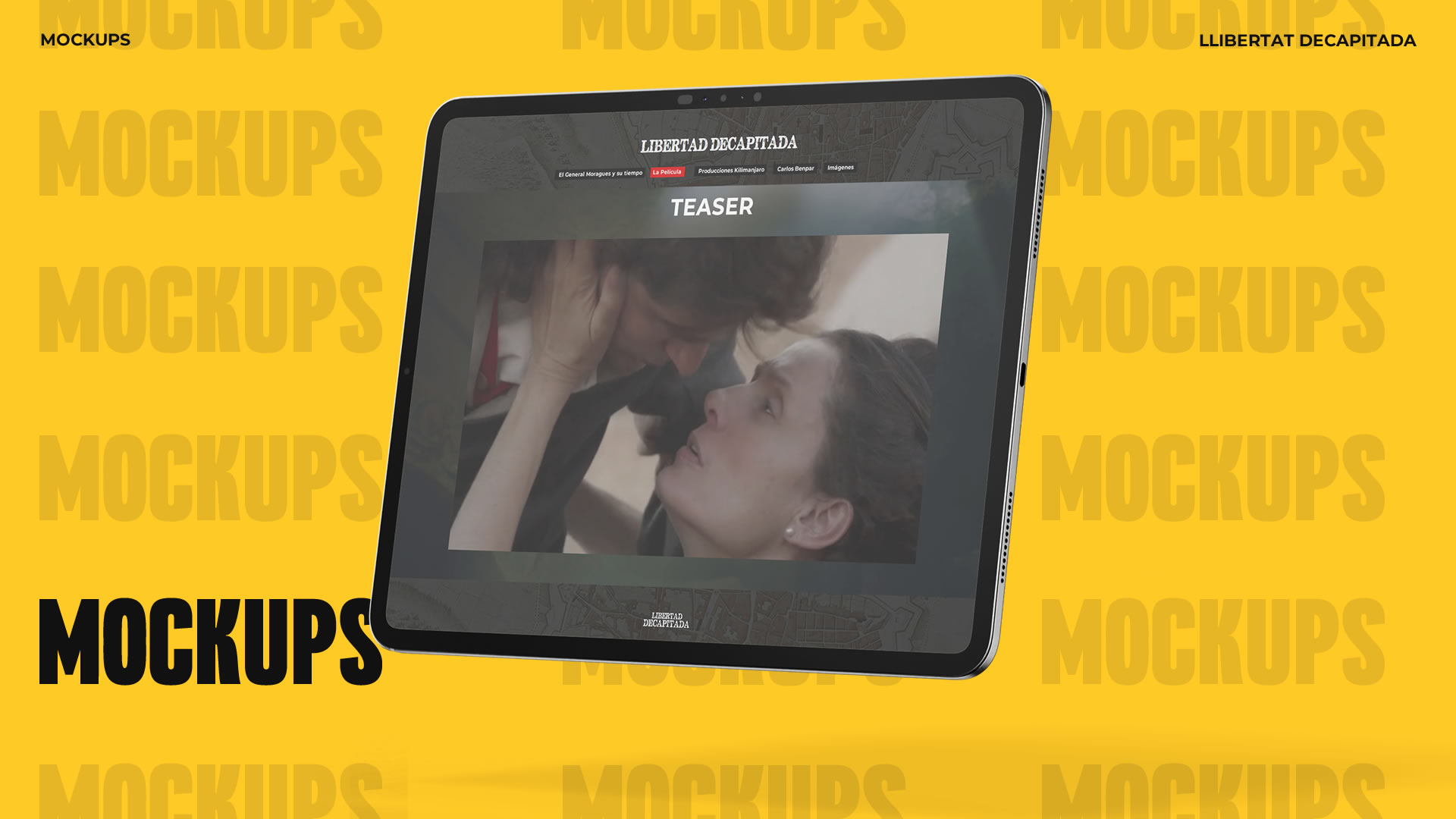
Mockups
Key Takeaways & Reflection
Next Steps
Since the website was conceived as a static informational platform, development concluded once it was deployed to the server and confirmed to be working properly. No future iterations were planned, and the client assumed full control of the site.
After the launch, a few minor updates were made at the client’s request — including small grammar fixes, image repositions, and content refinements. These were handled promptly to ensure the website aligned closely with the director’s vision and effectively served its purpose as a presentation tool for investors and cultural institutions.
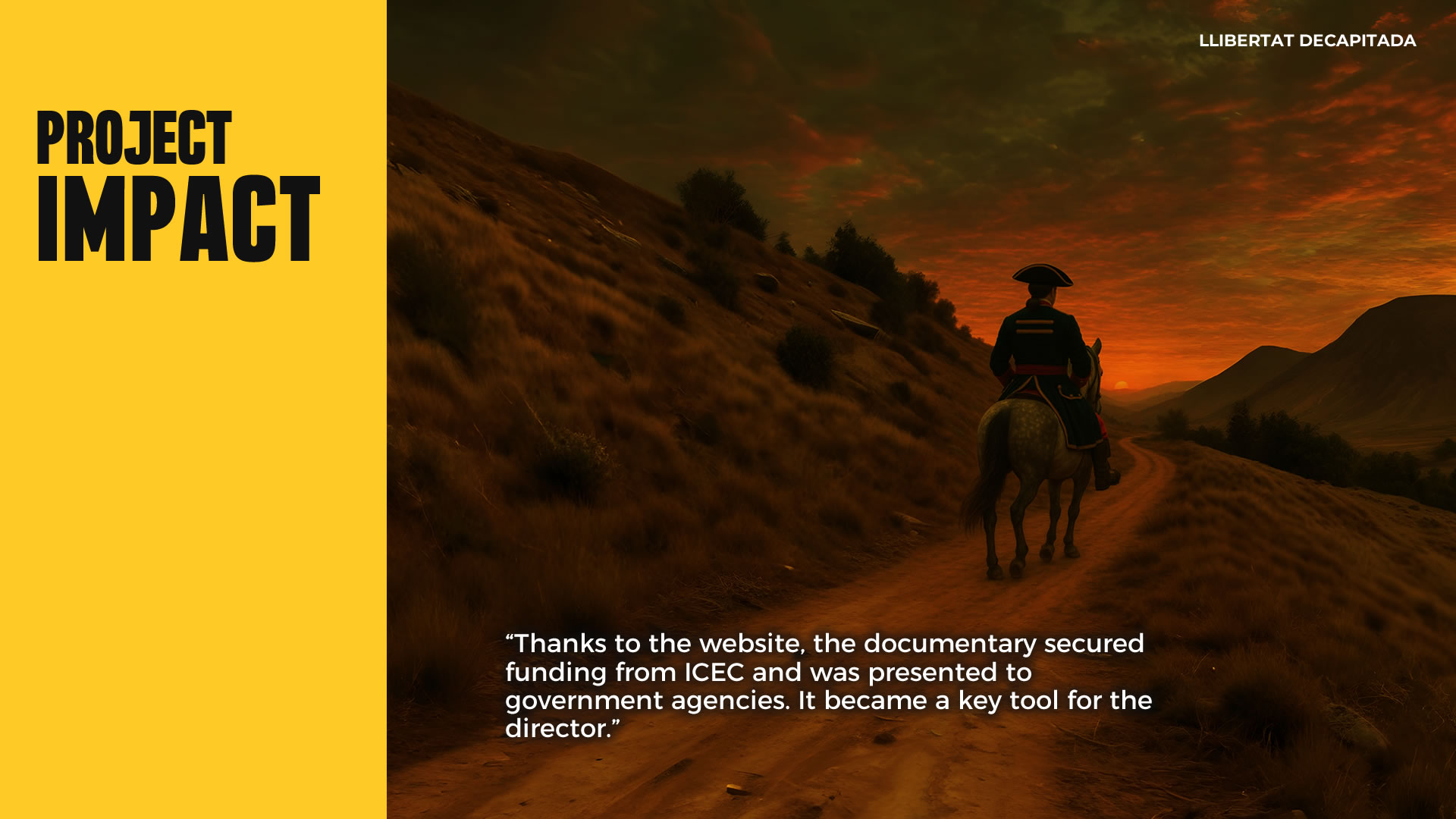
Project Impact
The website successfully fulfilled its purpose — serving as a key tool for presenting the documentary to investors and public institutions. The client was highly satisfied and used it as a digital portfolio to showcase his professional background and promote the project.
Thanks to this site, the project secured financial support from the Institut Català de les Empreses Culturals (ICEC). This highlighted the positive impact of a strategic digital approach on the institutional communication of the documentary.
Although the production was paused due to the pandemic, the website remained active for several years, functioning as an essential part of the director’s public identity and creative work.
This project taught me how to balance the client’s vision with user needs, integrating strategic UX decisions without compromising the visual identity. Collaborating with a director with a strong aesthetic perspective helped me strengthen my argumentation and negotiation skills, ensuring an intuitive navigation while preserving the documentary’s character.
Time management and multimedia resource optimization were also key challenges. I implemented an efficient workflow to process images without sacrificing quality, and maintained clear communication to handle delays in content delivery.
Ultimately, I reinforced the belief that successful design is not just visually appealing — it must be functional, strategic, and adaptable to both client and user needs.
More Projects