A feature to create tailor-made travel routes
Odiseo Buenviaje
Travel planning can be overwhelming when looking for personalized experiences. This UX/UI case study explores how a digital platform can help users create dynamic itineraries based on their specific interests.
Through Design Thinking and interactive prototyping, I designed a feature that allows travelers to generate custom routes using Google Maps, filtered by preferences such as cultural tourism, gastronomy, or nature.
Problem
Users of the Odiseo Buenviaje app faced difficulties when planning personalized travel routes, as the platform lacked flexible options and recommendations tailored to their interests and preferences, limiting the overall travel experience.
Solution
We designed and implemented a personalized route feature that allows users to select specific interests, integrate temporary and permanent events, and plan their trips through an interactive calendar, offering a more intuitive and customized experience.
Role
UX/UI Designer
Duration
2-month project.
Understanding the User

Research
Objective
To deeply understand the app’s users in order to identify their needs and pain points when planning personalized travel routes.
Research Methodology
In-depth interviews. Observations at travel agencies.
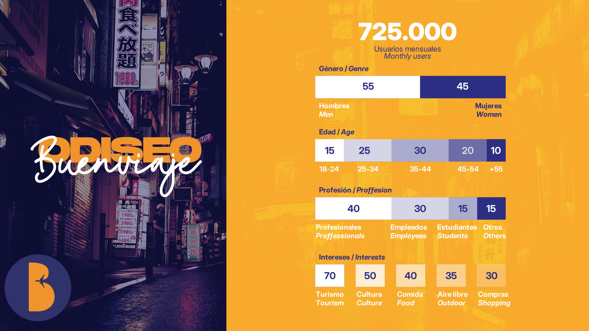
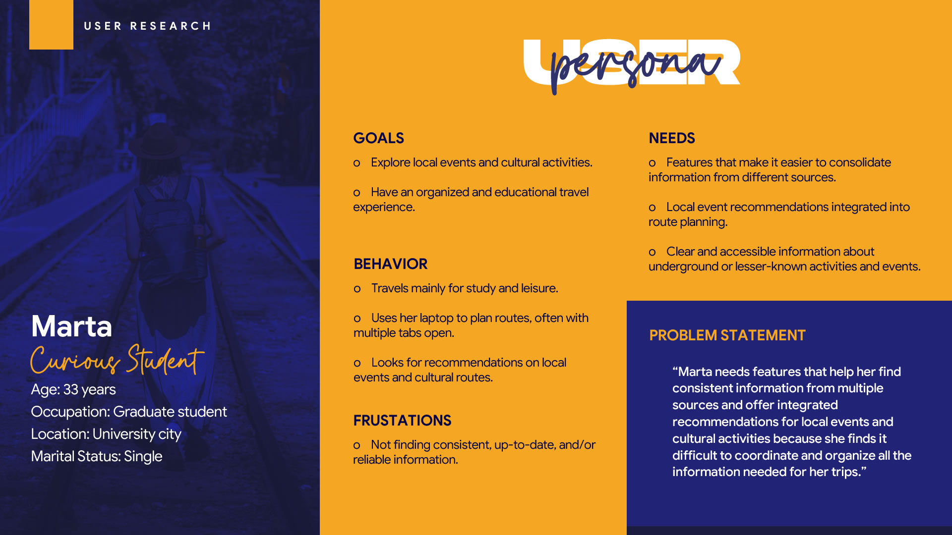
Demographic Profile
Ages 25–50. Mixed genders. Residents of urban areas with access to multiple transportation options. Professionals and students who frequently travel for both work and leisure. Interests include technology, travel, cultural exploration, and outdoor activities.
Recruitment
12 participants selected from the Odiseo Buenviaje database. Recruited via app ads, social media, and email.
Defining the Problem
Synthesis
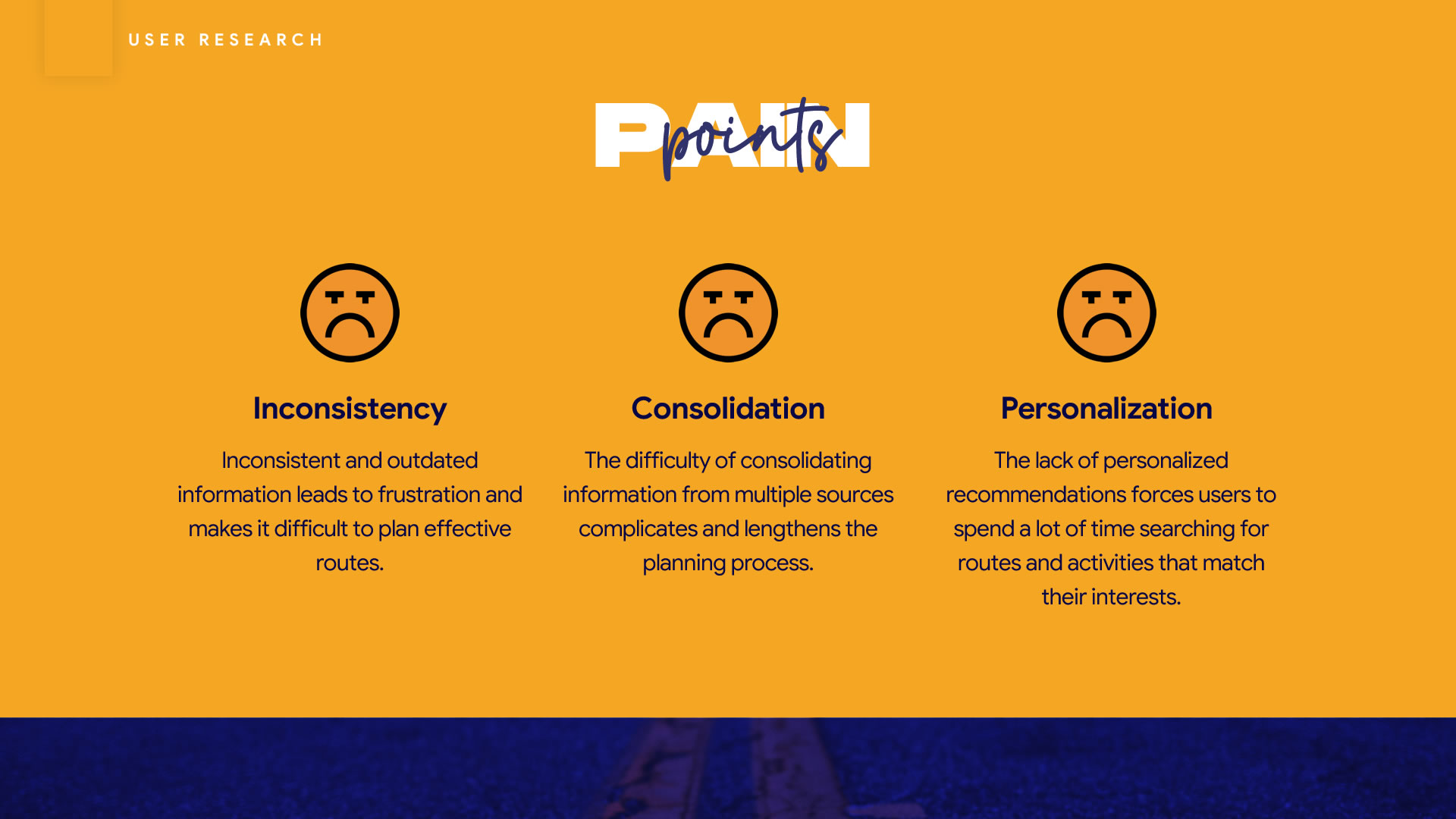
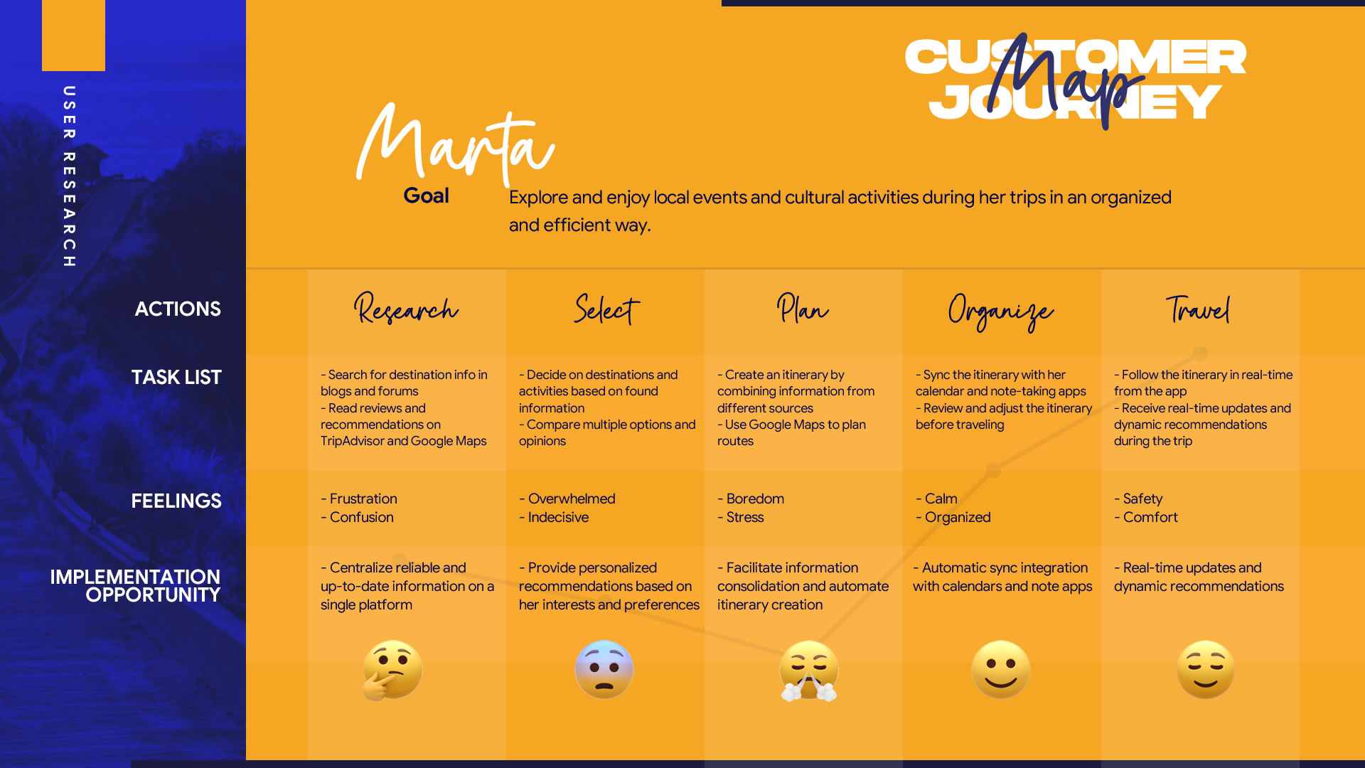
Users need to consult multiple sources to create a travel route. Much of the information is outdated. The data is unreliable. Routes are poorly personalized.
Ideas for a Solution
Objective
Based on the data obtained during the research phase, our objective is to generate ideas for the personalized routes feature in the Odiseo Buenviaje app, using Google Maps as the foundation and focusing on various predefined themes.
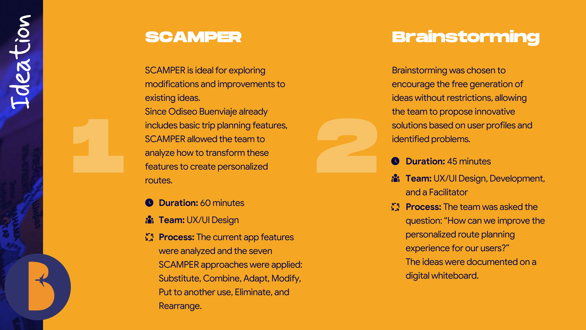
Key Points
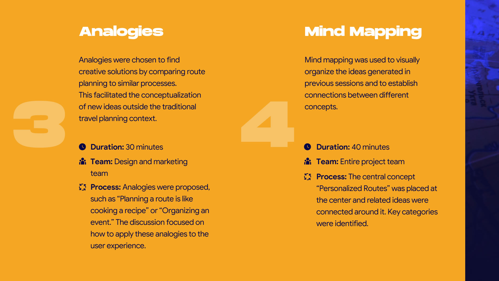
During the ideation sessions, the three pain points identified during the research and synthesis phases (Inconsistency, Consolidation, and Personalization) were strategically addressed in each applied technique.
Information Inconsistency
- We proposed incorporating an automatic route update system that provides real-time data (from verified APIs like Google Maps, weather, and traffic) about schedule changes or place closures.
- A content validation system was suggested, allowing users and local experts to update and verify information about recommended places.
- We discussed the idea of including real-time notifications about relevant changes along the route.
Difficulty Consolidating Information
- We proposed merging data from multiple platforms (TripAdvisor, travel blogs, Google Maps) into a single interface to avoid switching between apps.
- We suggested eliminating the need for external apps by integrating recommendations and booking features directly into Odiseo Buenviaje.
- We identified the need for a unified platform to combine reservations, maps, and recommendations.
Lack of Personalization
- We thought about adapting content personalization technologies (like Spotify playlists) to generate travel routes based on previous preferences.
- We discussed organizing route search results based on the user's interests and travel habits.
- We came up with the idea of creating personalized user profiles where interests (gastronomy, culture, adventure) are stored to deliver aligned suggestions.
Design
The next step was to define the flow, making sure the design elements aligned with the key points identified during the ideation sessions, and begin sketching the screens on paper.
User Flow Diagram
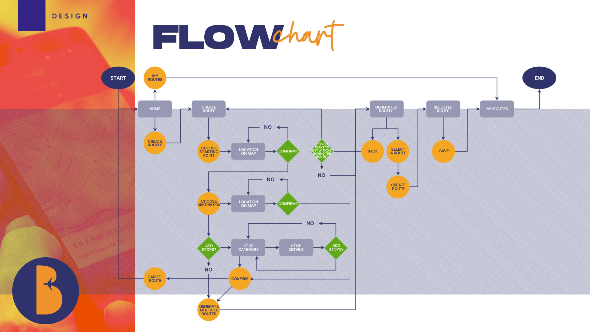
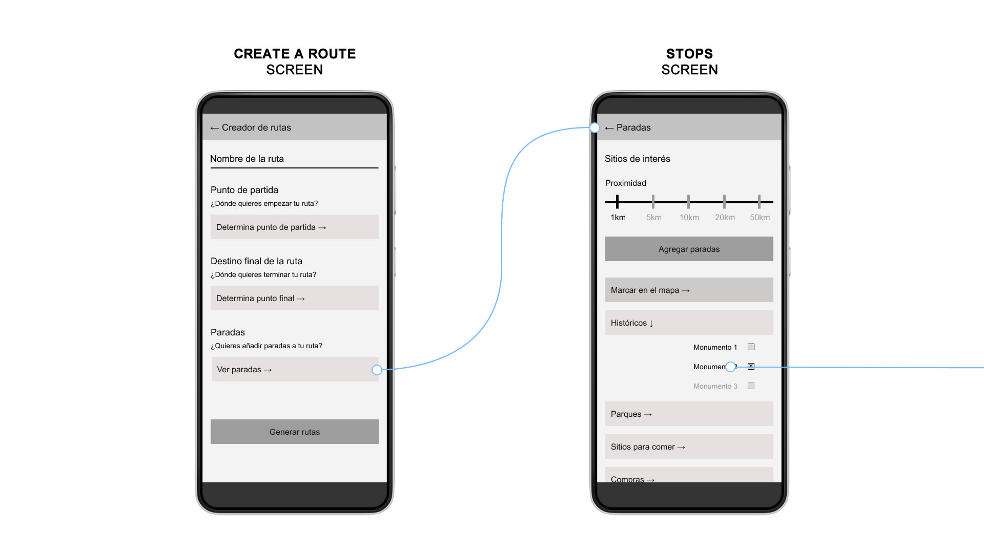
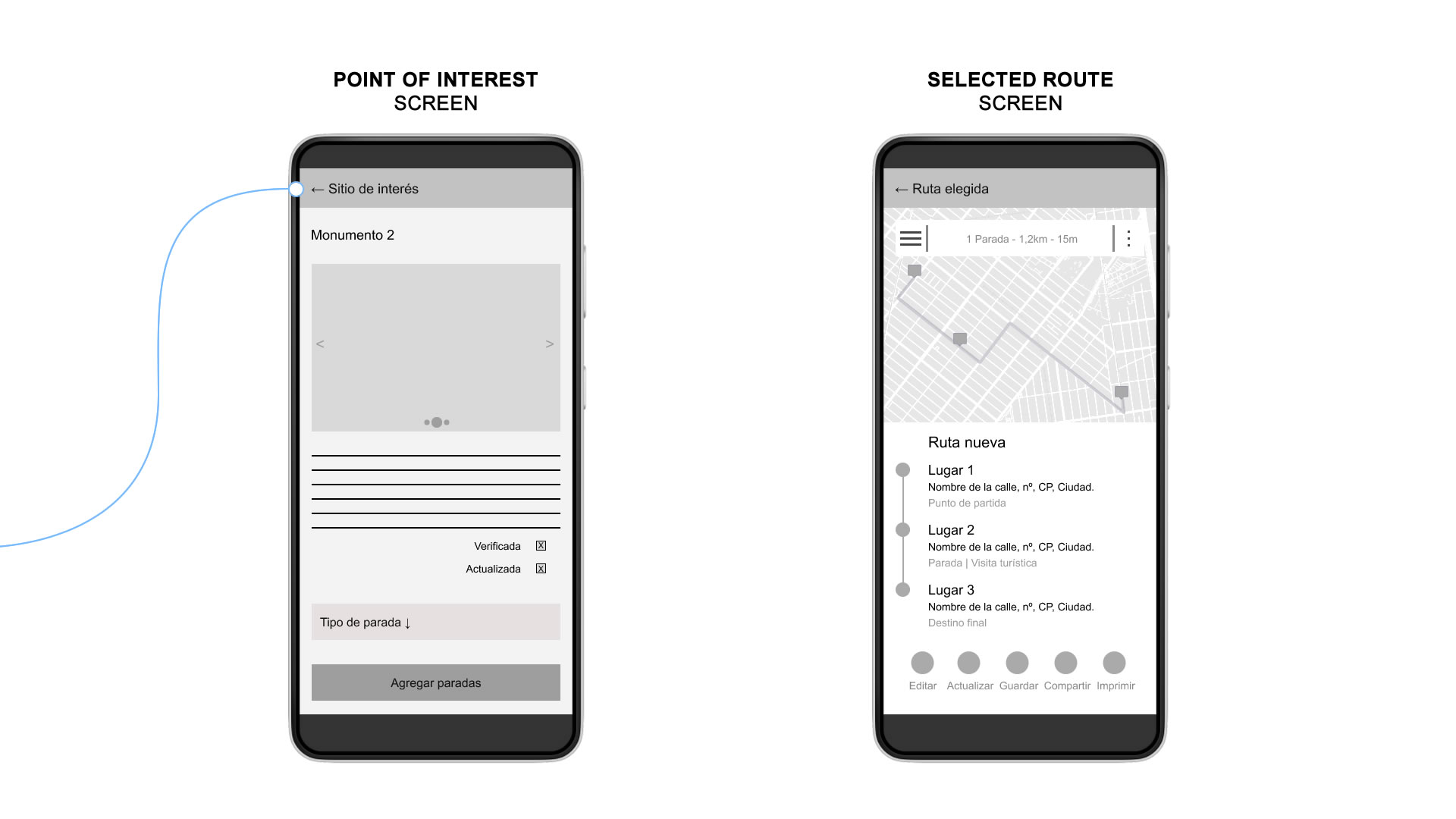
Paper Wireframes
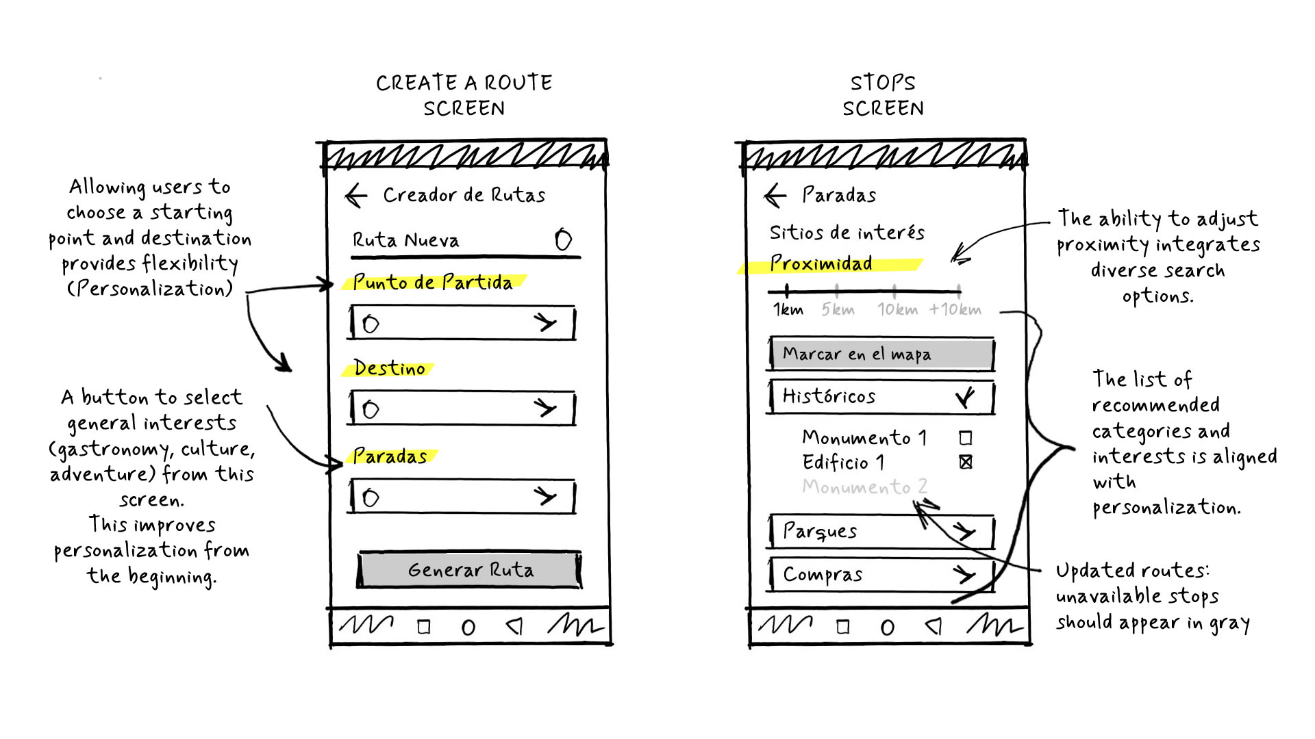
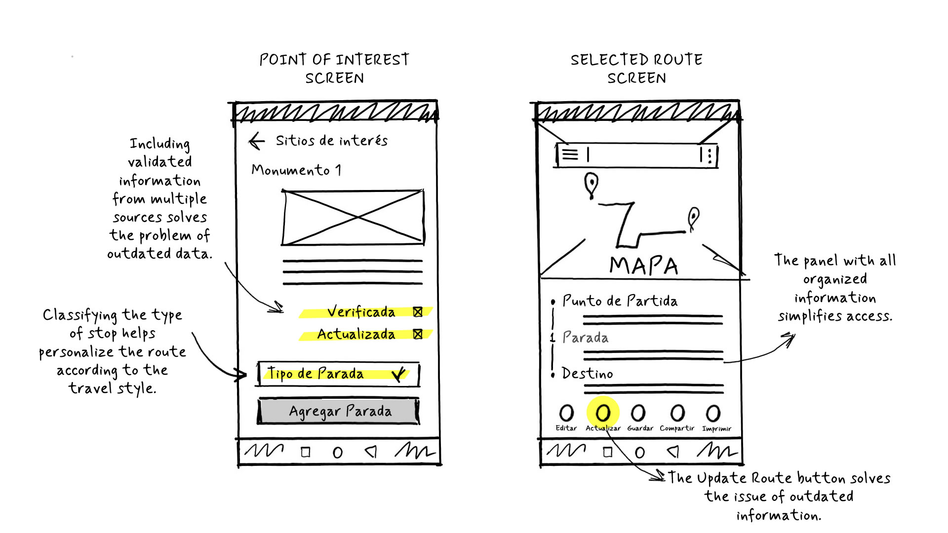
Prototype
Lo-Fi Prototype
Once the user flow diagram was refined and screen coherence ensured, we moved on to studying whether the sketches met the user’s goals and the project requirements. After validating the sketches with the design and development team, I began digitizing them.
Usability Study
In order to identify navigation, comprehension, and user experience issues before moving to high-fidelity stages, we conducted a usability study using our low-fidelity prototypes.
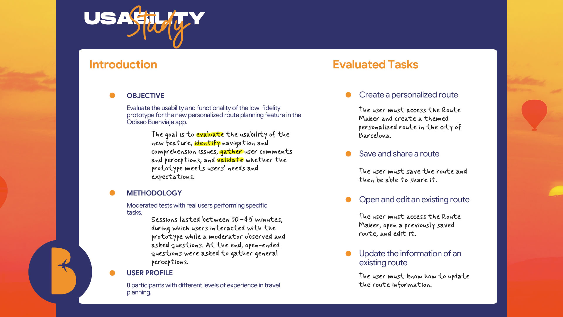
Findings and Opportunities for Improvement
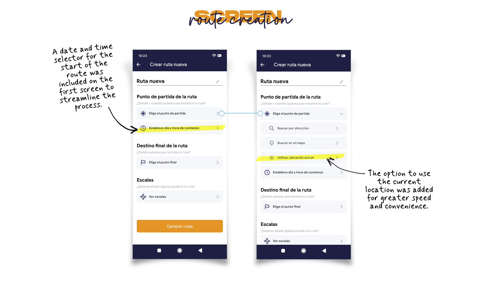
1 · Optimization of the Route Creation Process
- Users felt they could save time if they were allowed to select the travel date from the first "Create Route" screen.
- It was suggested to include an option to use the current location as the starting point, avoiding manual input.
- Include a date selector on the initial route creation screen to streamline planning.
- Add a “Use Current Location” button pre-selected in the origin field for greater speed and convenience.
2 · Improved Information Display and Validation
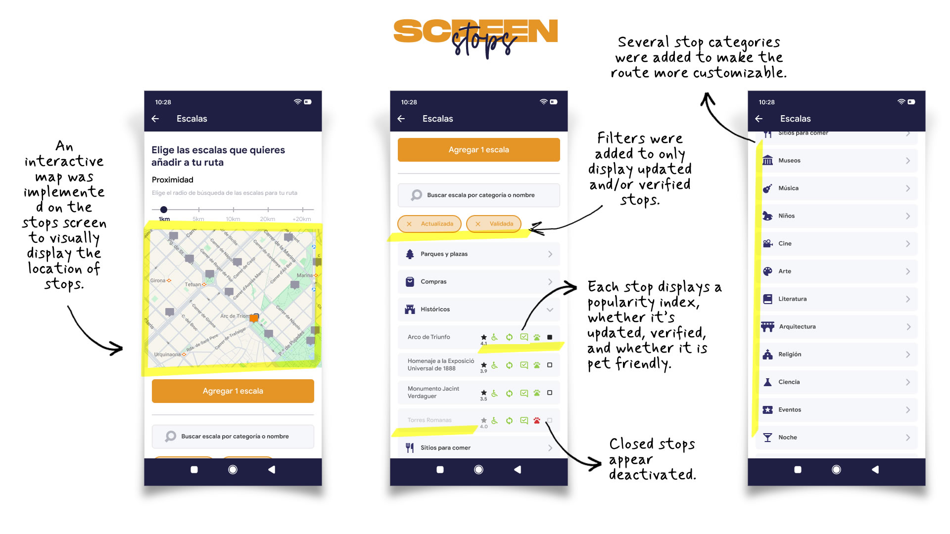
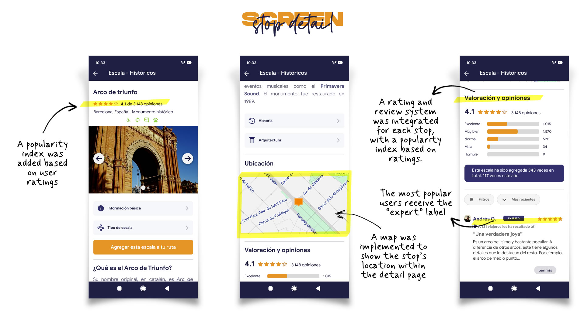
- Lack of an interactive map on the “Stops” and “Stop Details” screens made it hard to visualize exact locations.
- Users wanted to filter stops that were verified or recently updated to ensure reliable info.
- They also suggested adding ratings and user reviews, as well as a reputation system to tag active users as “Experts.”
- Some users proposed showing stop popularity by displaying how many times it has been added.
- Implement an interactive map in the Stops section to visually display locations and allow direct interaction.
- Add filters in the “Stops” tab to show only verified and/or updated stops.
- Incorporate a rating and comment system, plus a user ranking feature (e.g., "Expert" badge based on contributions).
- Display a popularity counter on the stop’s detail screen, showing how many users have added it.
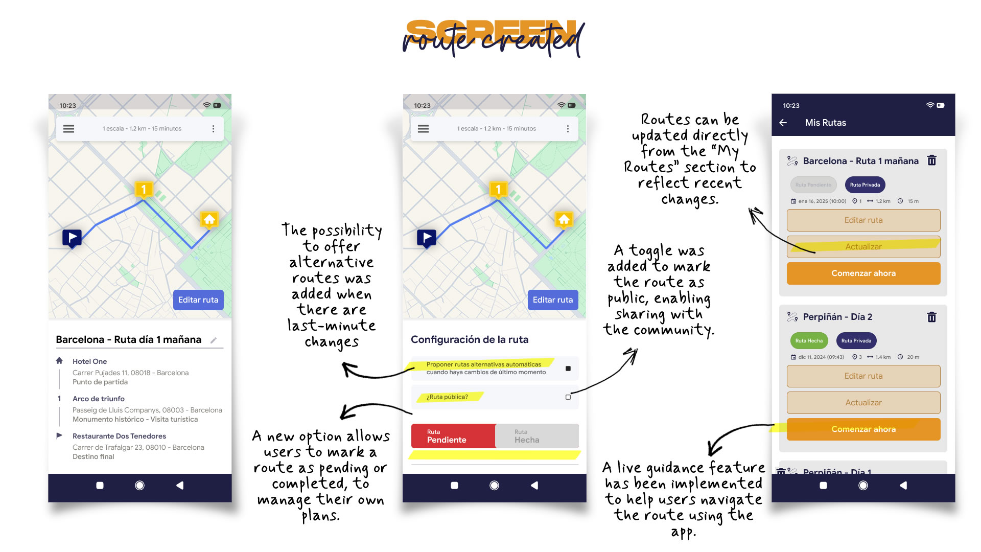
3 · Personalization and Flexibility in Route Management
- It was proposed to add a toggle on the “Created Route” screen to mark whether the route has been completed or is still pending.
- A user recommended adding the option for the app to generate alternative routes in case of unexpected events.
- Users found it helpful to define whether the completed route is public or private, allowing them to share with others or keep it personal.
- Include a toggle on the route screen to mark it as pending or completed.
- Add an option to enable automatic alternative routes in case of last-minute changes (traffic, closures, weather).
- Implement a button to set route visibility as public or private, enabling users to share or keep their routes to themselves.
Hi-Fi Prototype
With the usability study results in hand, it was time to work on the high-fidelity prototype. The client wanted the "Route Maker" feature to maintain the same visual style as the Odiseo Buenviaje app, so we kept the existing brand aesthetic.
Test
Validation Usability Testing
In order to validate the improvements made to the personalized routes feature before launch, a Validation Test was conducted to confirm that the applied changes resolved the previously identified issues and that the user experience was satisfying.
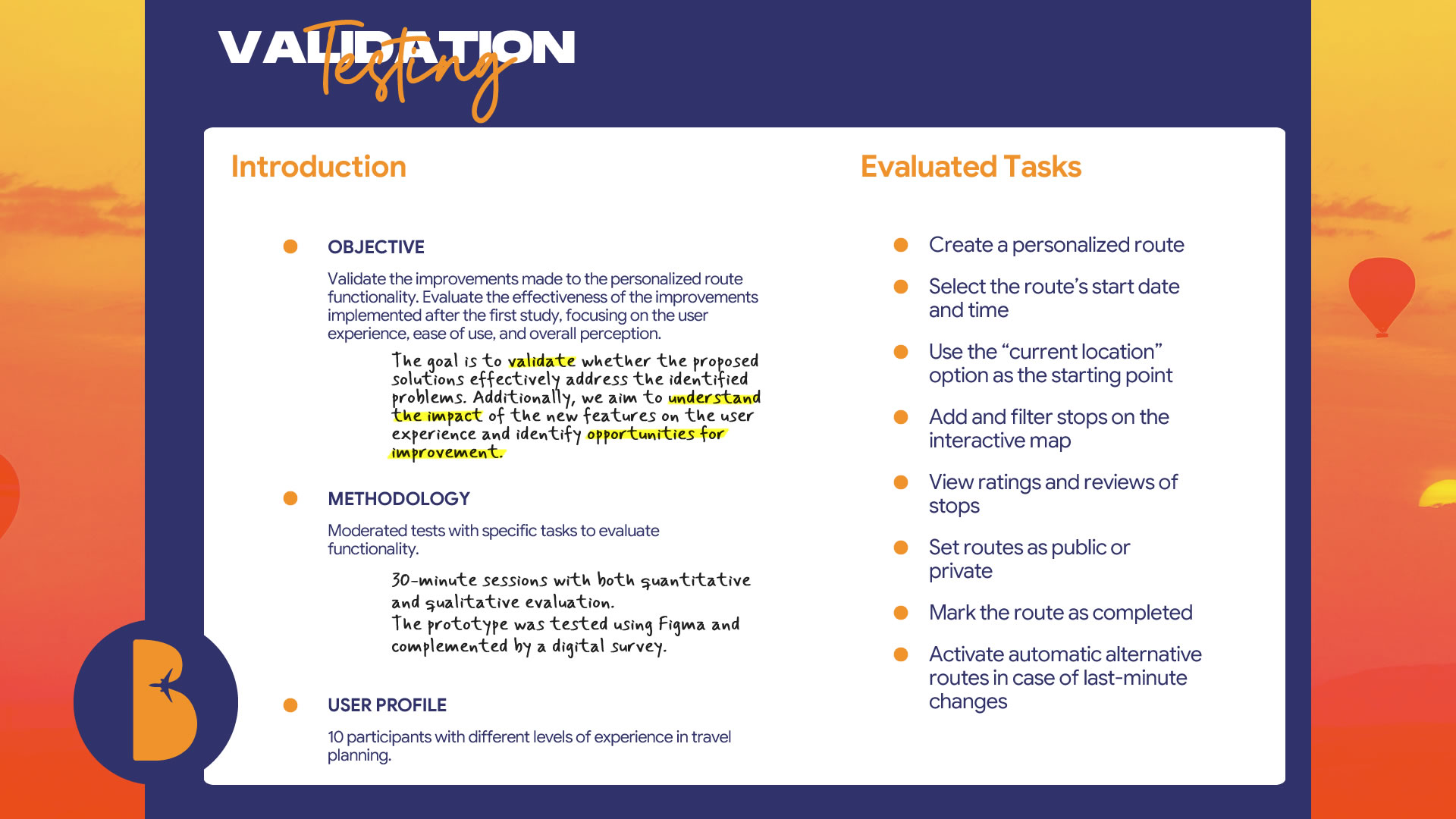
Impact of Implemented Improvements
The usability study demonstrated that the implemented improvements significantly optimized the user experience, especially regarding the smoothness of route creation and interaction with new features. However, some specific areas for improvement were identified. Implementing these adjustments will ensure an even smoother and more satisfying experience.
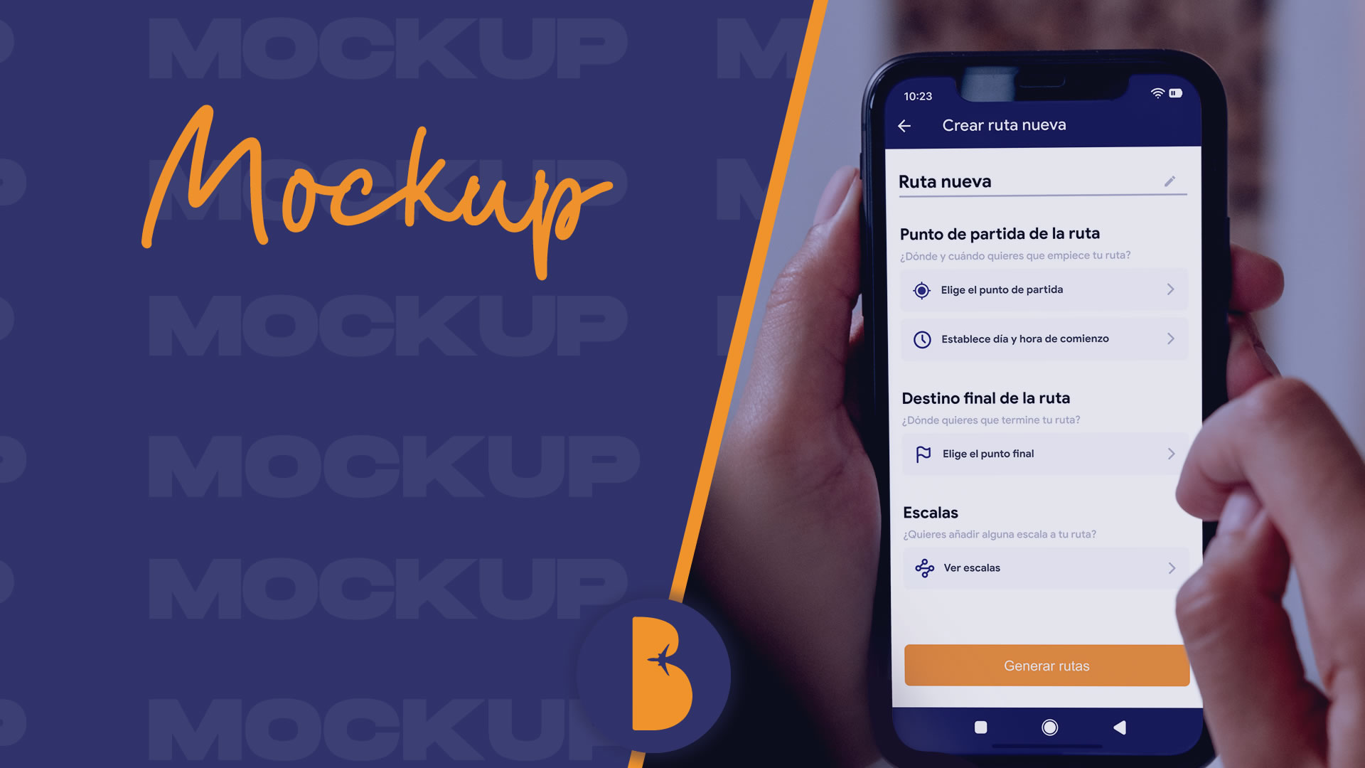
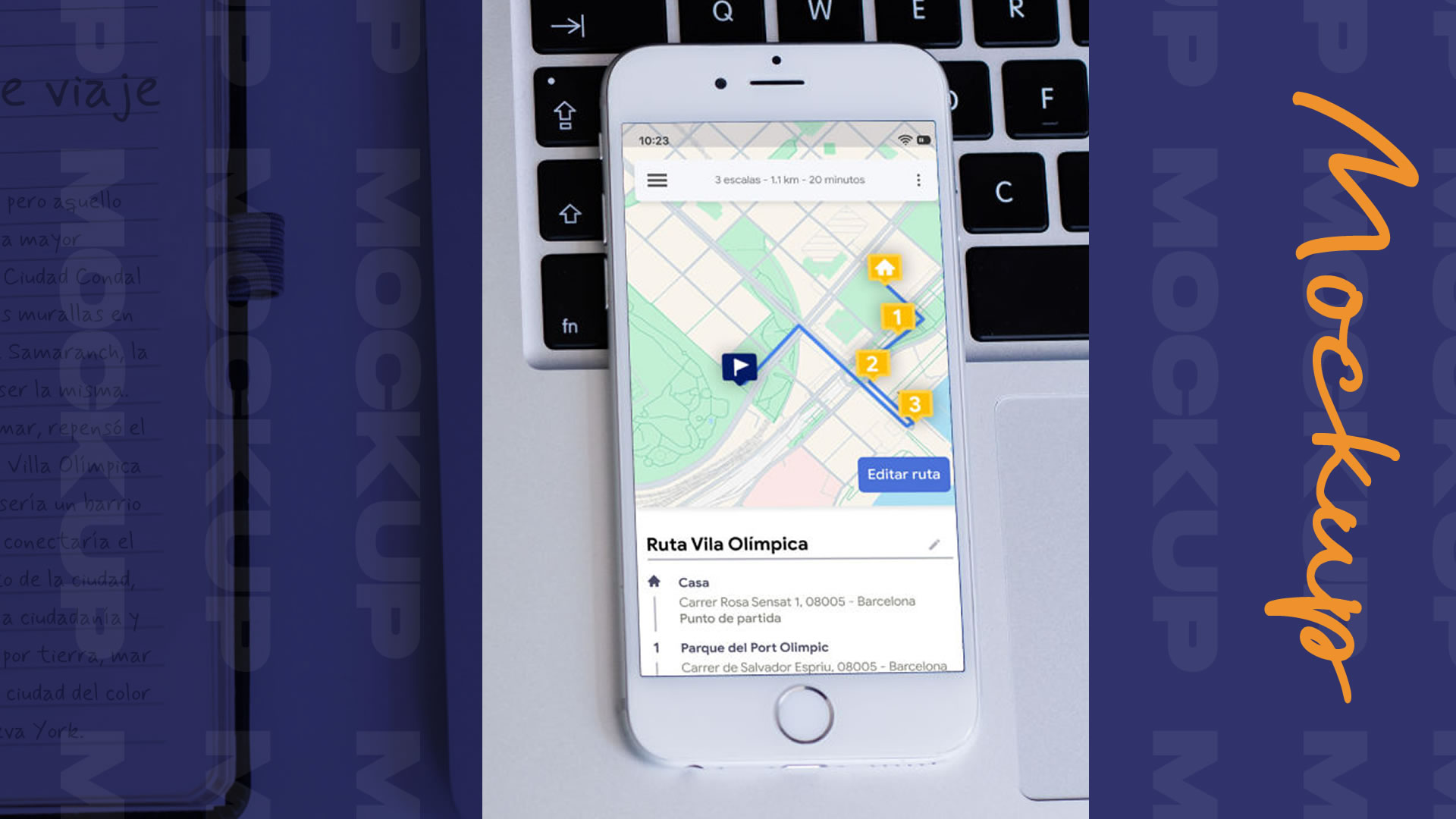
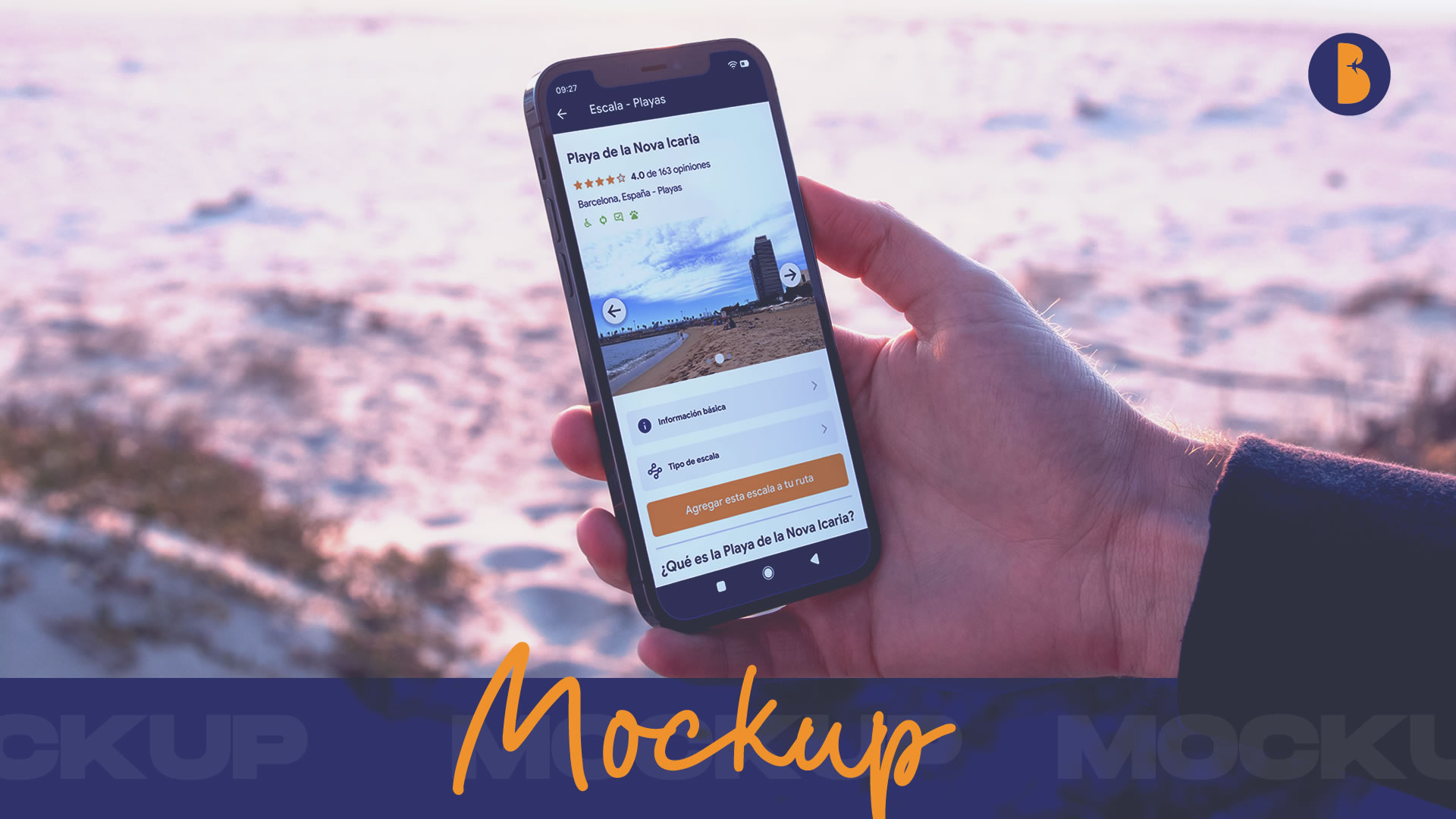
Mockups
Accessibility Considerations
These considerations ensure that the feature not only meets accessibility standards, but also delivers an inclusive experience for all users.
Accessibility Based on User Context
The app has been designed with dynamic adaptation to user context in mind—whether the feature is used indoors or outdoors, during the day or at night, with or without internet coverage. It includes an offline mode and can detect environmental factors (like low light or motion) to automatically adjust brightness and contrast. In “direct mode” for live route assistance, button sizes increase for better interaction.
Multisensory Routes
An auditory navigation mode is suggested for users with visual impairments or those who prefer not to look at the screen while walking. The app could include directional sounds or haptic feedback (e.g., vibration patterns for actions like turning, going straight, etc.).
It’s also suggested to integrate audio or visual content about surroundings (such as landscapes, historical buildings, or nature) to enrich the live route experience.
An optional storytelling mode could be offered, where the app narrates cultural stories or relevant facts at various stops.
Accessibility Information at Stops
The app displays up-to-date information on whether stops are accessible for people with reduced mobility, including ramps, accessible stairs, wide paths, or adapted restrooms.
Community collaboration is also encouraged, allowing users to tag or validate accessible points of interest. Active contributors could earn badges such as “Accessibility Expert.”
Additionally, users can apply filters to create routes made exclusively of accessible stops.
Conclusions

Next Steps
1. User Behavior Monitoring
Implement analytics tools (Google Analytics, Mixpanel, etc.) to track how users interact with the feature.
2. User Feedback Monitoring
Gather user feedback through in-app surveys, ratings in app stores (App Store, Google Play), social media, and customer service channels.
3. Bug Fixes (Hotfixes)
Quickly resolve any bugs or technical issues affecting the feature.
4. Data-Driven Optimization
Conduct design iterations based on collected data.
5. Tutorials and Help
Create educational materials, such as video tutorials or help center articles, to guide users in using the new feature.
6. Performance Evaluation
Compare key metrics before and after the launch, such as: user retention rate, increase in average app time, and/or number of routes used.
7. Qualitative Analysis
Organize focus groups or user interviews to dive deeper into their experience with the feature.
8. Feedback-Based Iteration
Regularly update the feature based on feedback and collected insights.
9. New Feature Development
Leverage the success of the current feature to introduce complementary functionalities.
10. Periodic Review
Conduct regular audits to ensure the feature’s proper functionality and ongoing relevance.
11. Technical Support
Set up a dedicated support channel for addressing issues related to the feature.
This project reinforced the importance of constant iteration in UX/UI, showing that listening to users and adapting the design to meet their needs is key to delivering real value. I learned how to turn insights into strategic decisions, balancing business goals, technical constraints, and user experience.
Additionally, working on personalized flow planning and integrating interactive features helped me deepen my understanding of designing digital experiences that adapt to different types of users. This experience reaffirmed my commitment to human-centered design and to effectively communicating UX/UI impact to teams and stakeholders.
More Projects