A website redesign to renew an architecture studio
Lara Castillo Studio
An architecture studio needs an online presence as refined as its own projects. In this UX/UI case study, I worked on redefining the digital identity of Lara Castillo Studio, focusing on intuitive navigation, minimalist visual design, and mobile optimization.
The goal was to create a website that reflected the brand’s elegance, made it easy to explore projects, and improved communication with potential clients.
Problem
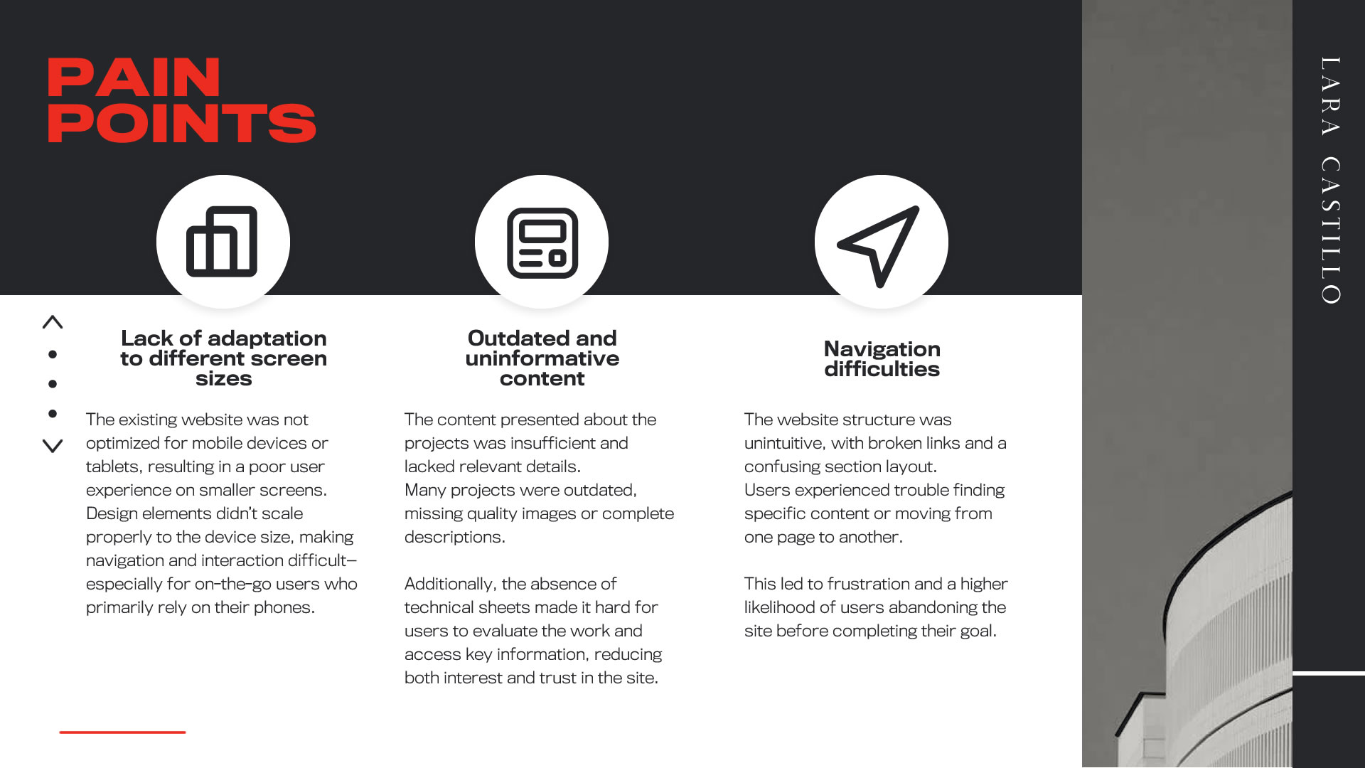
The website of Lara Castillo architecture studio did not adequately reflect its modern and professional image. It had navigation issues—especially on mobile devices—lacked updated and relevant content, and didn’t offer an intuitive user experience. This negatively affected the brand’s perception and made it harder for users to explore the studio’s projects.
Solution
A minimalist and optimized website was designed and developed, focusing on showcasing architectural projects through a smooth user experience. The design prioritized mobile navigation, included advanced filters to help users find projects easily, and enhanced visual presentation. Accessible elements were also incorporated, such as alternative text and improved color contrast, to ensure an inclusive experience.
Role
UX/UI Designer
Duration
The project spanned approximately 12 weeks, divided into the following phases: research and definition (4 weeks), ideation and prototyping (6 weeks), and testing and final adjustments (2 weeks).
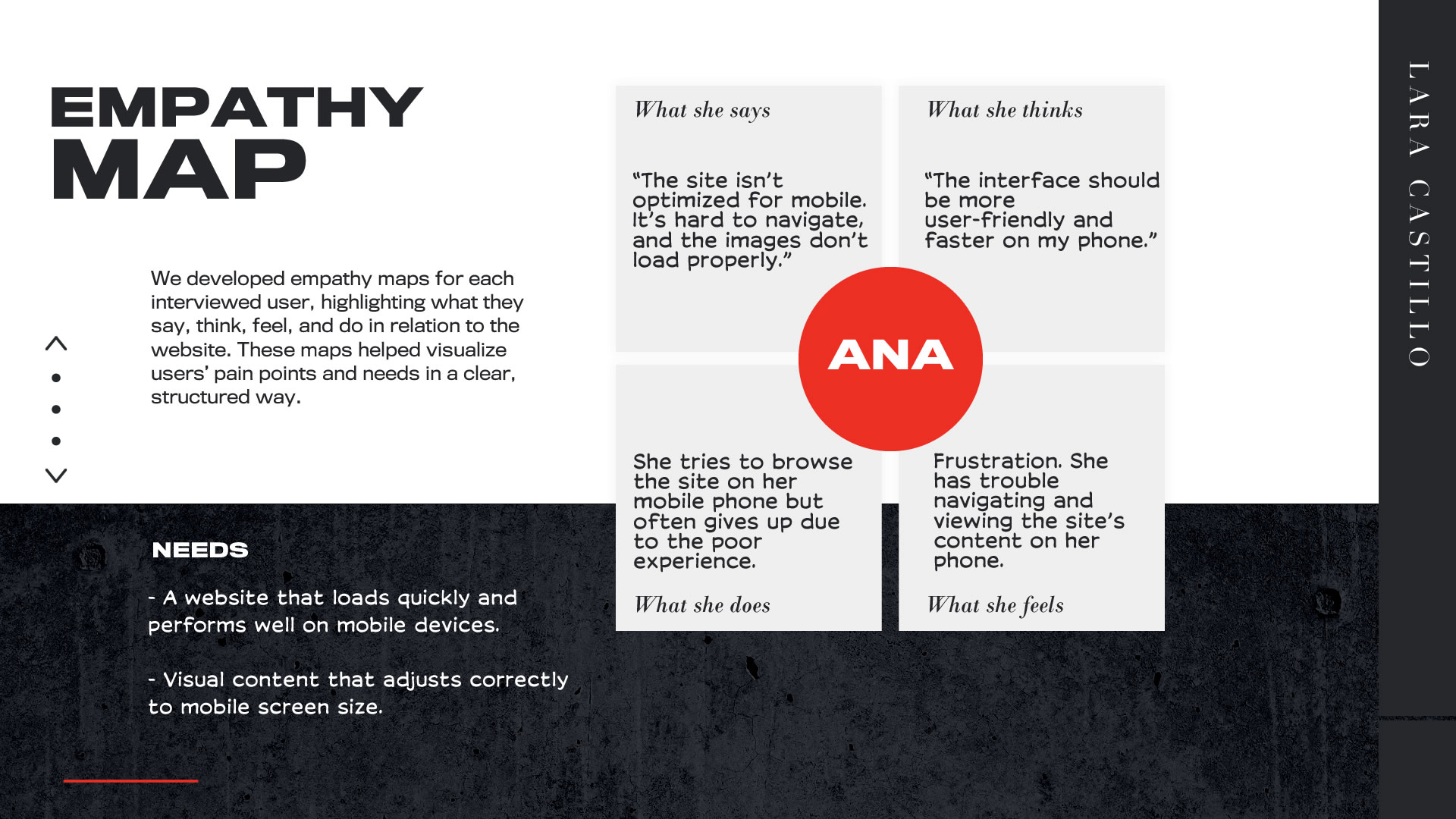
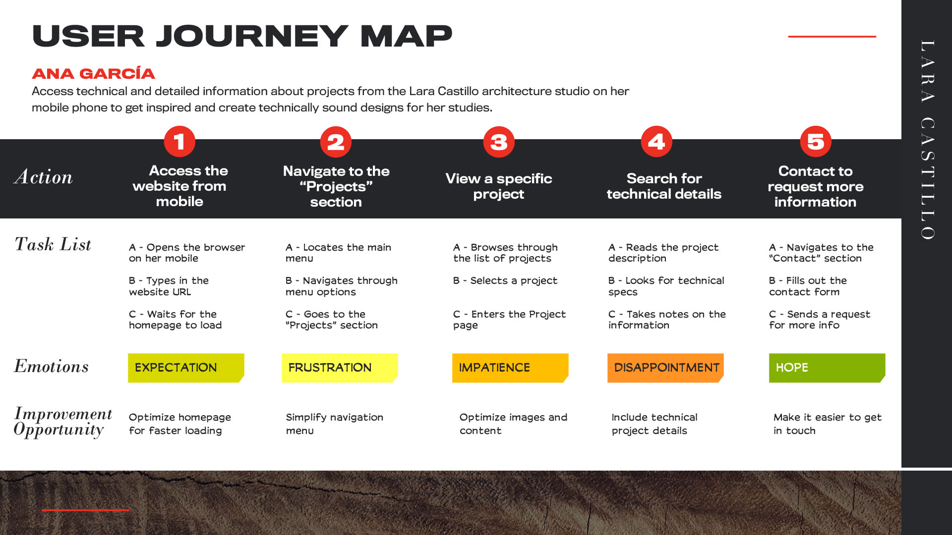
Understanding the User
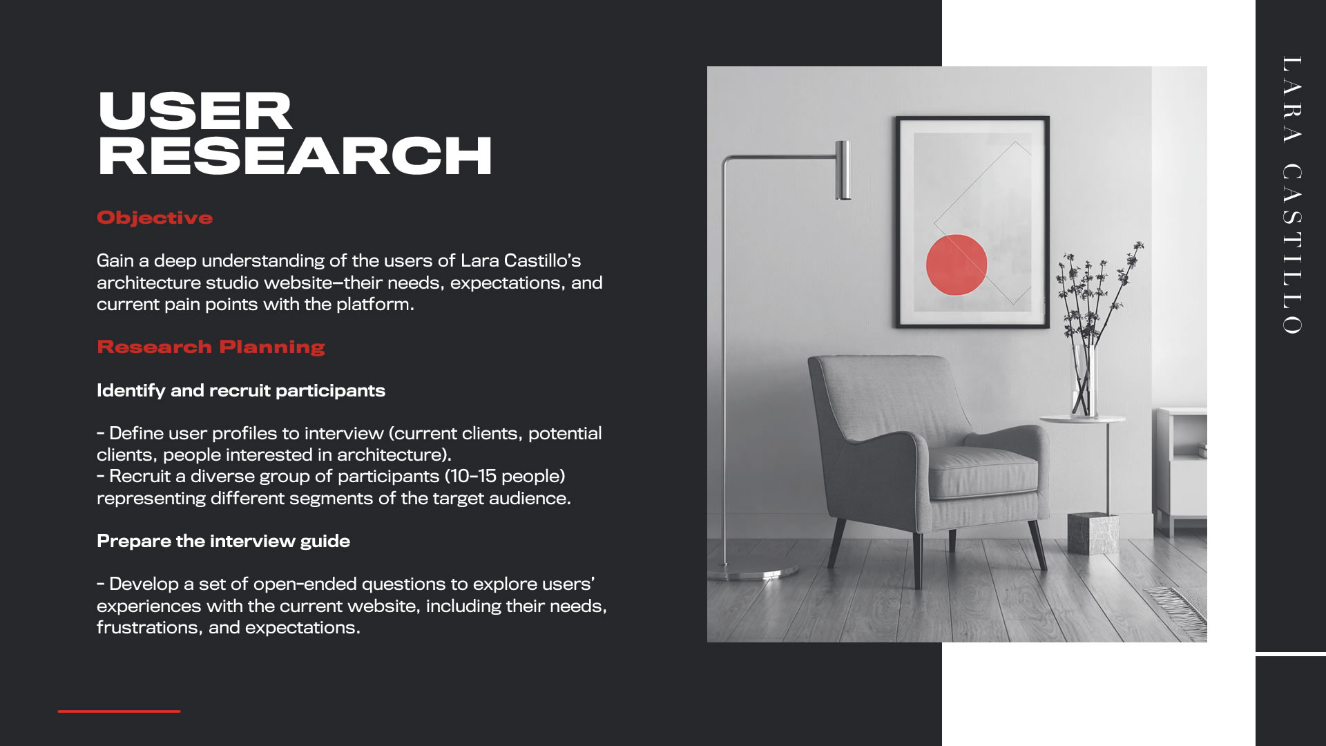
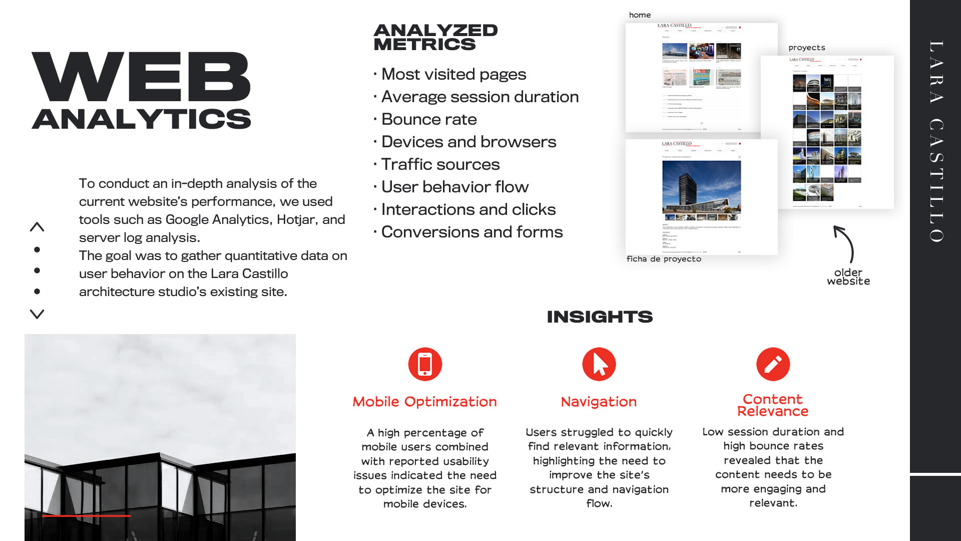
Research
Objective
The main goal of the research was to identify the needs, pain points, and expectations of users when interacting with the current Lara Castillo studio website. This helped us understand how to optimize the user experience, improve navigation, and prioritize key functionalities.
Research Methodology
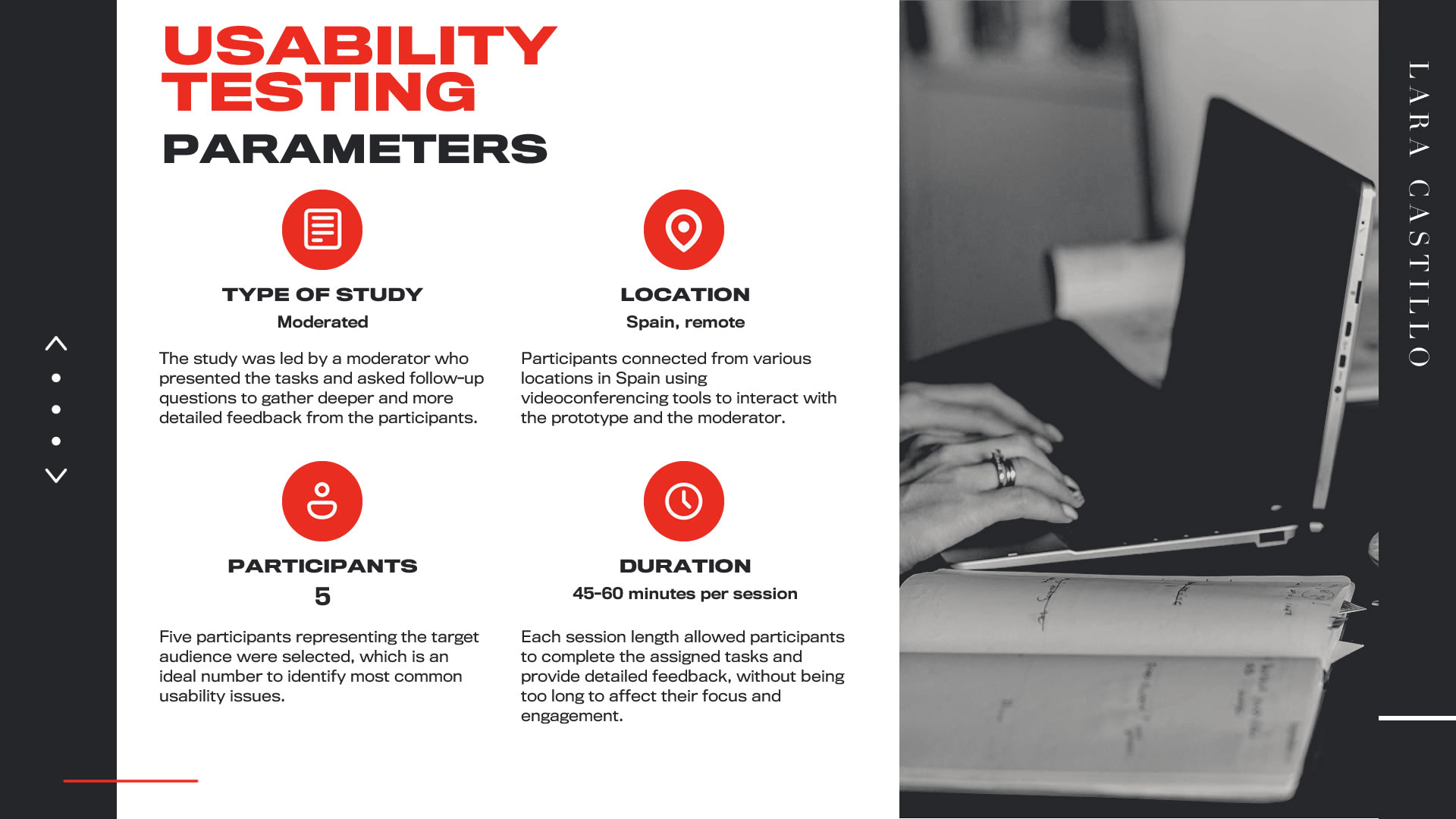
A combination of qualitative and quantitative methods was used: individual interviews with potential users, a competitive audit to identify best practices in the field, and moderated usability testing to evaluate the current site’s flow and user experience.
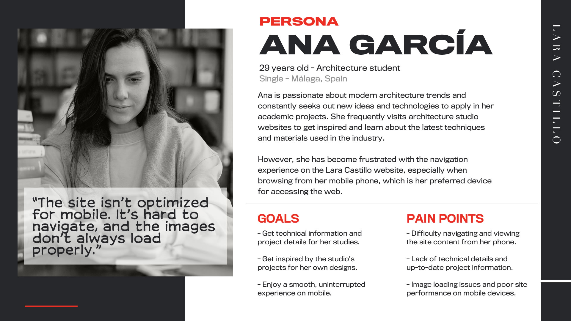
Demographic Profile
The focus was on professionals in the architecture sector, architecture students, and potential corporate clients. Participants were between 25 and 50 years old and interested in accessing project information and contacting the studio easily.
Recruitment
Participants were recruited through professional networks, direct contact with architecture students, and potential Lara Castillo clients. Twelve representative participants were selected based on demographic and behavioral criteria aligned with the target audience.
Defining the Problem
Synthesis
The research revealed that users had difficulties navigating the site, struggled to find updated content, and experienced issues with responsiveness across different screen sizes such as mobile phones and tablets.
Ideas for a Solution
Objective
During the ideation sessions, the pain points identified in the research and synthesis phases became the central focus, guiding every technique to generate specific and effective solutions.
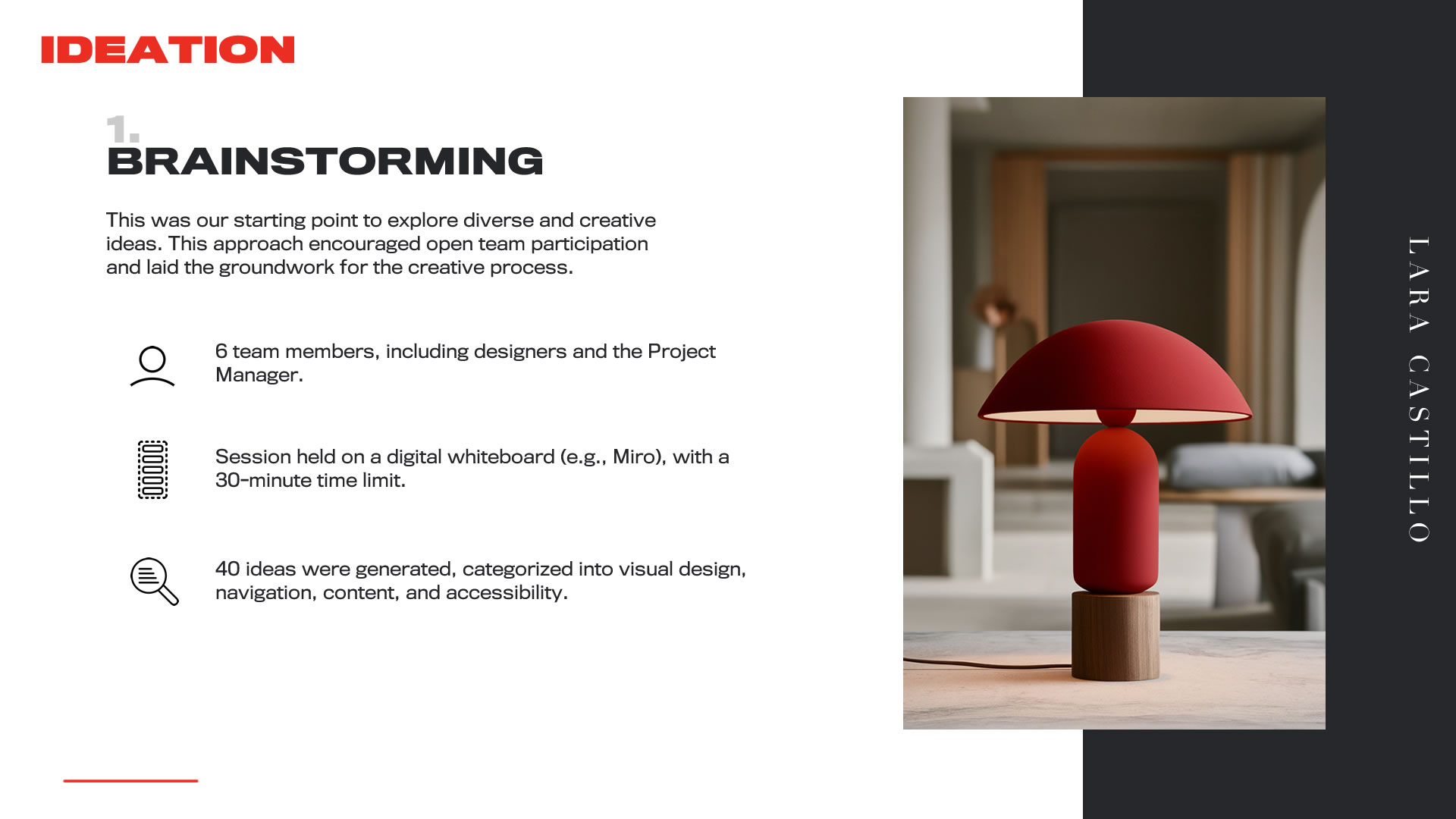
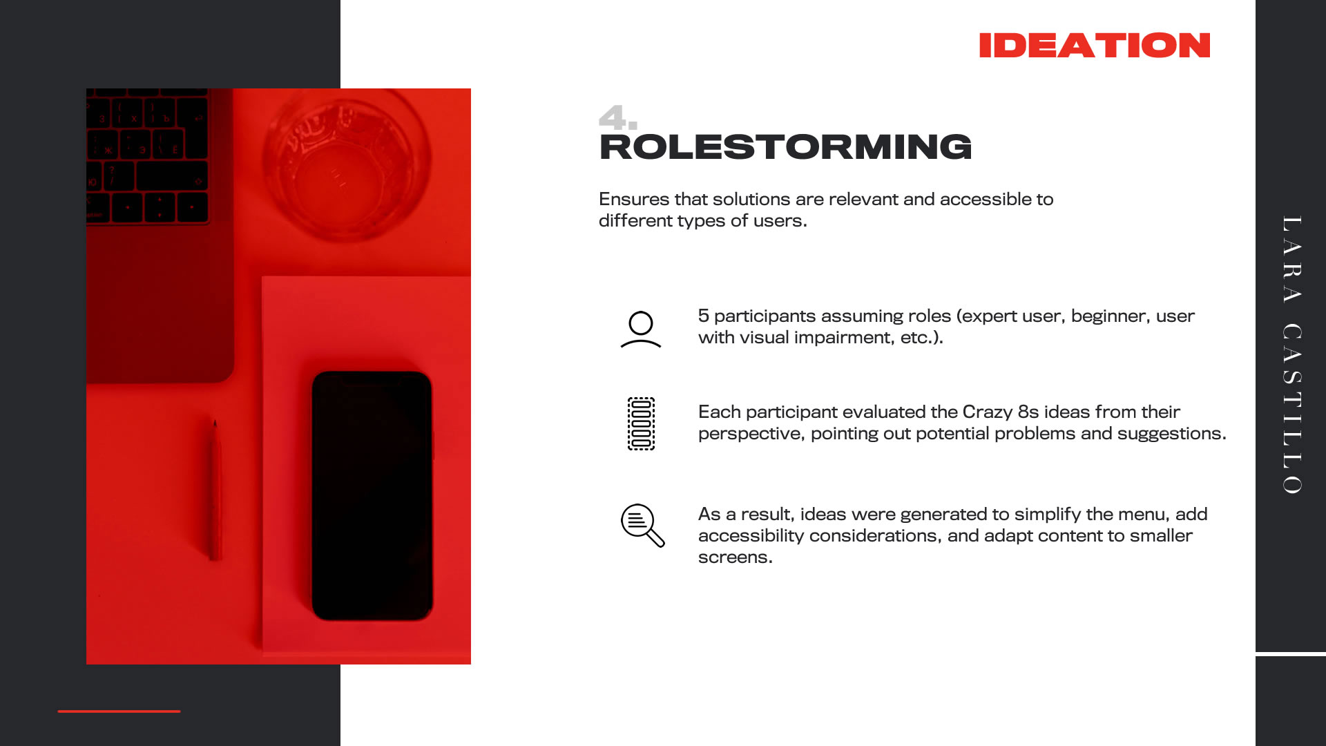
Key Points
Throughout the ideation sessions, the team worked with a focused approach to address the three main pain points identified during research: lack of responsiveness, insufficient content, and navigation issues. Each technique applied was oriented toward generating clear solutions aligned with user needs.
Lack of responsiveness across devices
- We started with the basics: simplified menus for small screens, use of scalable images, and fluid layout design.
- A key idea was to implement breakpoints to ensure optimal display on mobile devices and tablets.
- A "mobile-first" approach was adopted for critical elements like navigation and visual content presentation.
Outdated and uninformative content
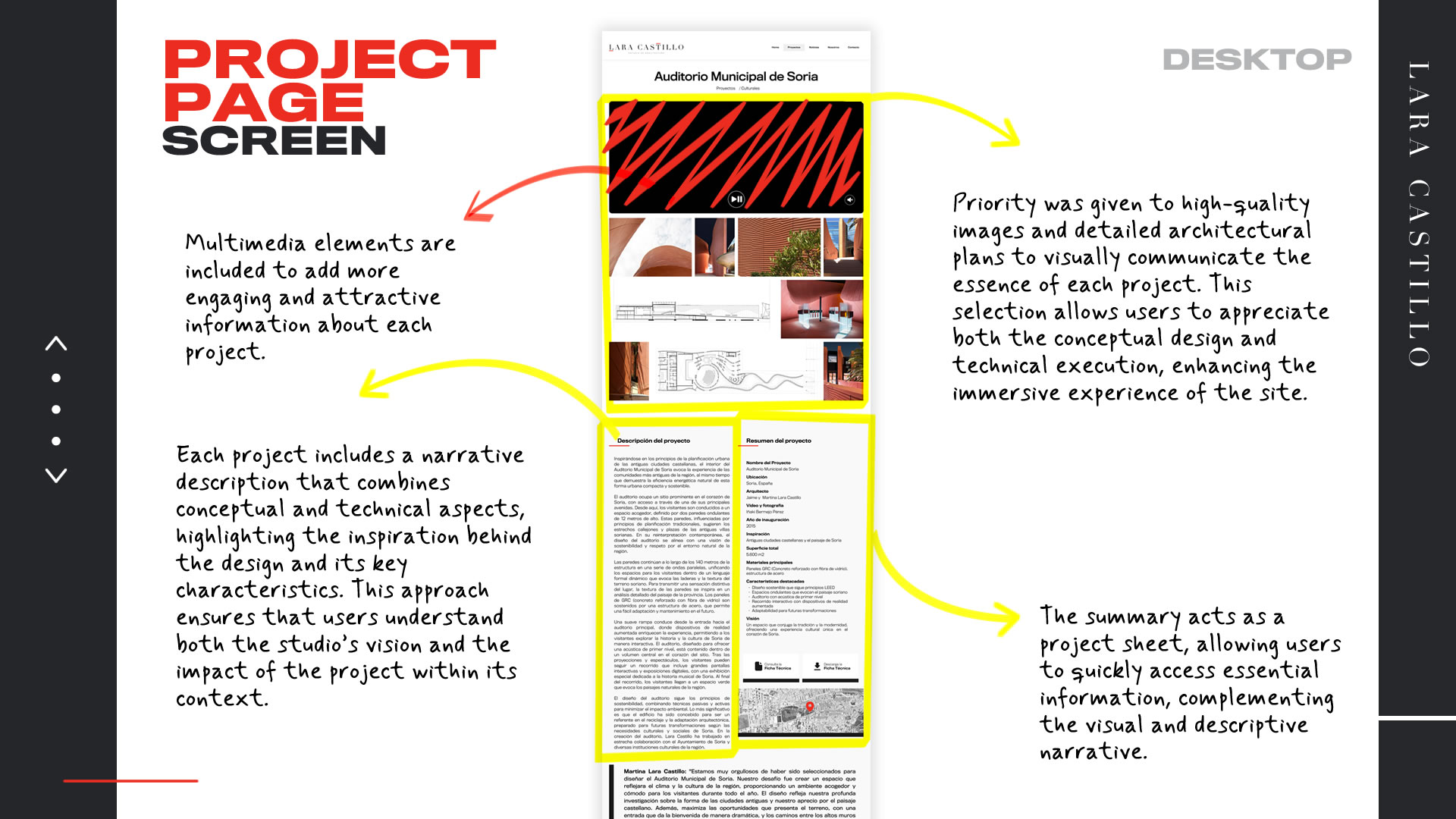
- We identified the need to include detailed technical specifications, high-quality image galleries, and comprehensive project descriptions.
- We benchmarked best practices for content presentation in the architectural industry.
- We concluded that each project should follow a standard structure including image galleries, detailed descriptions, technical data, and related links.
Navigation issues
- Efforts focused on designing a logical, easy-to-use navigation system across all platforms.
- Ideas included organizing user flows based on interests and user behavior.
- We proposed features like accessible menus, breadcrumb trails, and simplified navigation options.
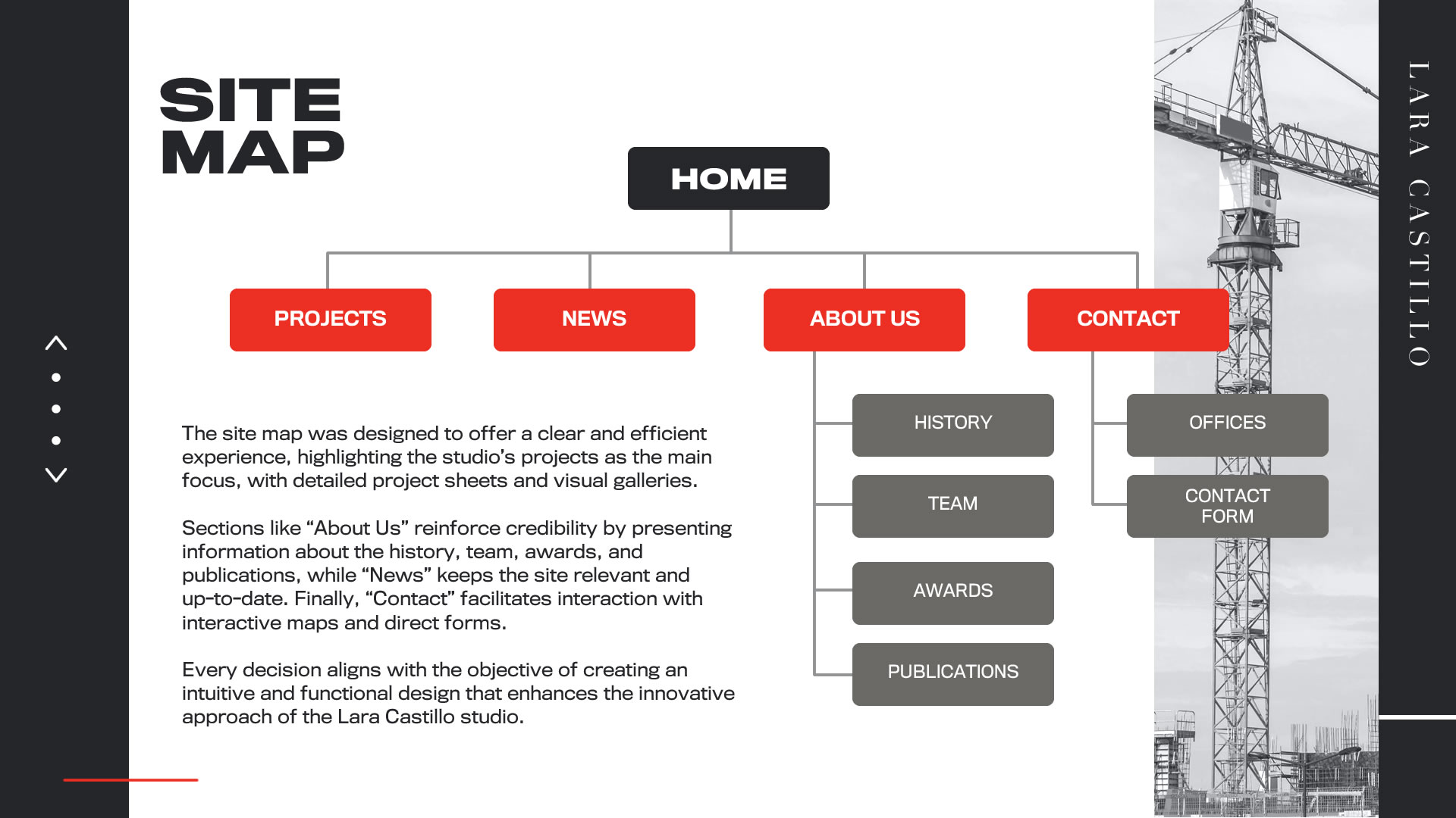
Design
We entered the design stage by creating the sitemap—a key step for structuring content in a logical, user-centered way. The main insights gathered during the ideation sessions laid a solid foundation for sketches and prototypes, ensuring the final design addressed the identified issues and met the client’s expectations.
Sitemap
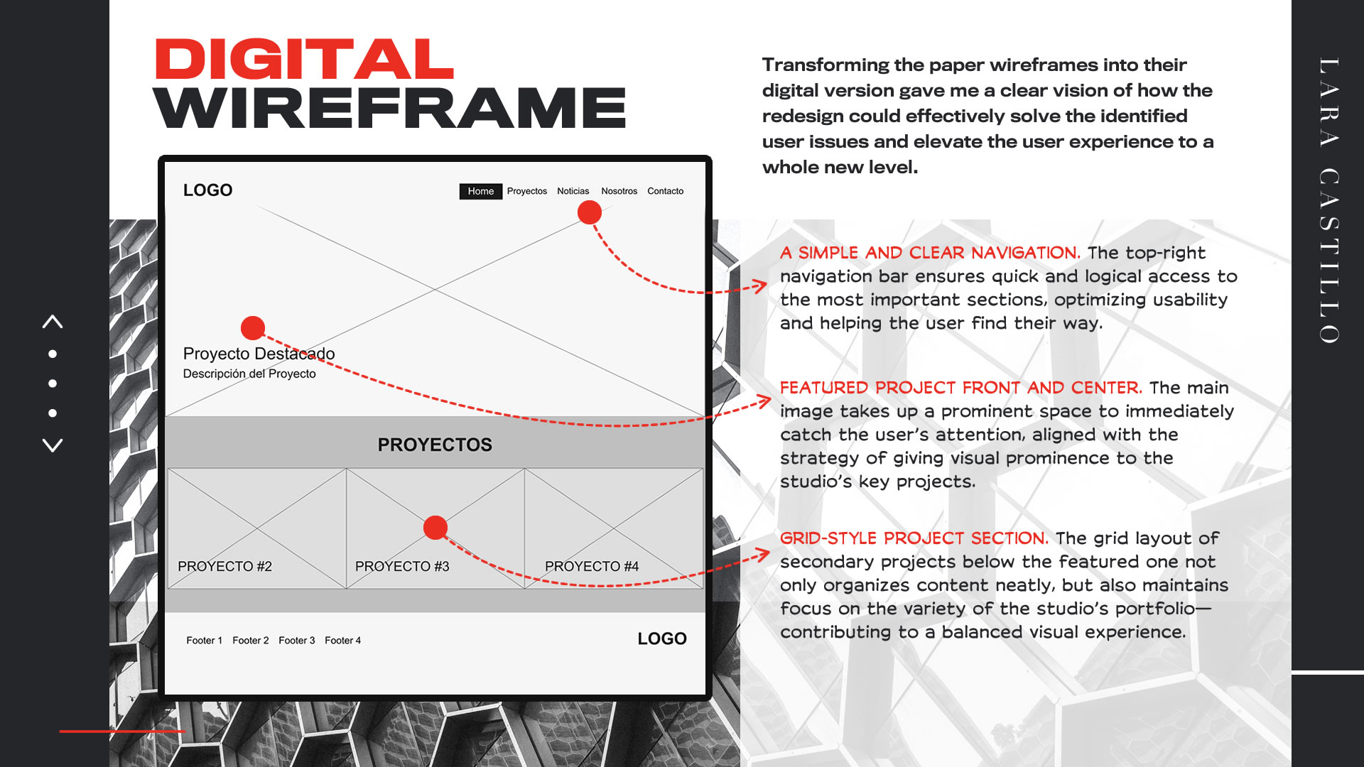
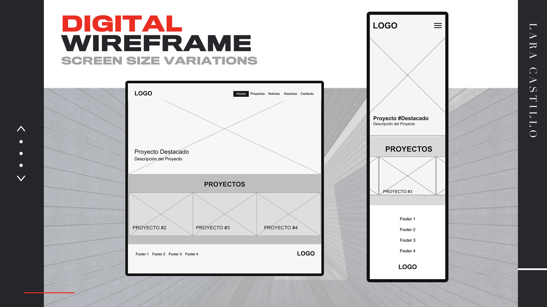
Paper Wireframes
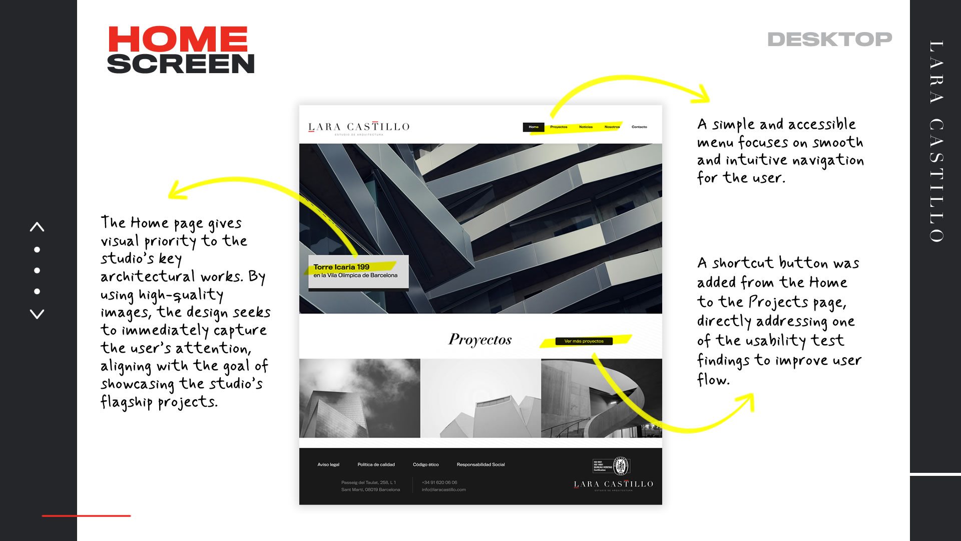
The next step was to sketch the wireframes. I focused particularly on the pain points identified earlier. I chose a minimalist, modern, and elegant design where visuals take center stage, and layout elements are arranged in a simple, clean, and effective way. The layout’s classic structure was intentionally kept sober, allowing the studio’s architectural innovation to stand out and be appreciated in full.
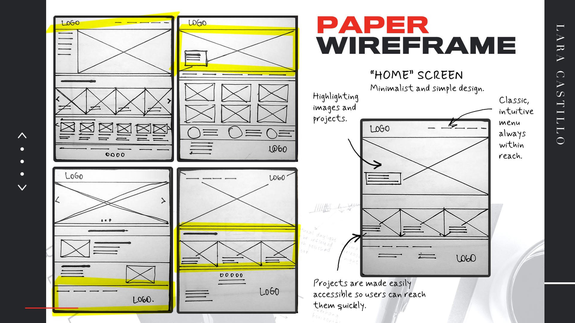
Although the main goal was to develop a fully responsive website, I chose not to apply a strict mobile-first approach. The reason lies in the nature of the content: the studio’s architectural projects require a wide visual space to be fully appreciated.
Since these works are the core of the site, I decided to prioritize their presentation on larger screens, ensuring an immersive and high-impact visual experience.
Later, I adapted the design for mobile environments, where we had identified more navigation challenges among our target users. This strategy allowed us to maintain both visual and functional integrity across all platforms, delivering a consistent and satisfying experience on any device.
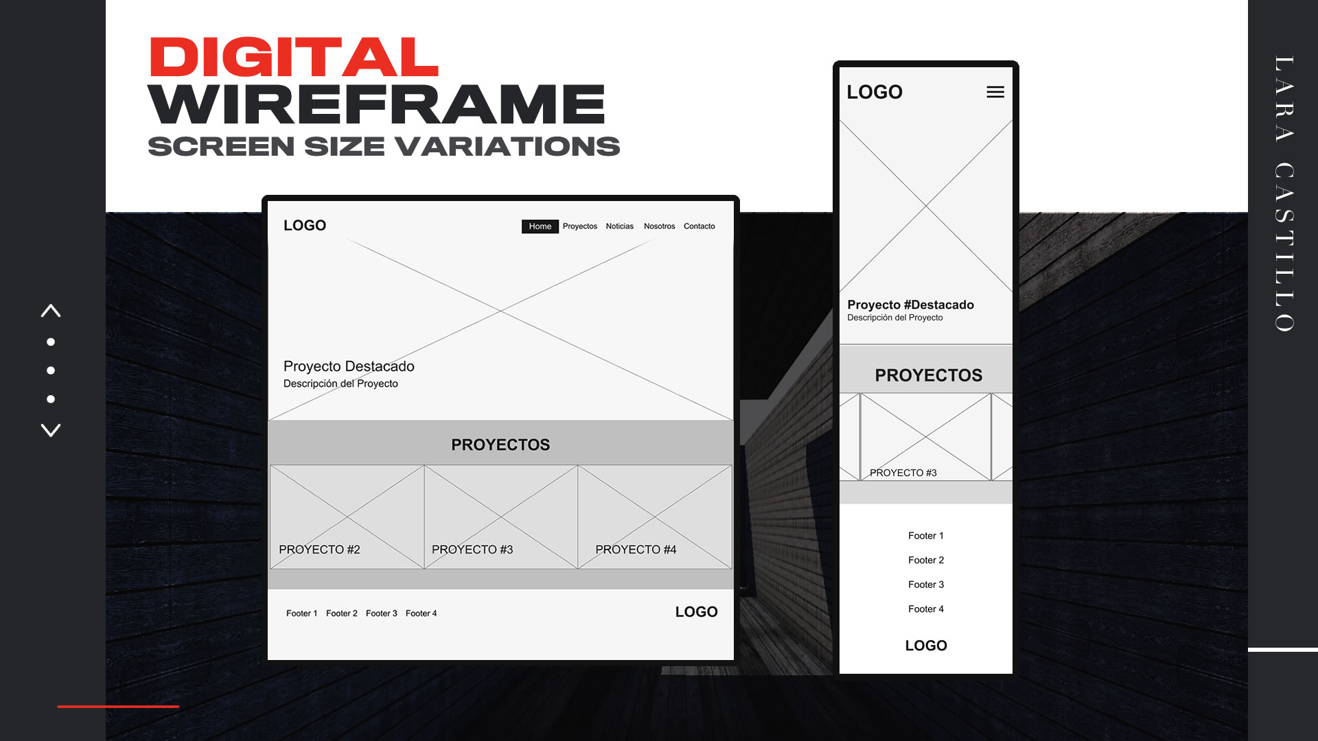
Prototyping
Low-Fidelity Prototype
We started by creating simple wireframes that translated the ideas and conclusions from the ideation phase into an initial visual structure. This step allowed us to quickly validate content organization, prioritize key elements like mobile navigation and project cards, and make early adjustments based on team feedback. The focus was on ensuring a clear and functional experience that would serve as a foundation for more detailed iterations in the next phases.
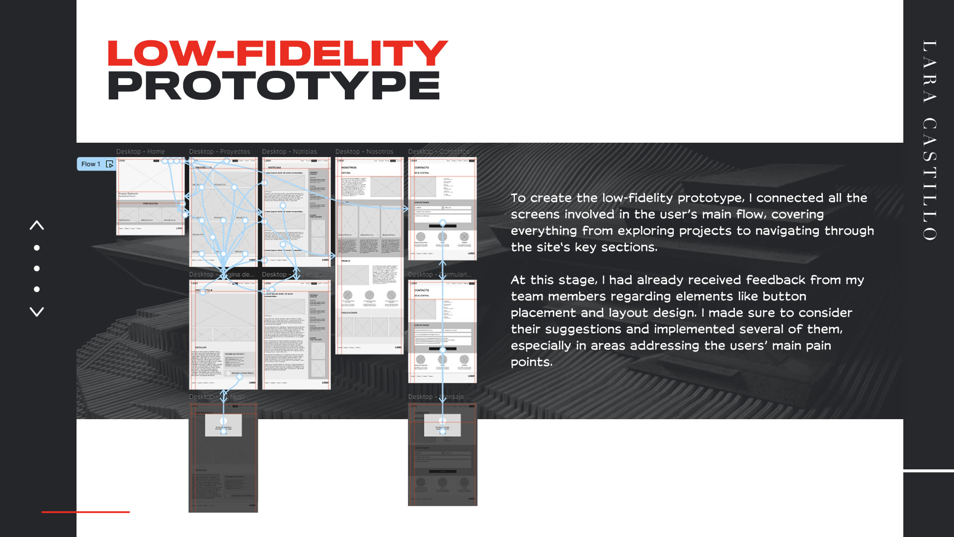
Usability Study
The next step was to conduct a usability study to identify potential navigation and functionality issues in the low-fidelity prototype before moving forward with more detailed versions. This step is crucial to validate that early design decisions effectively respond to user needs, allowing quick adjustments to flows, interactions, and content hierarchies. The goal of conducting these tests at this stage is to ensure that the final experience is intuitive, efficient, and aligned with the project’s objectives.
Findings and Improvement Opportunities
1· Lack of responsiveness across devices
-
Participants reported difficulties using dropdown menus on small screens.
KPI: Average task time increased by 40% on mobile compared to desktop (5.6 min vs. 4 min). -
Incorrect display of key buttons like “Submit form” discouraged users from completing actions.
KPI: 3 out of 5 participants failed to complete tasks due to the interface not being properly adapted to their devices.
- Refine responsive design to better adapt site elements for mobile and tablet devices.
- Optimize button tap areas for better touch interaction.
2· Outdated and uninformative content
-
Users struggled to find the requested project in the "Projects" section.
KPI: 20% of participants failed to complete the task of downloading a technical sheet.
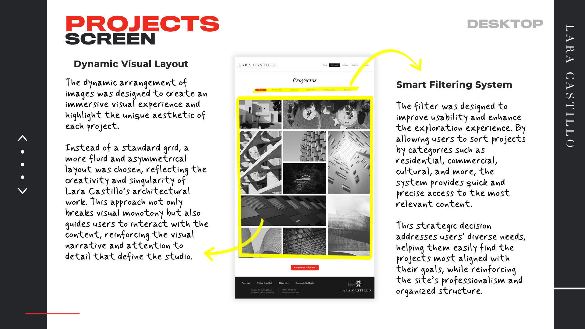
- Add advanced filters by category, location, or project type to improve search and project exploration.
3· Navigation issues
-
The “Projects” section on the homepage lacked a clear button for direct access.
KPI: 60% of participants followed incorrect paths to reach “Projects”.
- Add a clear button in the “Projects” grid on the homepage that links directly to the desired section.
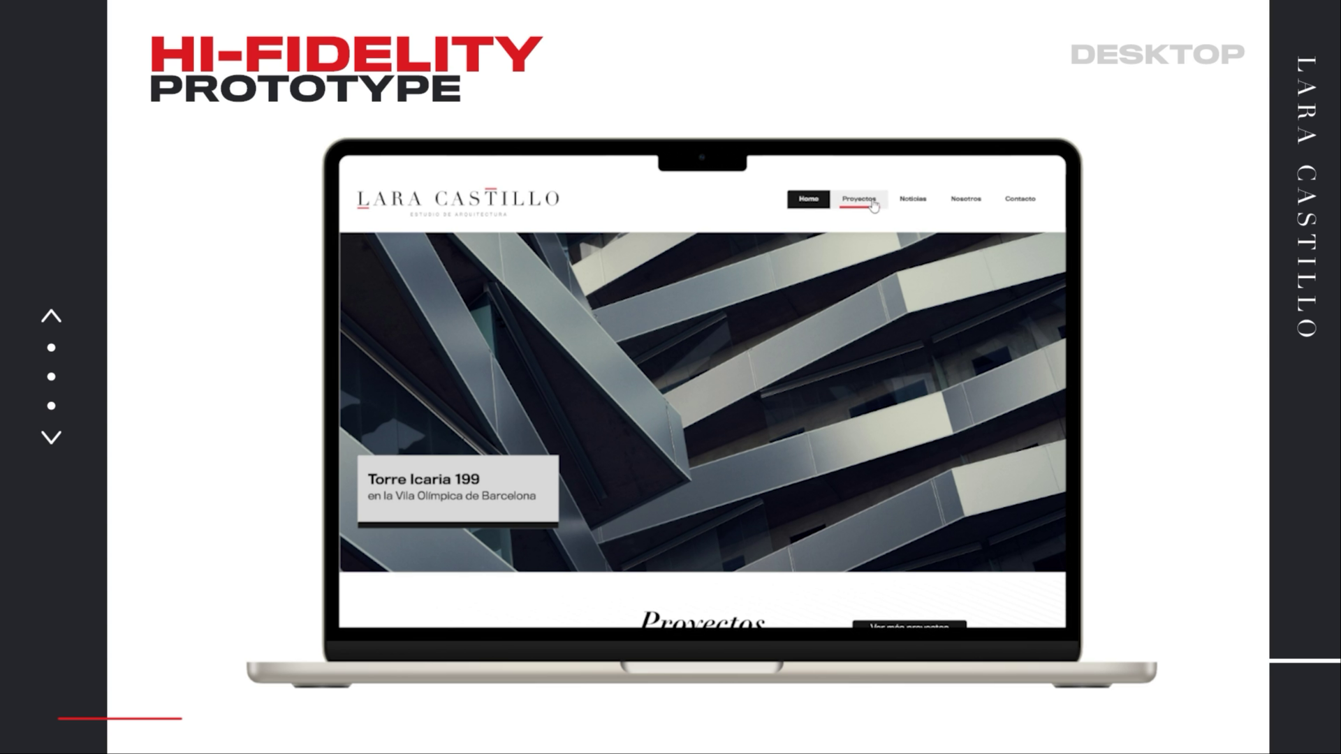
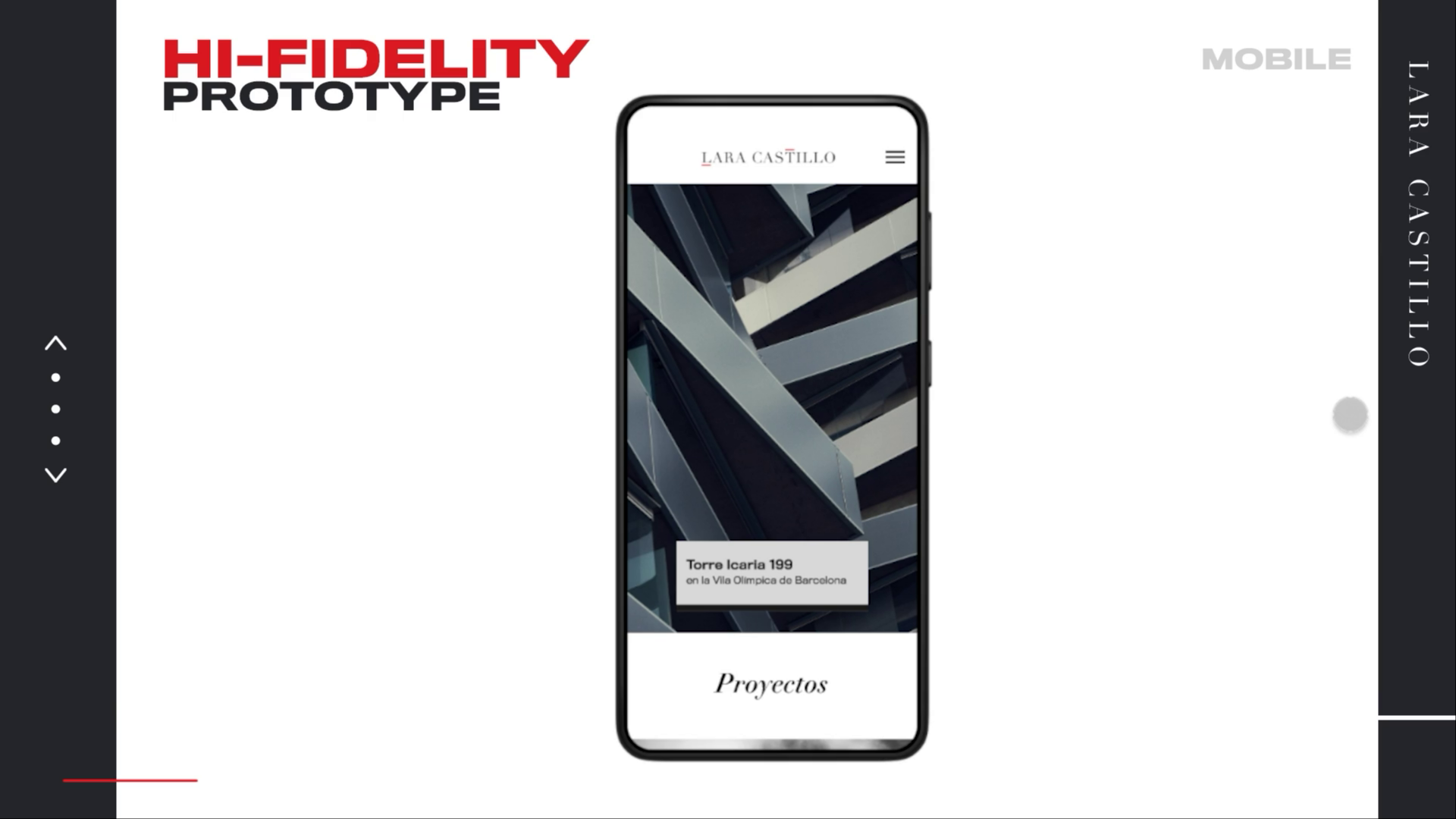
Hi-Fi Prototype
Based on the findings from the usability study, we moved forward to refine the design and develop the high-fidelity prototype, integrating key improvements based on user feedback. This process included optimizing navigation, implementing advanced filters in the project section, and adding interactivity to elements like maps on the contact page. The high-fidelity prototype combined a modern visual aesthetic with optimized functionality, ensuring the final design was not only visually appealing but also intuitive and aligned with both user needs and project goals.
Testing
Validation Usability Testing
A Validation Usability Test was conducted to confirm that the implemented improvements addressed the previously detected issues and to ensure the final design met user expectations. This approach is ideal at this stage, when the design has been refined and its effectiveness needs to be confirmed before full implementation.
Impact of the Implemented Improvements
The improvements had a significant impact, increasing task completion rates and reducing average task times. Additionally, the perception of the design as intuitive and sophisticated strengthened the studio’s professional image.
-
More efficient search filters
Average time reduced from 4.2 minutes to 1.8 minutes to find a project.
-
Improved completion rate
Increase from 60% to 100% in successfully completed tasks.
-
Optimized touch buttons
Elimination of mobile interface errors (before: 3/5 users; after: 0/5 users).
-
Design perception
User satisfaction increased from 3.2 to 4.9 (out of 5).
-
Interaction with content
Users described image and project card layout as "intuitive" and "visually engaging", encouraging deeper exploration.
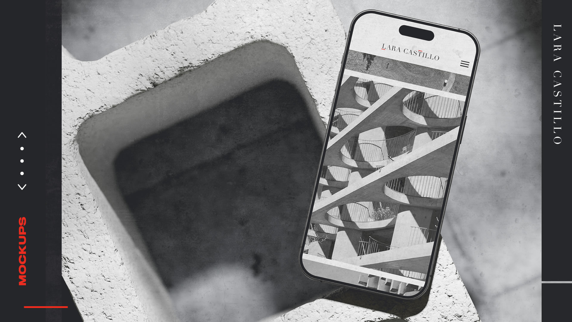
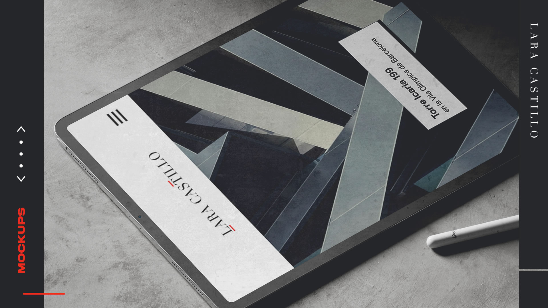
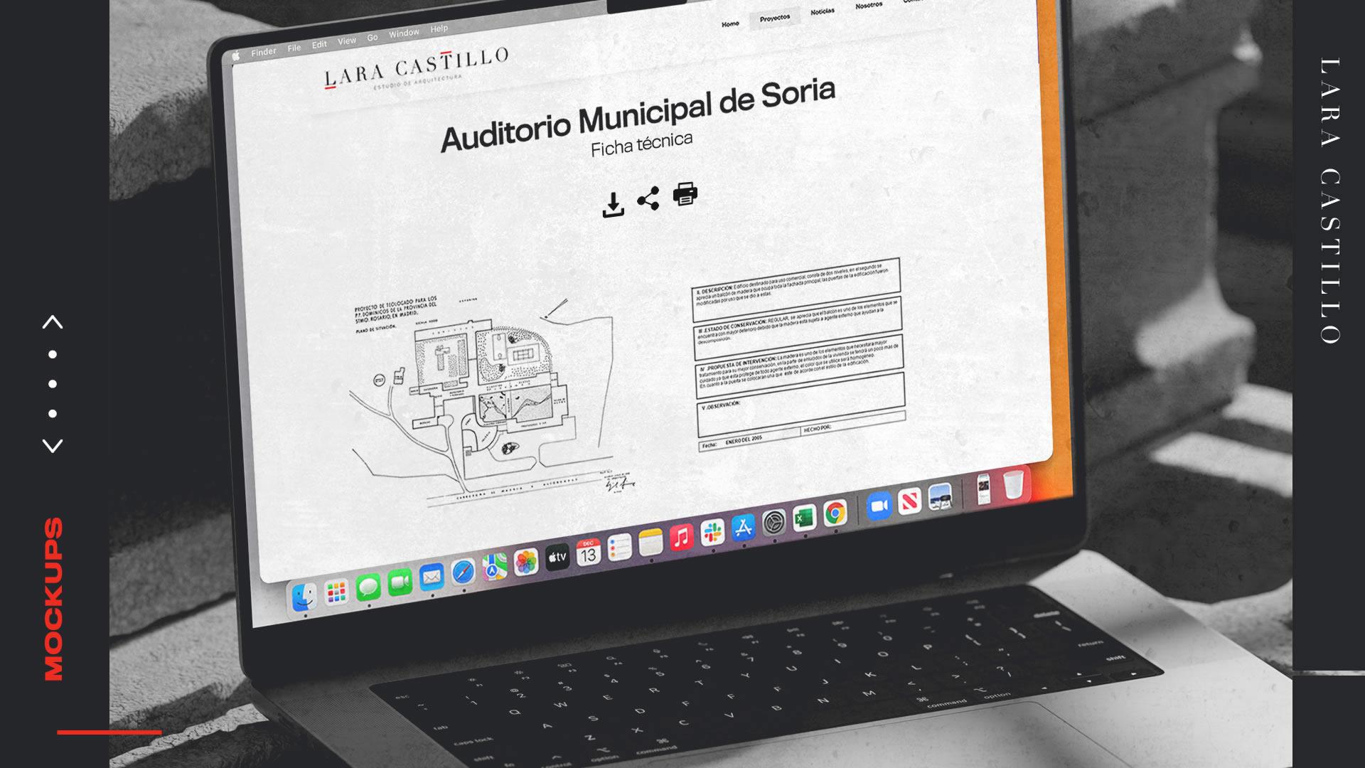
Mockups
Accessibility Considerations
From the very beginning, accessibility was a key pillar in the design of Lara Castillo’s website, ensuring an inclusive experience for all users. Standard practices were implemented, such as proper color contrast, readable typography, keyboard-optimized navigation, and screen reader compatibility. Additionally, all interactive elements were made accessible across devices, improving the experience on both desktop and mobile.
Reading Mode for Architectural Projects
A “Reading Mode” was designed for each project sheet to enhance accessibility, removing distractions and optimizing spacing—ideal for users with dyslexia or attention difficulties.
Projects with Audio Descriptions and Specialized Filters
Projects include detailed audio descriptions as an alternative for users who need or prefer audio content.
Additionally, the "Projects" page features filters like “View projects with higher visual contrast” and “Projects with audio descriptions,” offering tailored options for users with specific needs.
Adaptive Interaction in Image Galleries
A feature was added to allow users to adjust the speed and size of images in the project gallery, benefiting individuals with low vision or motor impairments.
Conclusions
Next Steps
1. Monitoring and usage analysis
- Track key metrics such as conversion rate, time on page, filter interactions, and mobile accessibility.
- Analyze navigation patterns and potential friction points using web analytics tools.
- Evaluate the impact of improvements on task completion rates and accessibility.
2. Usability testing in production
- Conduct usability tests with real users in a live environment to detect issues not identified during development.
- Implement A/B testing sessions to evaluate different interface variants and optimize the user experience.
3. Optimization and improvements based on feedback
- Gather user feedback through short surveys and feedback forms.
- Prioritize iterative improvements based on collected feedback and usage metrics.
- Adjust navigation, accessibility, and performance elements based on data insights.
4. Ongoing maintenance and support
- Monitor site performance and fix any technical errors or bugs.
- Ensure compatibility with new browser and device updates.
- Optimize load speed and multimedia resource efficiency.
5. Planning new features
- Explore expansion opportunities, such as integration with social media or augmented reality tools for project visualization.
- Identify emerging user needs and propose new improvements for the studio’s digital experience.
This project reinforced my focus on accessibility and usability, showing that successful design is not just about visual appeal, but about helping users find information effortlessly. I learned how to balance minimalism and functionality, ensuring intuitive navigation while maintaining the studio’s visual identity.
Additionally, usability testing was essential in making data-driven strategic decisions and translating insights into meaningful improvements. Collaborating with different professional profiles helped align the design vision with business objectives, strengthening my ability to create scalable, user-centered solutions.
More Projects