A digital platform to connect local producers and consumers
EcoPunt Barcelona
Buying fresh, local products can be a challenge without a direct connection between farmers and consumers. This UX/UI case study explores how a digital platform can facilitate the sale of local produce by removing intermediaries and streamlining the shopping experience.
Through UX Research, information architecture, and UI design, I developed a prototype that allows users to filter products by location, availability, and sustainability criteria—ensuring intuitive and accessible navigation.
Problem
Consumers are increasingly looking for sustainable and local shopping options but often don’t know where to find fresh products directly from farmers. At the same time, farmers need an accessible platform to manage their production and connect with customers without middlemen. The lack of a centralized solution makes this connection difficult and limits access to local goods.
Solution
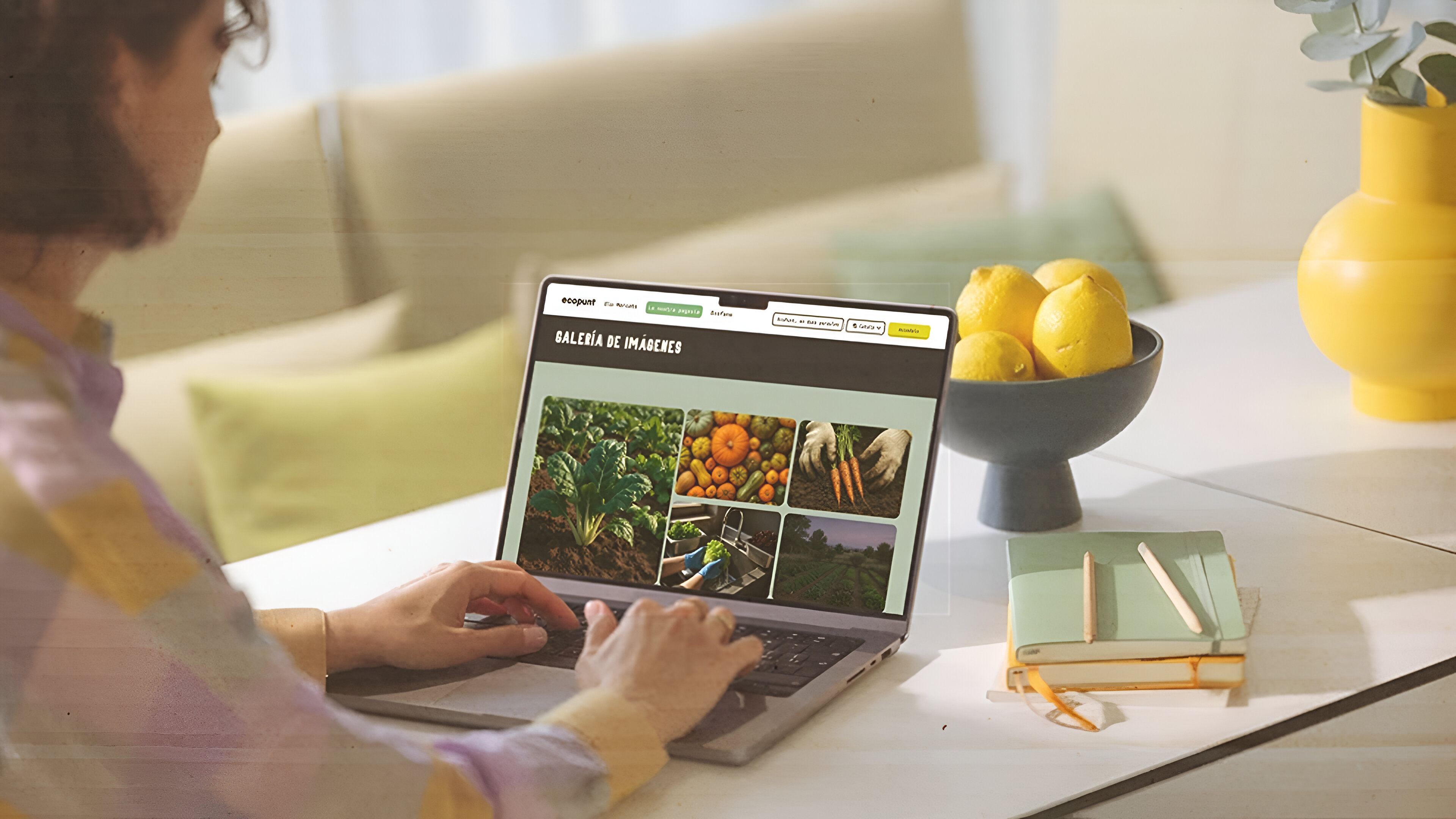
EcoPunt is a digital platform that facilitates the purchase of fresh, sustainable products by directly connecting consumers with local farmers. Through a mobile app and website, users can explore nearby markets, reserve baskets, and receive information about seasonal products. With an intuitive and accessible interface, EcoPunt promotes a more sustainable lifestyle while supporting the local economy.
Role
As the UX/UI designer, I was responsible for user research, wireframing, prototyping, and design iteration based on usability testing. I also worked on the information architecture and accessibility strategies to ensure an inclusive and efficient experience.
Timeline
The project development spanned approximately 12 weeks, including research, ideation, prototyping, and usability testing phases. Multiple iterations were made to refine the user experience before final delivery.
Understanding the User
Research
Objective
The goal of this research was to understand the needs, expectations, and behaviors of EcoPunt’s key users—an initiative that connects local farmers with urban consumers in Barcelona. We aimed to identify barriers in the buying and selling of local products and opportunities for improvement to design a platform that enables efficient, sustainable interaction between producers and consumers.
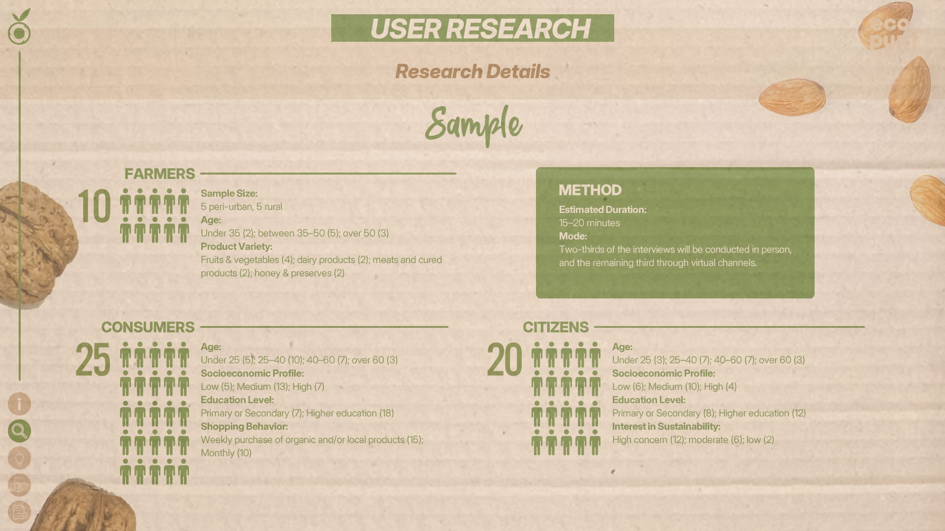
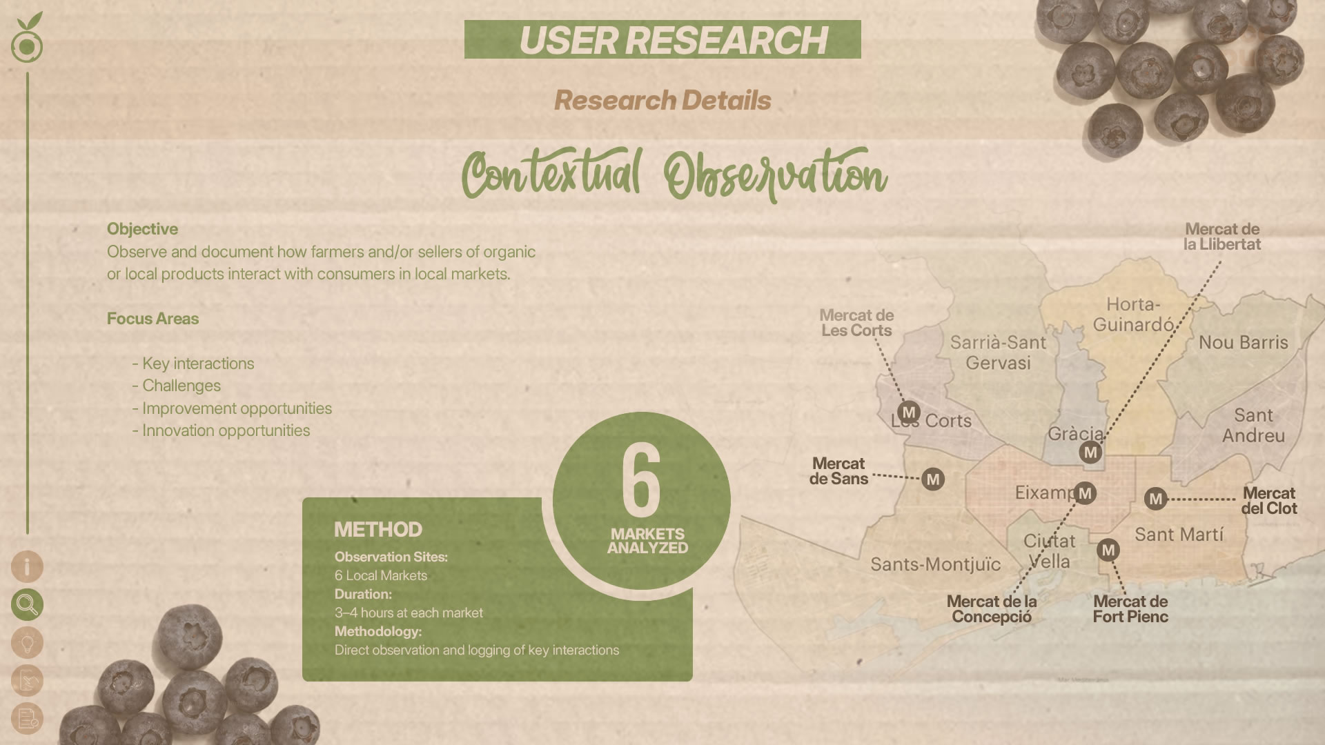
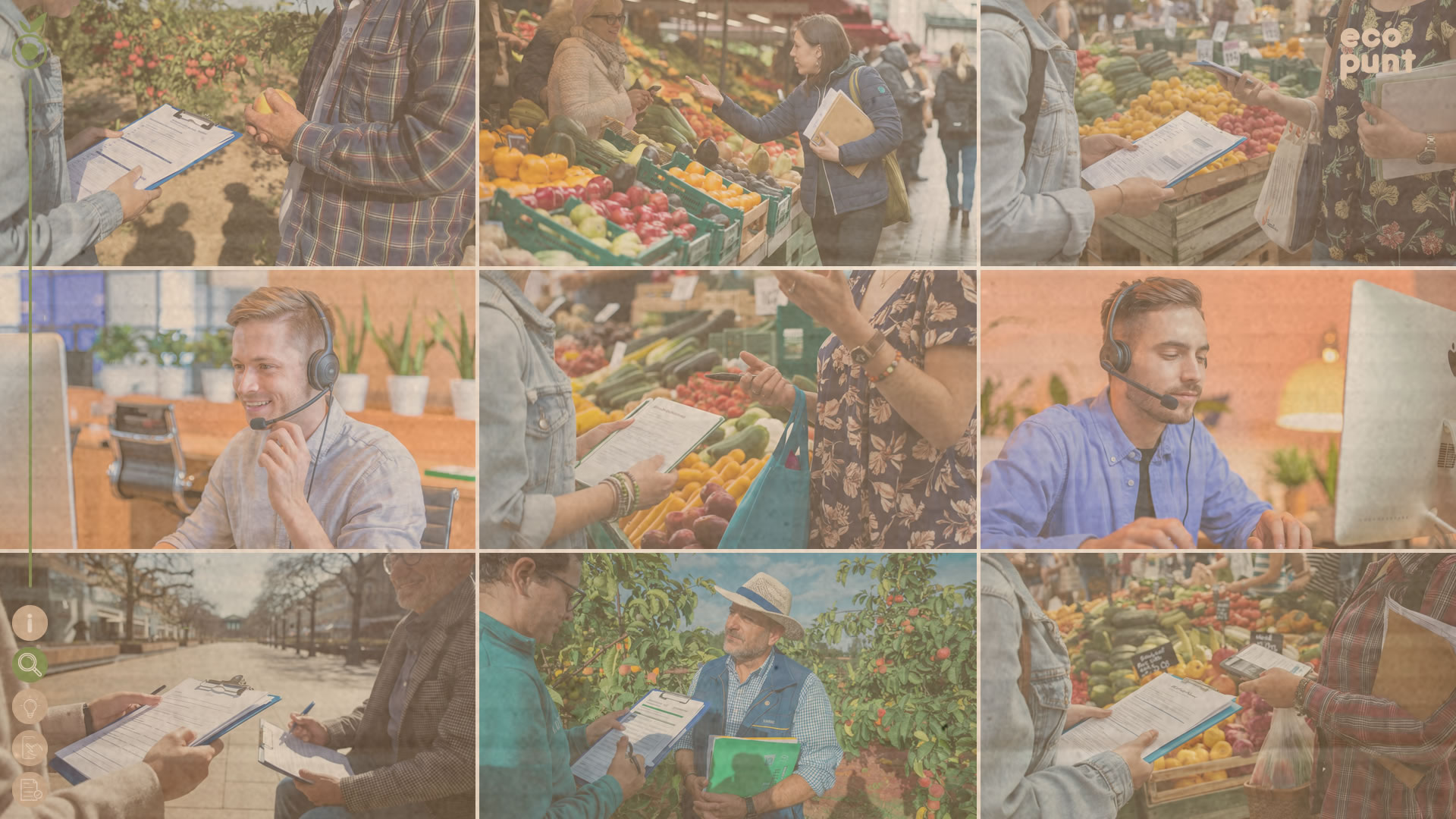
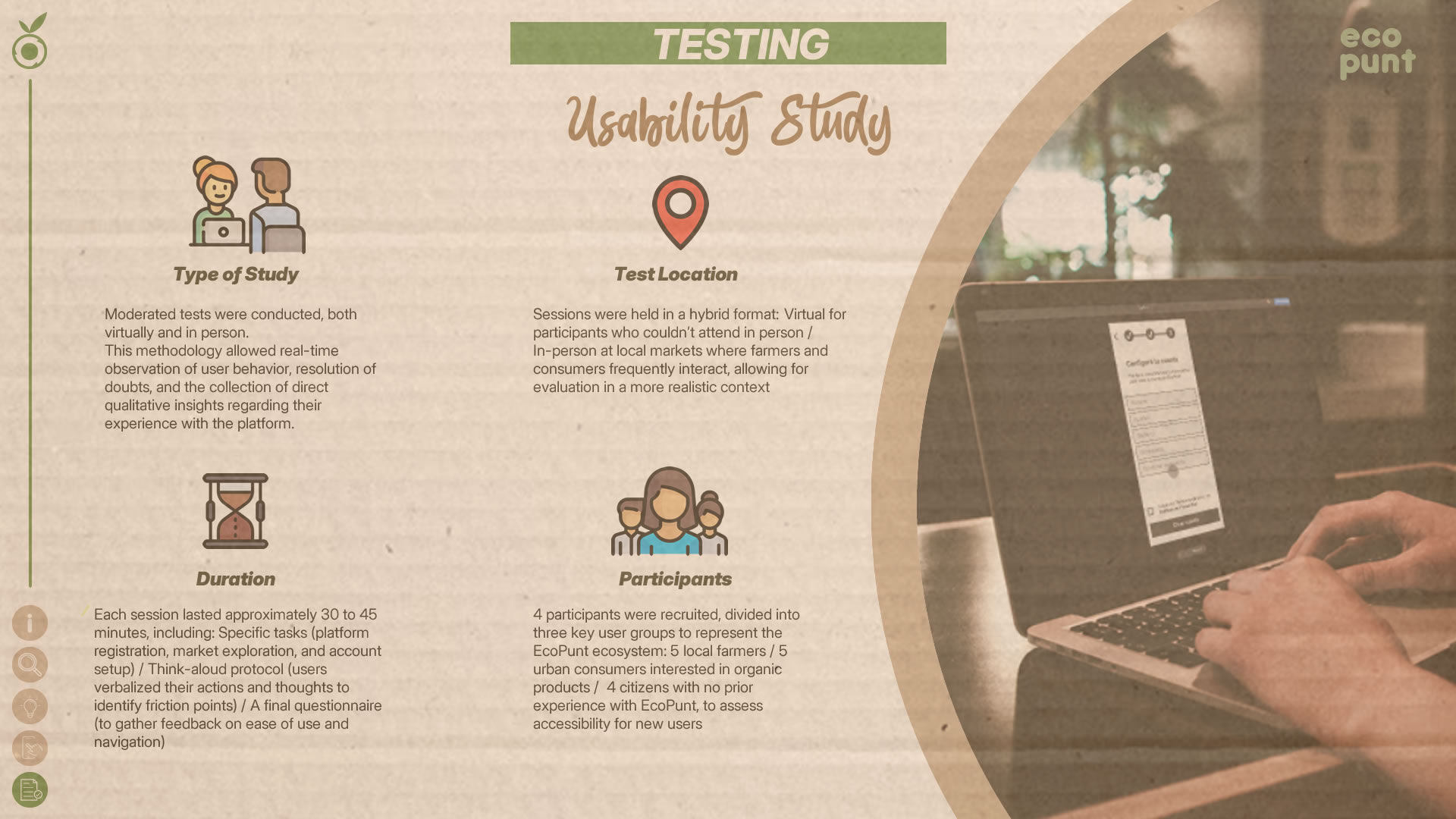
Research Methodology
A mixed-methods approach was used, combining qualitative and quantitative research. First, in-depth interviews with farmers, consumers, and citizens were conducted to explore motivations and challenges. Then, contextual observation in local markets helped analyze interactions and buying behavior. Finally, quantitative surveys gathered data on shopping patterns, interest in local products, and perceptions of sustainability.
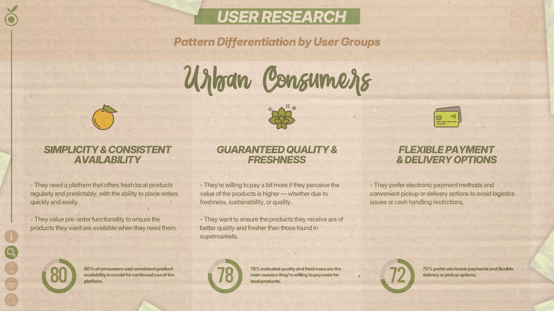
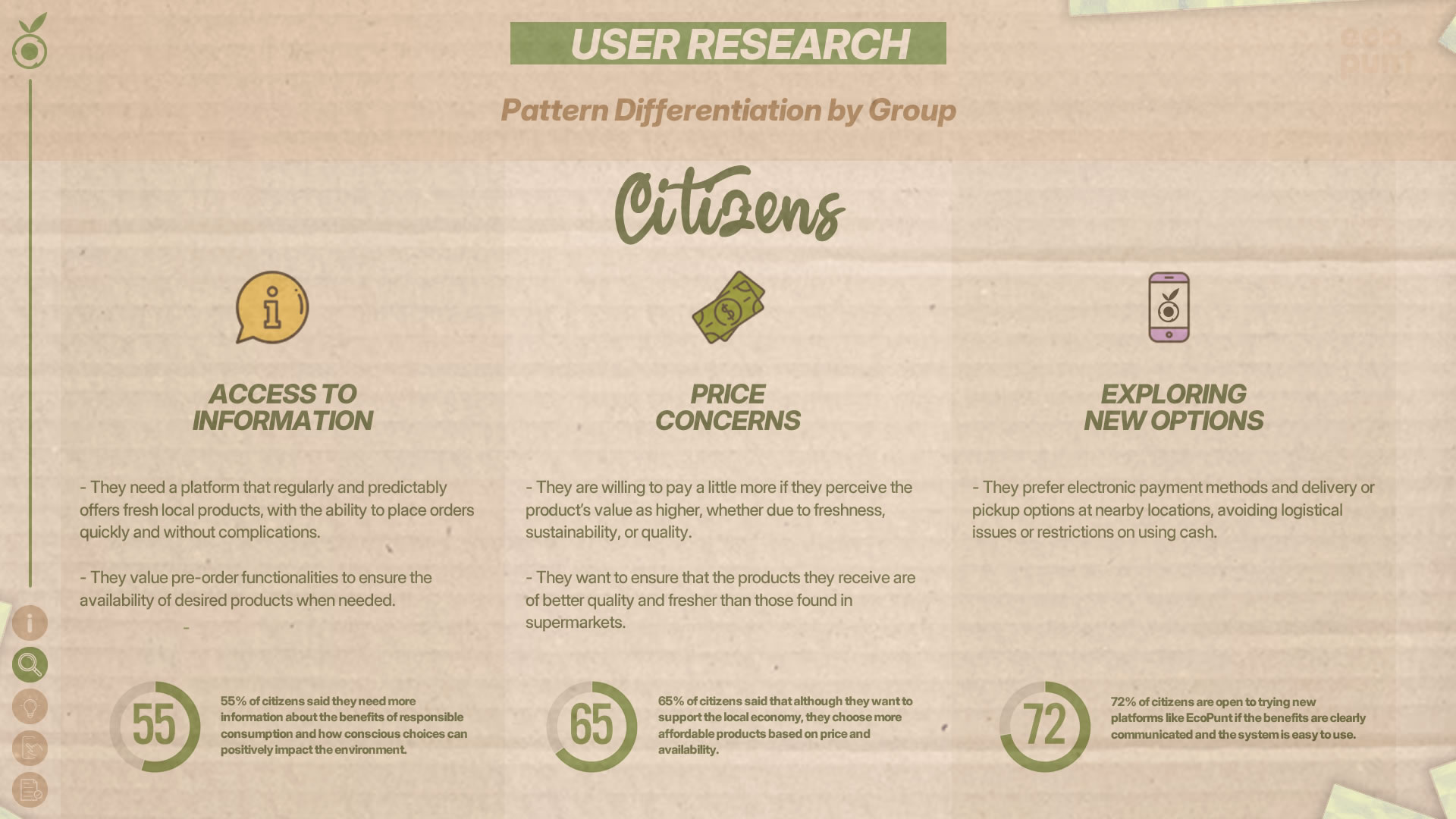
Demographic Profile
The participants were divided into three main groups:
- Local farmers: Small-scale producers of fruits, vegetables, and other goods, aged between 30 and 60, with varying levels of experience in direct sales.
- Urban consumers: Barcelona residents (ages 25–50) interested in fresh and sustainable products, with high engagement in online shopping.
- General citizens: Individuals with moderate interest in responsible consumption (ages 40–60), seeking information about local markets but not necessarily making regular purchases.
Recruitment
A total of 55 people were interviewed and 150 survey responses were collected, allowing us to extract representative data and validate qualitative insights with quantitative findings.
Defining the Problem
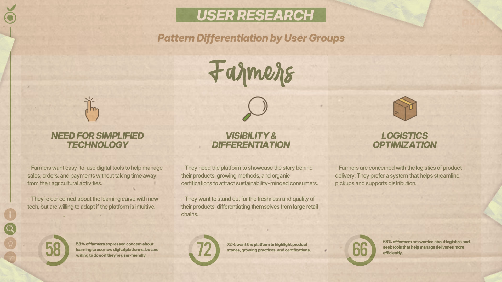
Pain Points
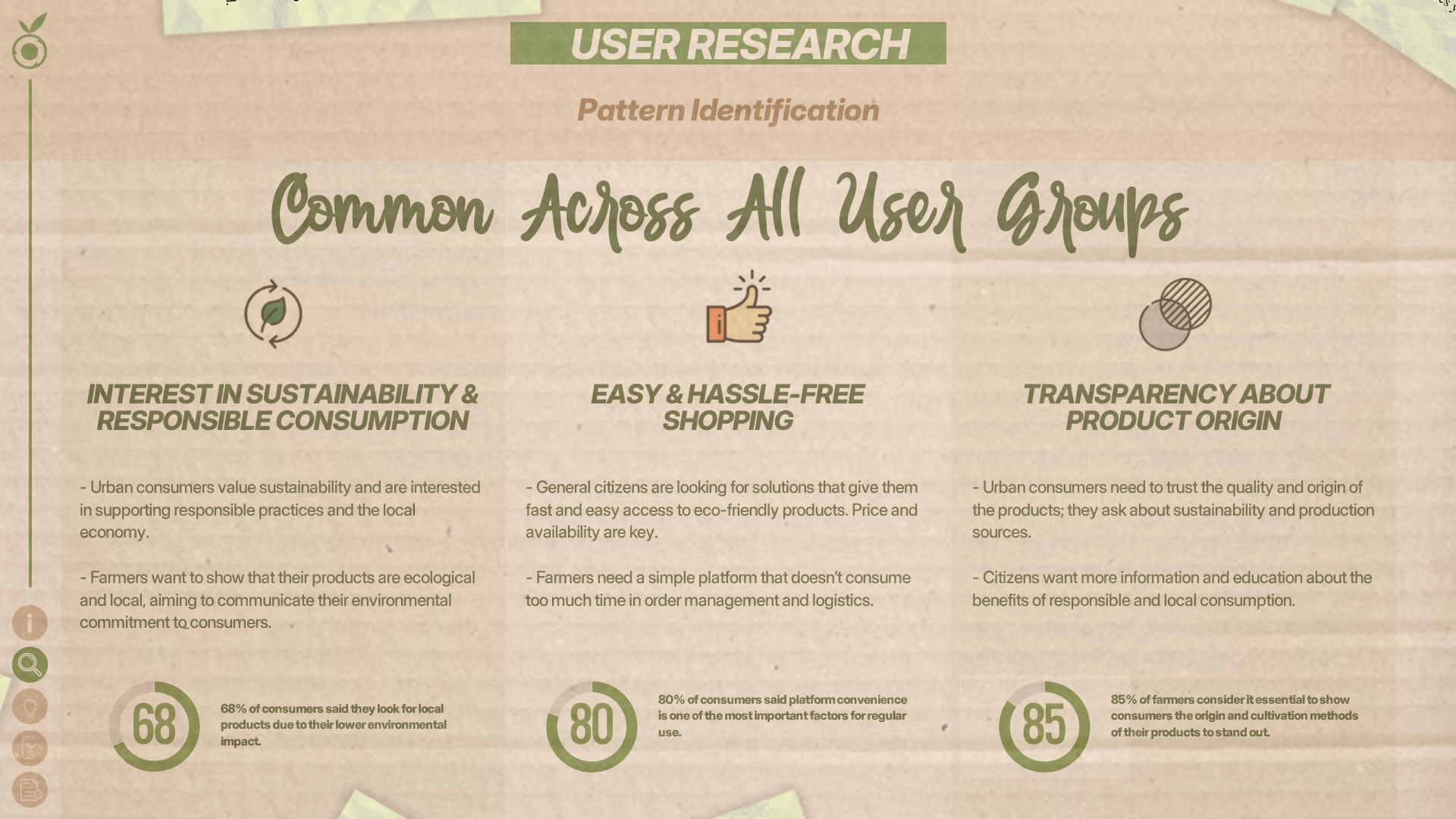
Grouping results by target audience allowed us to segment the specific needs, motivations, and frustrations of each user group—ensuring design solutions responded precisely to their realities and expectations. Farmers, urban consumers, and general citizens interact with EcoPunt in very different ways, so analyzing data separately made it easier to identify key issues and improvement opportunities for each user type.
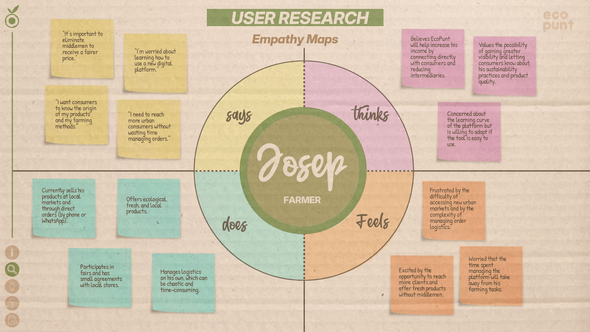
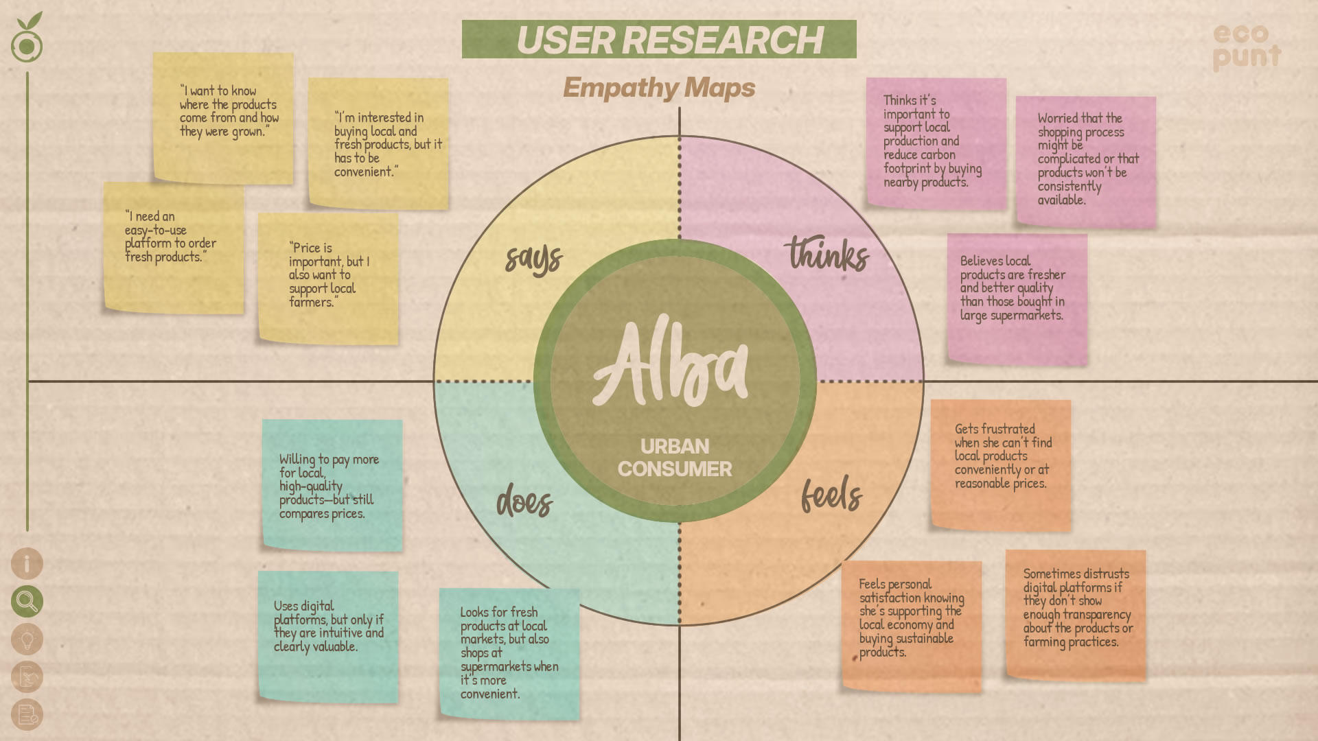
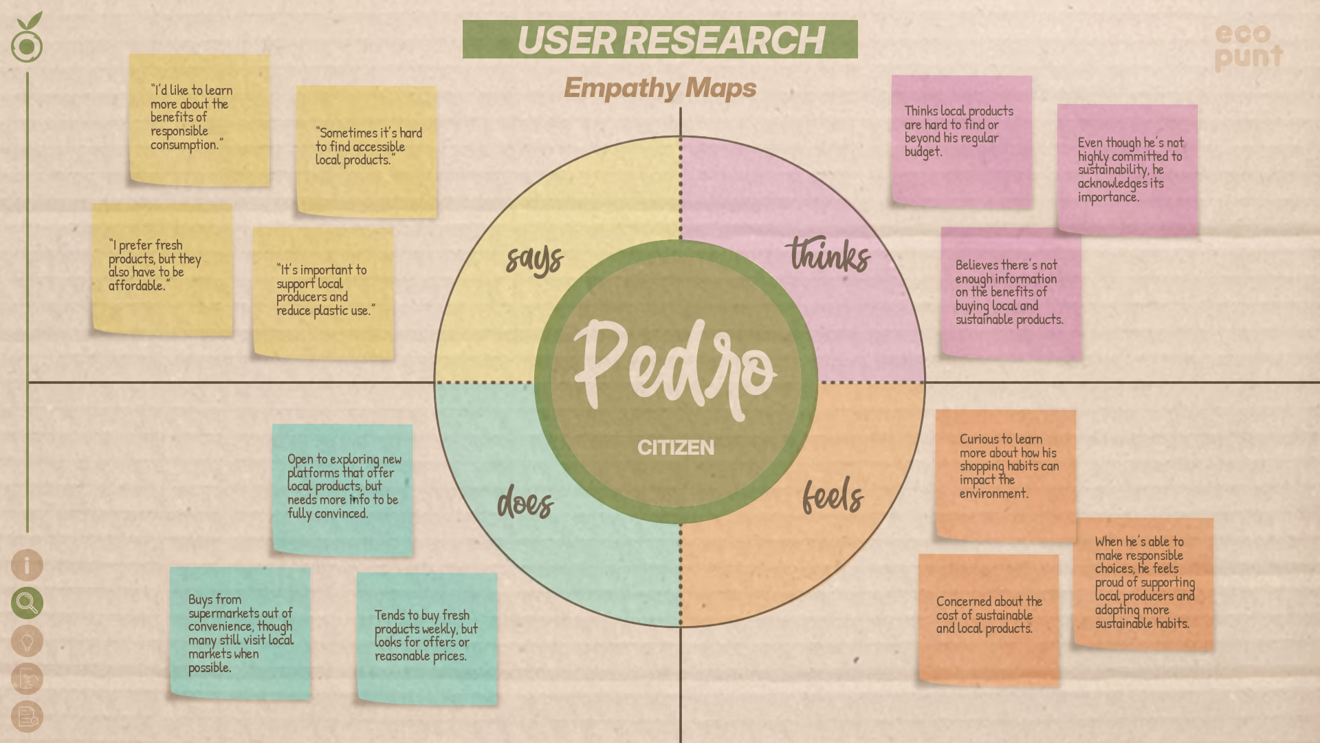
Empathy Map
Empathy maps were created to deepen our understanding of each group and humanize the data collected during research. By visualizing what each user thinks, feels, says, and does, we could better understand their experiences and generate solutions aligned with their emotions and behaviors. This exercise helped design a platform that not only functions technically, but truly connects with users’ needs and expectations.
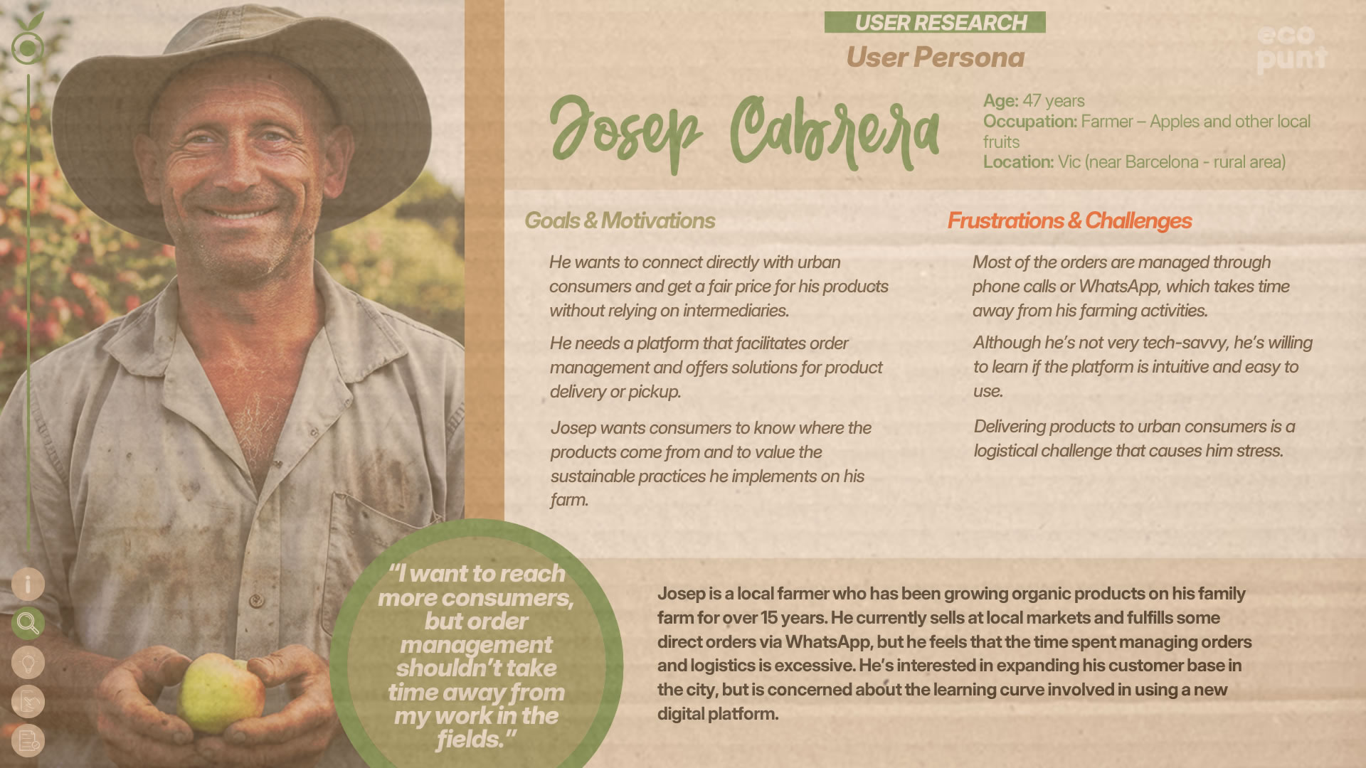
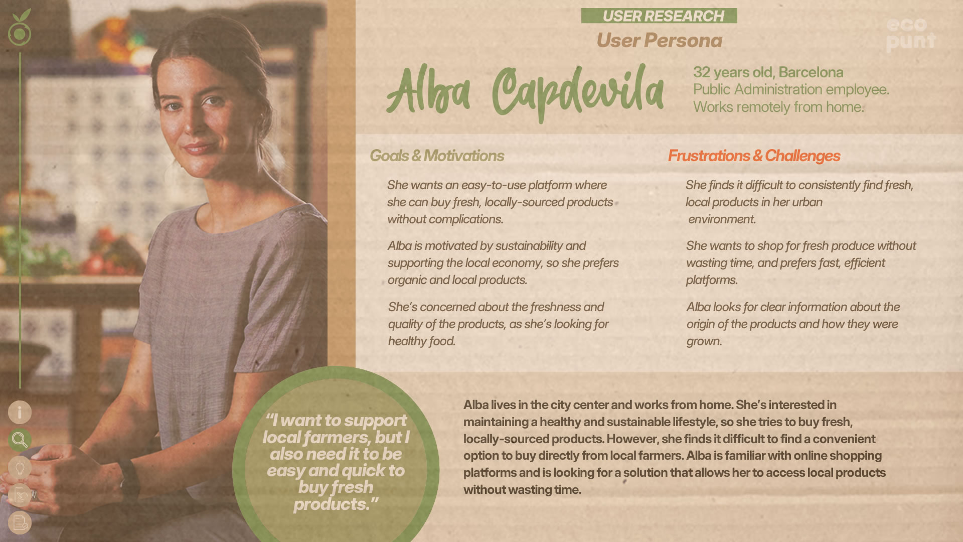
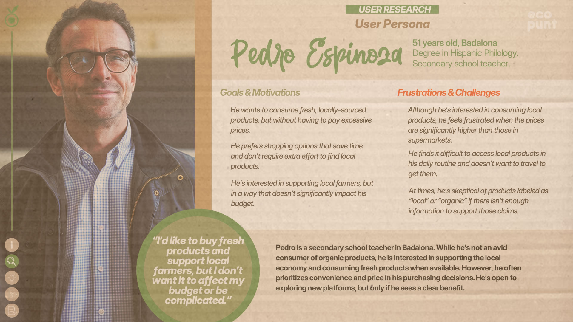
Personas
After developing the empathy maps, we created “Personas” to represent each user group through more detailed and realistic profiles. This step helped consolidate research findings and define fictional users based on real data, including their motivations, frustrations, and specific behaviors. These personas served as constant references throughout the design process, ensuring that every decision remained aligned with user needs.
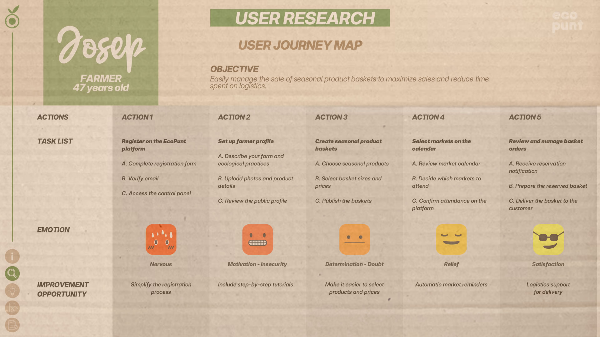
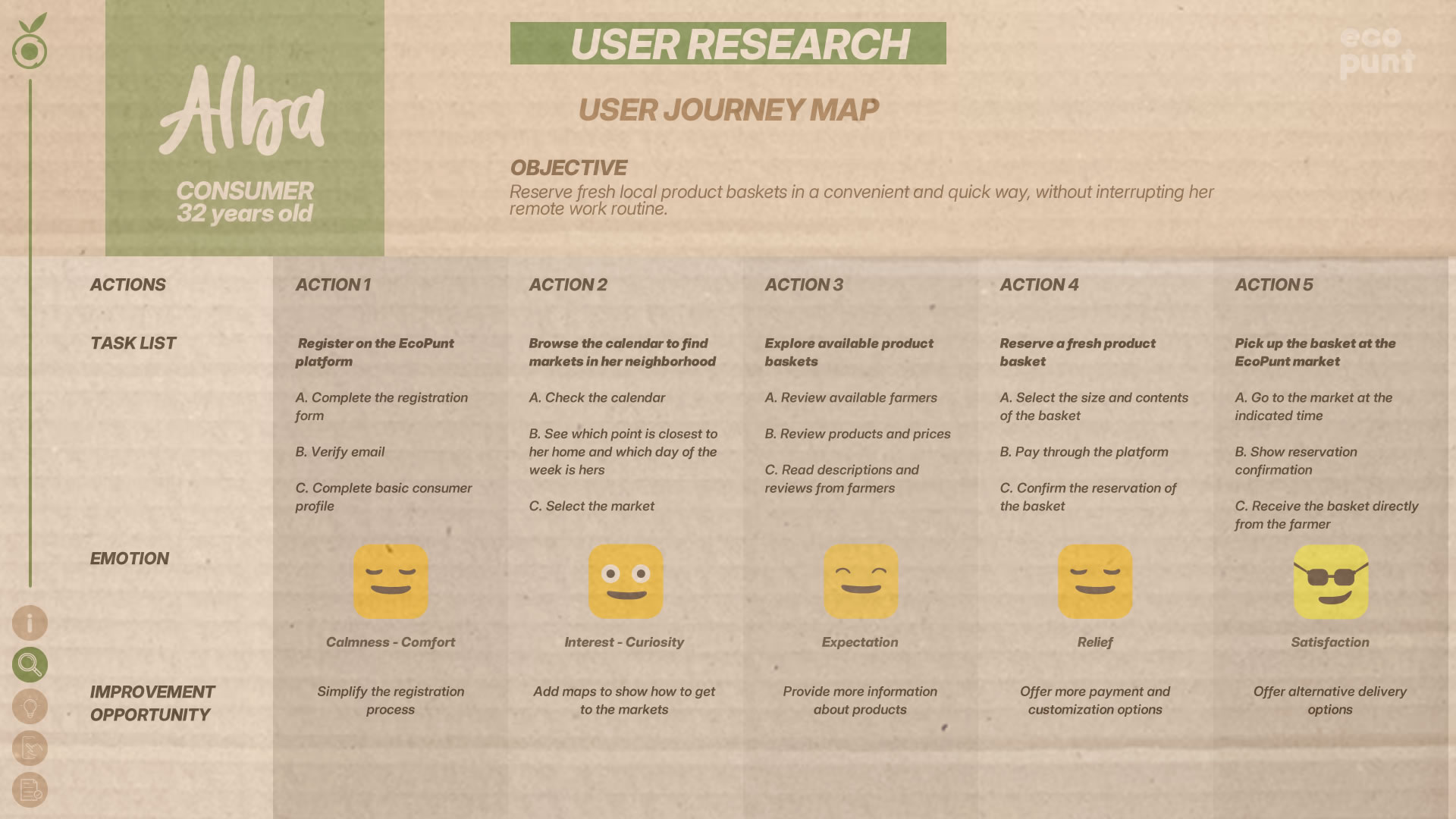
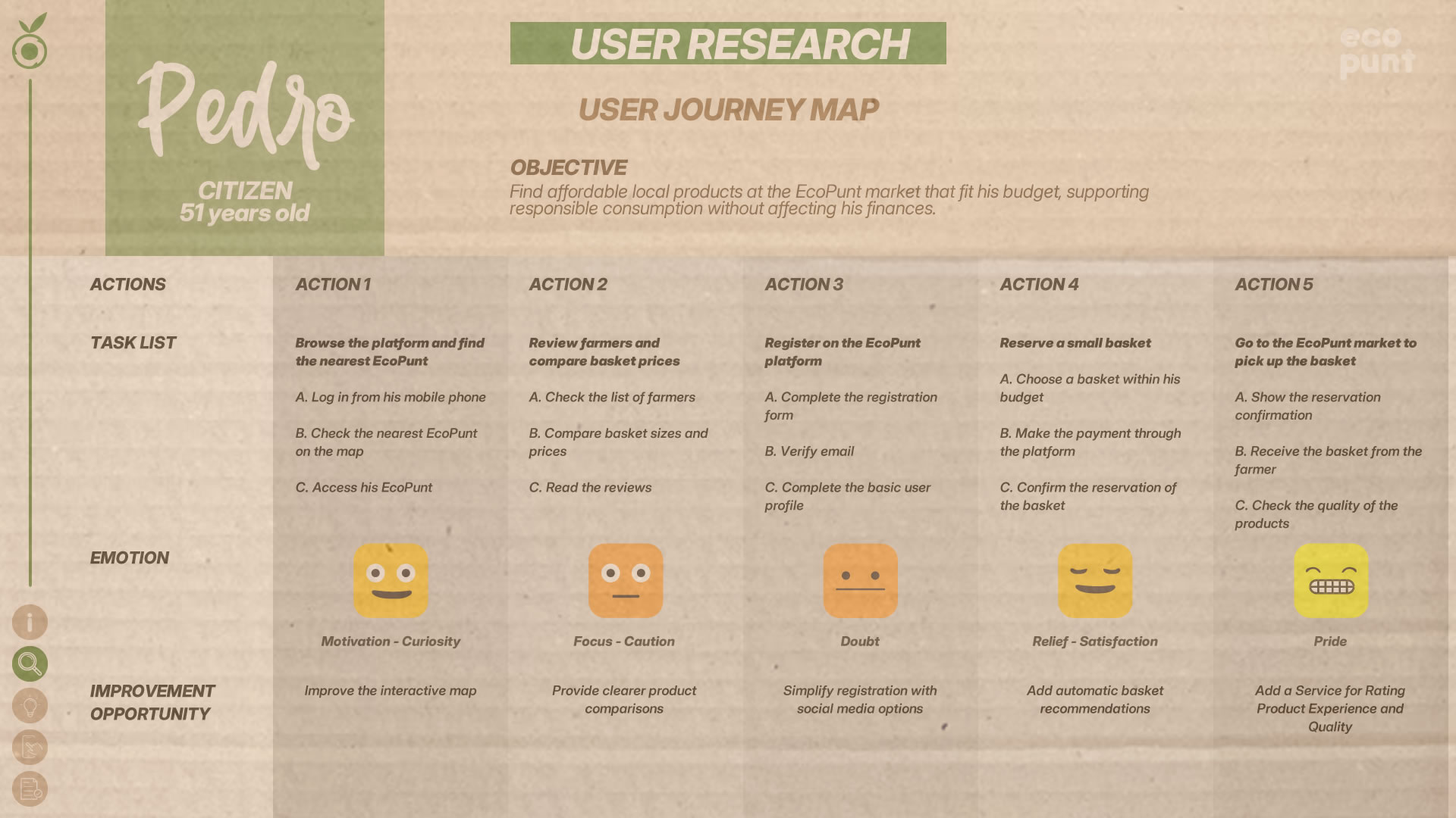
User Journey Map
The User Journey Map helped us visualize each user’s experience interacting with EcoPunt, identifying friction points and opportunities for improvement along their journey. By mapping actions, thoughts, and emotions at every stage, we were able to detect pain points and design solutions to optimize the experience. Throughout the project, these maps were key in prioritizing improvements, ensuring seamless navigation, and validating that the platform truly addressed the problems uncovered in the research phase.
Ideas for a Solution
Objective
To develop an effective solution aligned with EcoPunt users’ needs, we planned strategic ideation sessions aimed at generating and refining innovative ideas to improve the shopping experience, product management for farmers, and platform transparency. Through structured techniques, we explored different approaches, selected the best proposals, and optimized them before moving on to the prototyping phase—ensuring every idea responded directly to the insights uncovered during user research.
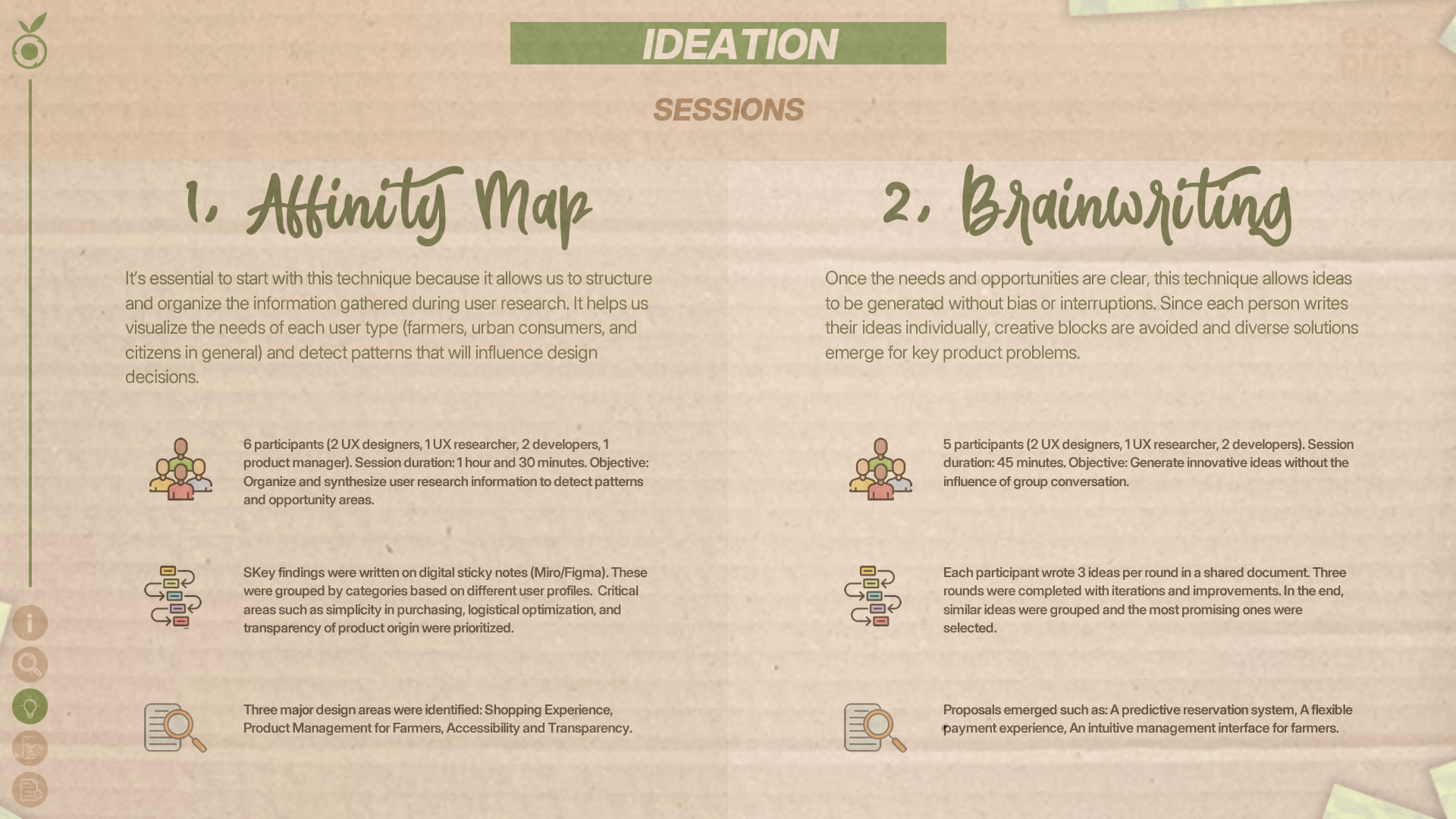
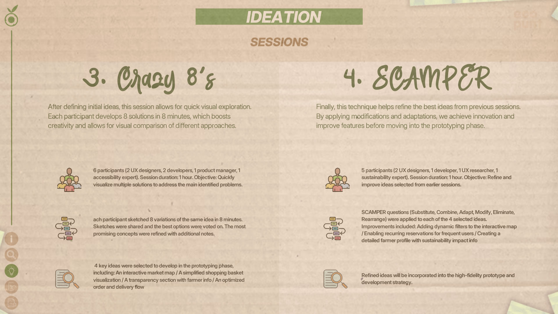
Key Points
After completing our ideation sessions, we generated a set of ideas that directly address the needs and challenges identified during the user research. These sessions allowed us to explore innovative solutions and prioritize those that best align EcoPunt’s functionality with the project’s goals. We now move into the design phase, where these ideas will take shape through wireframes and prototypes that optimize the user experience and ensure intuitive navigation.
Accessibility and Ease of Use
- Multiple simplified interface versions were proposed for managing baskets and orders, highlighting shortcuts and streamlined flows without unnecessary steps.
- Key concerns from both farmers and consumers regarding accessibility were organized and prioritized based on urgency and impact.
- Ideas were generated for interactive tutorials and in-app support to reduce the learning curve.
Transparency and Product Trust
- Detailed profile cards for each farmer, including information about their production methods.
- A direct messaging system between farmers and consumers.
- A dedicated section featuring farmers’ stories with testimonials and production photos.
- A proposed system for verifying organic products with quality tags and certification seals.
Availability and Product Discovery
- An interactive calendar showing real-time market schedules and product availability.
- Personalized notifications to alert users about nearby markets and available products.
- Advanced filters to search for products by type, market, or farmer.
Logistics for Shopping and Pickup
- Lack of delivery options was identified as a major barrier for some users.
- The pickup system was simplified by consolidating all collections at the market while keeping scheduling flexibility.
Education and Sustainability Awareness
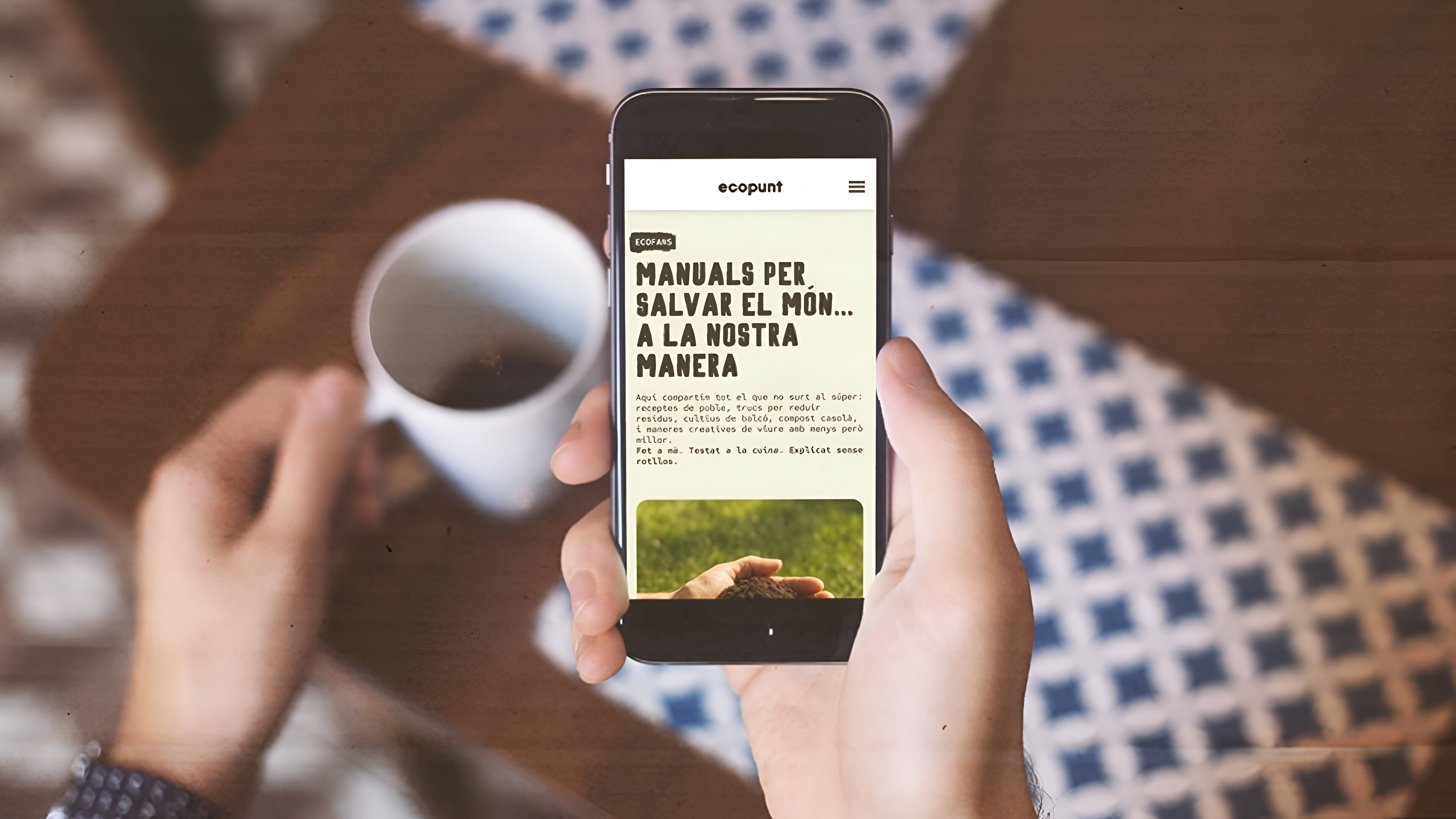
- Creation of an educational section within the platform featuring content on responsible consumption.
- A dedicated “EcoFans” section with articles, videos, and tips on sustainability.
- Identification of key topics users wanted to learn about, including sustainability, environmental impact, and local economies.
Design
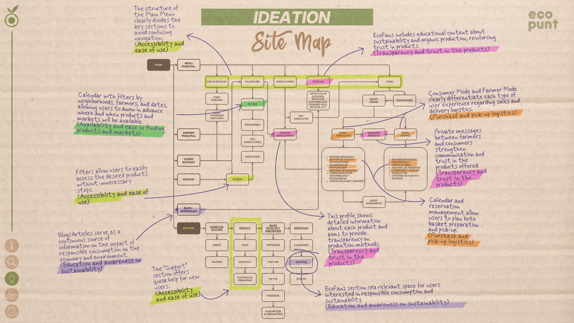
The ideation sessions provided a set of key solutions based on the user needs and pain points identified during research. With these ideas organized, the next step was to structure them logically and functionally within the platform. We started by creating the Site Map, ensuring that the information architecture supported intuitive and accessible navigation aligned with the defined user flows. This process helped us establish content hierarchy, define main sections, and ensure each feature was correctly positioned before moving into visual design.
Site Map
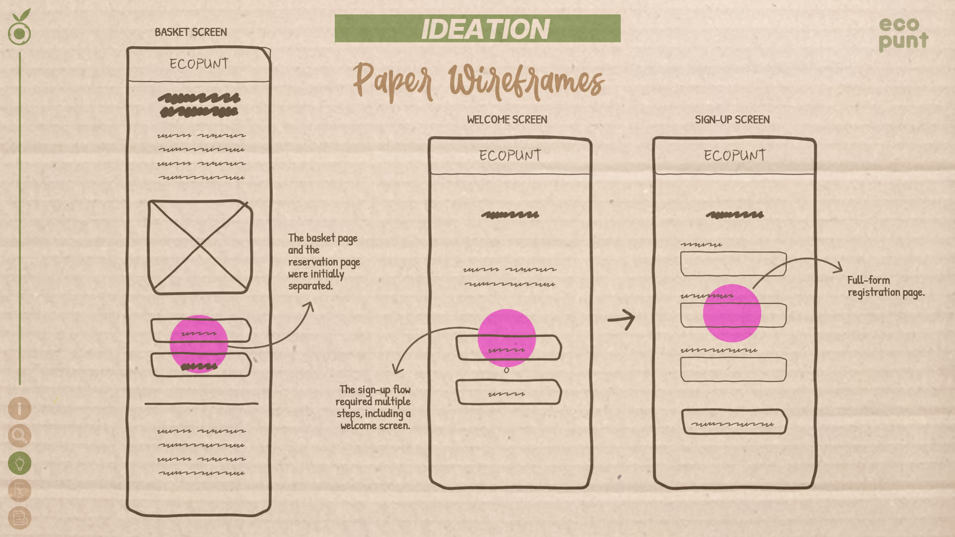
Paper Wireframes
Before diving into detailed screens, we started with paper wireframes to sketch out initial ideas and explore different ways to present information. Since EcoPunt was a project built from scratch, we experimented with structures inspired by conventional e-commerce flows: step-by-step registration and checkout processes, and familiar navigation patterns. These early sketches helped us visualize the initial architecture and identify opportunities for improvement before moving on to digital formats.
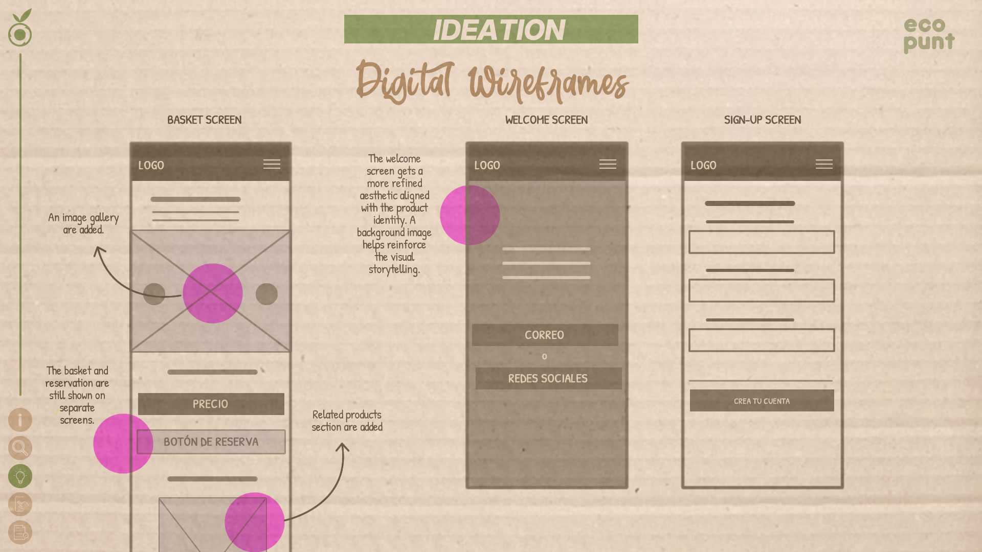
Digital Wireframes
Once the initial paper wireframes were validated, we moved to the next step: digital wireframes. At this stage, we began consolidating the general structure and defining key interface elements such as visual hierarchy, spacing, and navigation flows. This process was essential for translating early ideas into a more precise and functional design foundation before moving into interactive prototyping.
Prototype
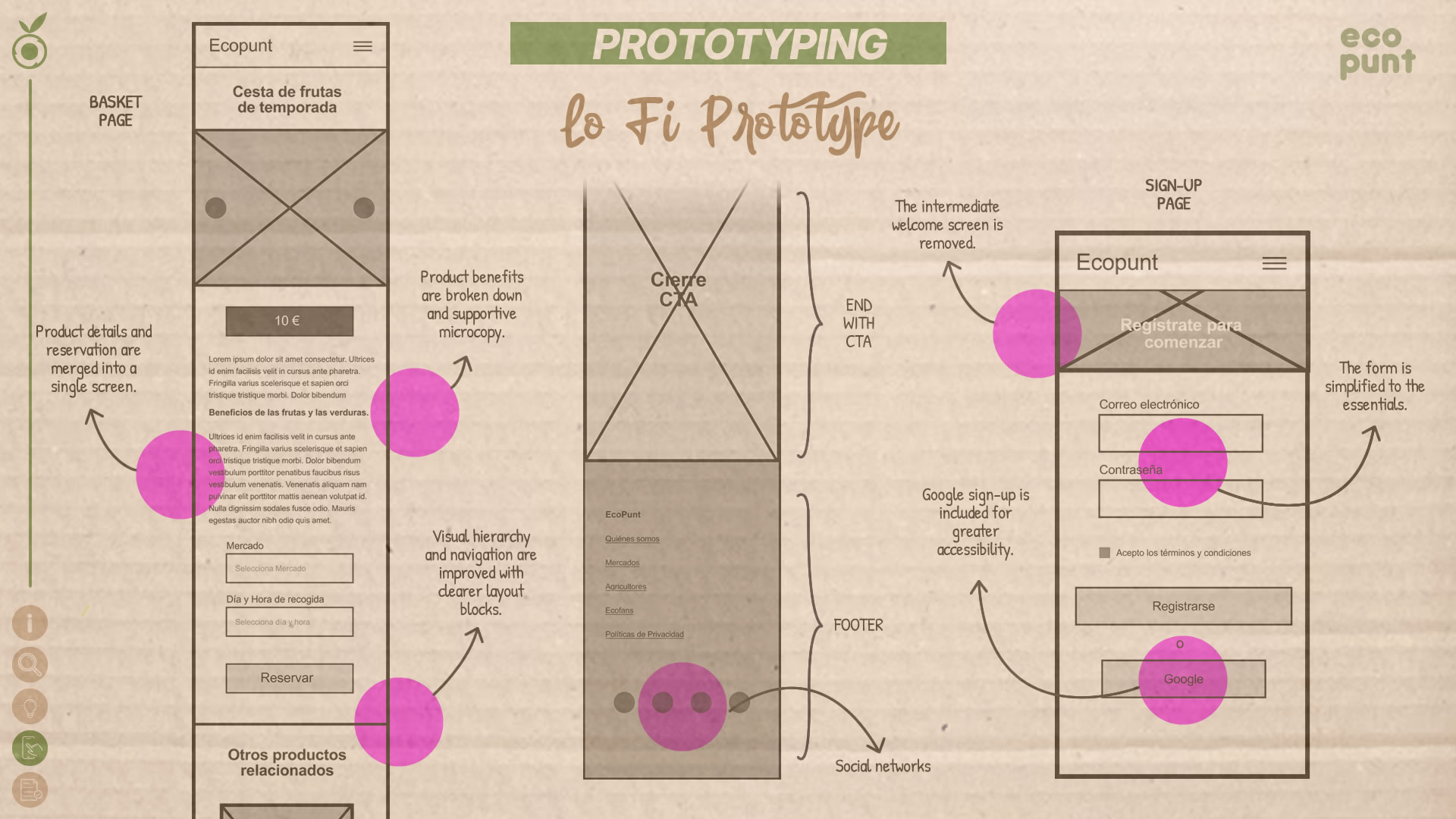
Lo-Fi Prototype
With the digital structure in place, we moved forward to low-fidelity prototyping, integrating basic navigation and key user flows. This phase allowed us to simulate core tasks and observe how users responded to real-use scenarios. By keeping the visuals minimal, we prioritized functionality, validating the clarity of flows, action points, and information organization before transitioning to high-fidelity design.
Usability Study
To evaluate the user experience of EcoPunt's low-fidelity prototype, we conducted a usability study focusing on three key aspects: the clarity of the reservation flow, the perceived trust and transparency of the basket page, and the users' understanding of the registration process. Through tests and interviews, we identified communication gaps that could cause friction or drop-off. These findings guided crucial improvements before moving to the high-fidelity prototype, ensuring a clearer, more trustworthy experience aligned with EcoPunt’s values of proximity and transparency.
Findings and Improvement Opportunities
1 · Lack of confirmation before reservation
-
Although users understood the reservation flow, they pointed out that there was no intermediate step summarizing what they were about to confirm. The “Reserve” button felt abrupt, with no review or context of the action.
KPI: 67% of participants said they expected a summary step before confirming the reservation.
- A detailed order summary block was added, clearly showing the name, weight, price, and brief description of the basket. New checkboxes were also introduced to confirm understanding and accept terms of service, making the process feel more human and intentional.
2 · Insufficient information on the basket page
-
During interviews, users expressed the need for more transparency and content on the basket page: what’s included, health benefits, ecological practices, and how the products are cultivated.
KPI: 73% of participants stated they needed more information before deciding to reserve a basket.
- Additional content blocks were added to the page, including: A section on health benefits. Info about cultivation methods and ecological certification. A visual gallery showing basket ingredients. Details about the producer behind the product. This upgrade helped build trust, transparency, and alignment with EcoPunt’s values.
3 · Confusion between registration and logind
-
Several users were unsure whether they were registering for a new account or logging into an existing one. The previous screen layout lacked clarity regarding the type of action being taken.
KPI: 58% of users reported feeling confused about whether they were logging in or signing up.
- The form was redesigned with a clear title: “Create Your Account.” Visual hierarchy was improved, redundant fields were removed, and new sign-up options were added (email, Google, Apple). A dedicated link was also added for users who already have an account.
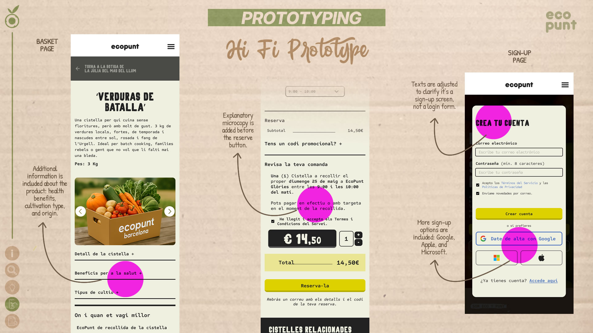
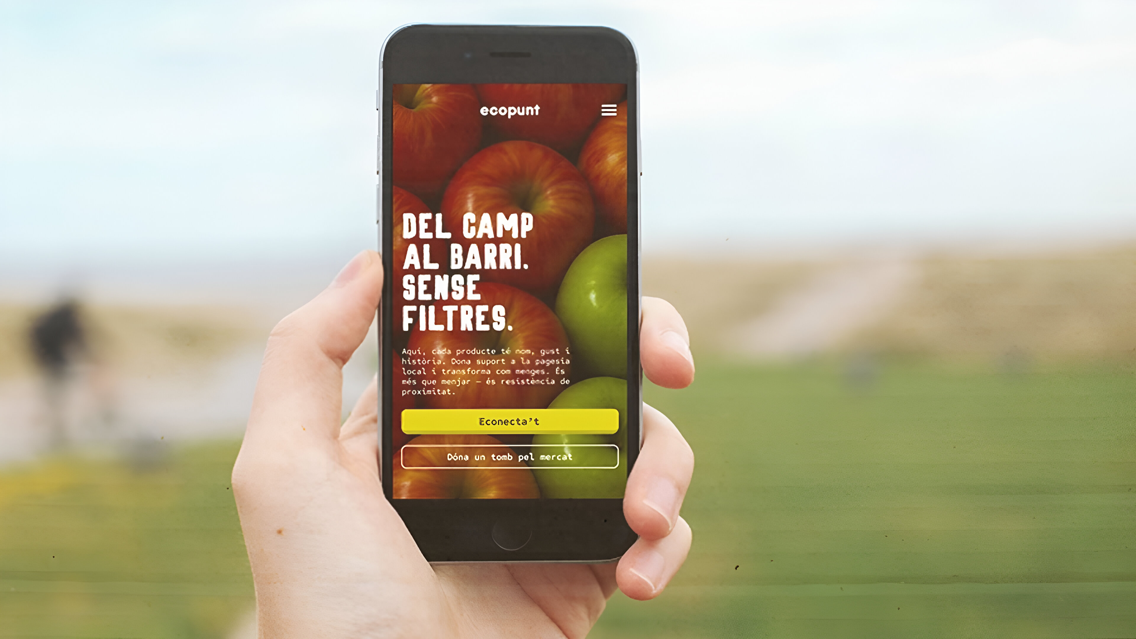
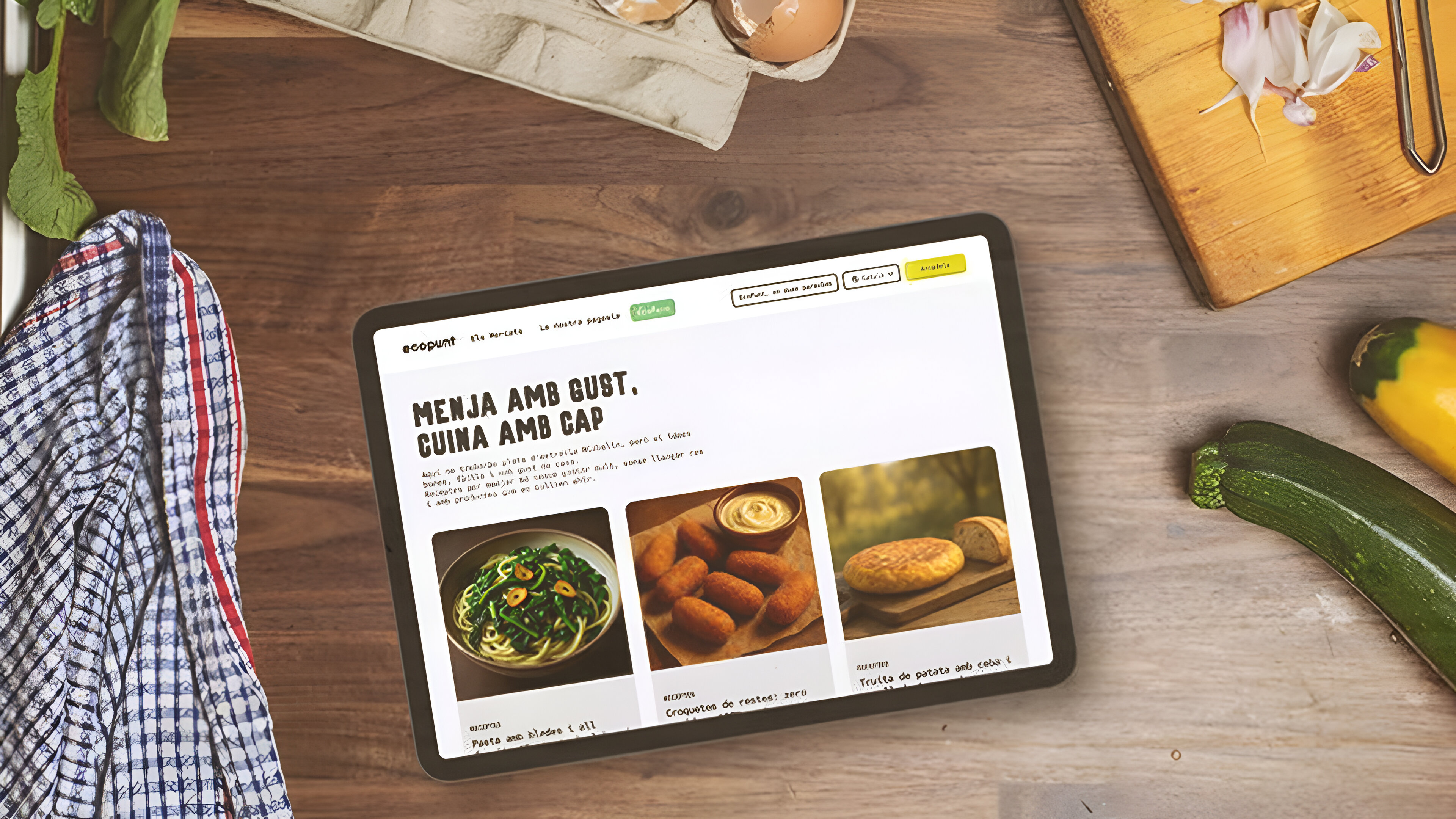
Hi-Fi Prototype
Based on insights gathered from the usability test, we refined the design and implemented the high-fidelity prototype, integrating strategic improvements driven by user feedback. This final version offers a warmer, more emotional, and accessible experience, with enriched content to foster trust, reduce friction, and humanize the interaction. The reservation flow, information hierarchy, and clarity of the registration form were optimized to deliver an intuitive, visually cohesive, and socially meaningful platform aligned with the project’s values.
Test
Usability Validation Study
For this stage, we conducted Usability Validation Tests to determine whether the implemented improvements successfully resolved the friction points identified in the previous study. We assessed whether navigation was clearer, content was more transparent, and if users were able to complete key tasks with ease. This final validation allowed us to evaluate the real impact of changes before the platform’s official launch.
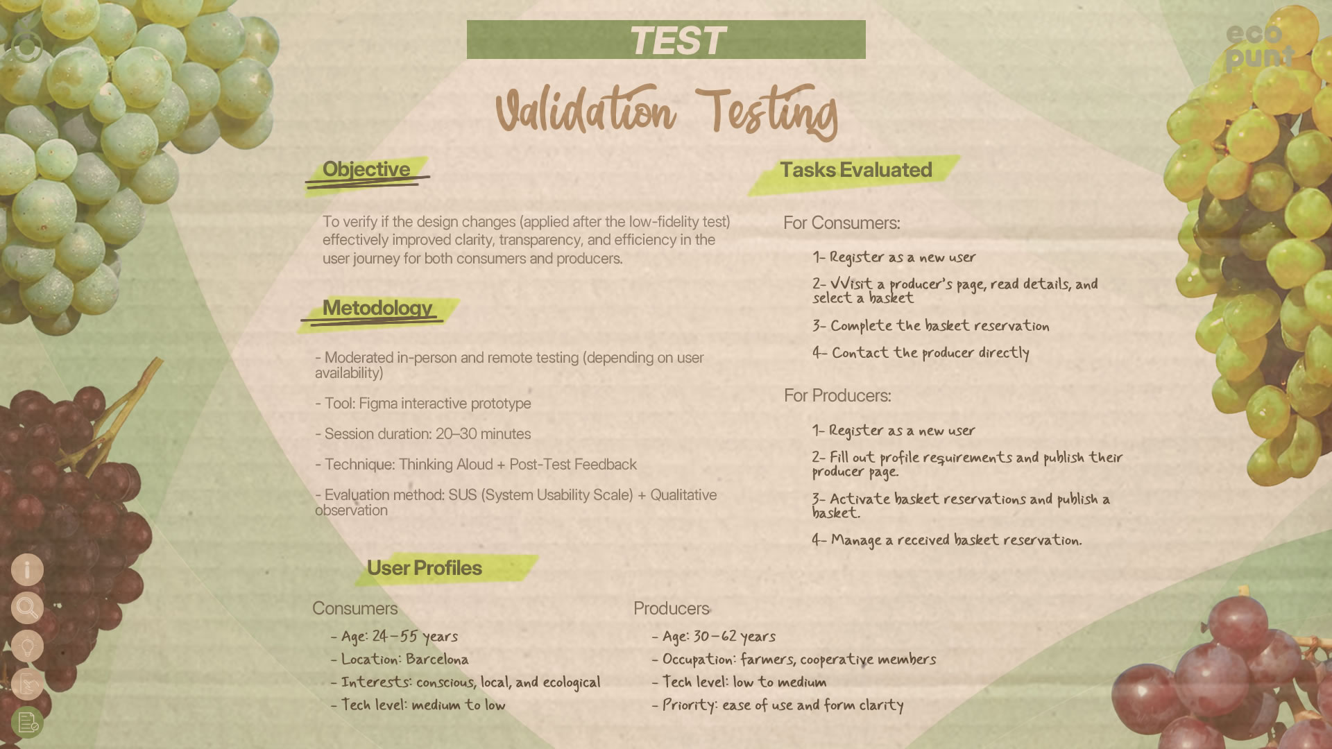
Impact of Implemented Improvements
The updates made based on the low-fidelity study findings had a very positive impact on user experience. Key task completion rates increased, especially for users with low digital literacy. Participants also reported a higher sense of trust in the platform due to improved content clarity and streamlined flows.
Clearer Basket Reservation Flow
A detailed summary was added before confirmation to show users what they were reserving, when, and where to pick it up.
KPI:
✓ 87% of users rated the new info block as “very clear”.
✓ Confusion about the reservation process dropped by 60%
✓ Perceived trust in the process increased by 45%
-
Stronger Transparency Perception
Informative dropdown sections were added to the basket page (health benefits, type of farming, cultivation methods).
KPI:
✓ 72% of users said they felt more confident before reserving
✓ 68% interacted with at least two information blocks
✓ +40% time spent on product page
-
Reduced Registration Errors
The design clarified the difference between signing up and logging in for existing users.
KPI:
✓ Navigation errors reduced by 55%
✓ Sign-up completion rate: 95%
✓ Average sign-up time: 38% faster
-
Strengthened Brand Identity
Warm, inclusive microcopy and headers were introduced, reflecting the tone of local markets and human connection.
KPI:
✓ 91% of users rated the tone as “friendly” or “authentic”
✓ +30% in user intention to return
✓ “This platform feels different”: spontaneously mentioned in 5 out of 8 interviews
-
Empowered Low-Tech Users
All flows were simplified, removing unnecessary steps to support non-digital users.
KPI:
✓ 100% of low-tech participants completed their tasks
✓ User drop-off rate during flows: 0%
✓ 85% of producers said they “felt capable of doing everything alone”s
Mockups

Accessibility Considerations
EcoPunt was designed with a focus on digital inclusion and accessibility, ensuring that both farmers and consumers can interact with the platform without barriers. Universal design principles were implemented to provide intuitive navigation, screen reader compatibility, and an interface optimized for users with varying levels of technological literacy. A simple structure and device adaptability were key to delivering an accessible experience for everyone.
High Visibility Mode & Smart Contrast
A dynamic high-contrast mode was designed to adapt automatically to ambient light conditions, enhancing visibility without compromising the platform’s visual aesthetic.
Accessibility in Areas with Limited Connectivity
EcoPunt includes an optimized offline mode that allows farmers to upload products and manage orders even without internet access, with automatic synchronization when the connection is restored. This feature supports inclusion for users in rural areas with limited connectivity.
Haptic and Audio Feedback for Farmers
Since many farmers use the platform outdoors and on the move, subtle vibrations and personalized sounds were implemented to confirm actions like publishing a basket or receiving a message—ensuring users receive feedback without needing to look at the screen.
Conclusions
Next Steps
1. Final Development & Implementation
- Code optimization and full development: Refine the code for efficient and scalable implementation on both web and mobile platforms.
- Security and performance testing: Conduct load and security tests to ensure the platform can handle multiple users without compromising stability.
2. Controlled Launch & Open Beta Testing
- Open Beta Phase: Invite a broader group of real users for live testing and gather feedback before the official launch.
- Monitoring & Quick Adjustments: Make rapid adjustments based on real-time user interactions.
3. Launch & Growth Strategy
- Onboarding & Education Campaign: Create educational content to help new users explore and benefit from all platform features.
- Adoption & Expansion Strategy: Partner with farming communities, local markets, and sustainability-focused consumer groups to promote EcoPunt adoption.
4. Continuous Measurement & Analysis
- Usage & Retention KPIs: Track metrics such as conversion rate, usage frequency, and user satisfaction.
- Iterative Optimization: Maintain a continuous improvement cycle based on behavioral data and evolving user needs.
This project allowed me to explore how UX/UI design can improve the experience of users with specific needs—such as farmers and consumers of organic products. I learned to balance functionality with accessibility, ensuring that every design decision enhanced navigation and usability.
Designing for two distinct audiences challenged me to create flexible user flows and modular solutions. Iteration through usability testing was essential to refine the experience and validate each adjustment with real users.
Ultimately, this project reaffirmed my commitment to designing intuitive, efficient digital products that create a positive impact on both society and the environment.
More Projects